 |
 Home
Home Java
Java Programs
 OOPs
OOPs String
 Exception
 Multithreading
 Collections
 JavaFX
 JSP
JSP
React Bootstrap ModalModals are useful web components to create an attractive layout for the user notification, lightbox, or custom content. We can keep anything inside the modal component. A modal is a popup component that is triggered using any specific action. Bootstrap supports a predefined modal component with three sections: modal header, modal footer, and modal body. Each section is customized in a way as their names. The header section will be positioned at the top, and the footer section will be positioned at the bottom of the container. The modal component requires JavaScript for the toggling of the state; hence we do not need to write any specific code for toggling the modal component. Modals are displayed on top of every other component and removed scroll while rendering it so that modal content can scroll instead of another component. When we select the close element of the modal, it will be unmounted. Bootstrap does not support nested modals; we can render only one modal component at a time. For the nested modals, we can use any third-party library such as @restart/ui. Let's understand how to use a modal component using React Bootstrap. How to Create Modal Using React Bootstrap?React Bootstrap supports <Modal> component to create the modal. We can use <Modal.Dialog />, <Modal.Header />, <Modal.Body />, and <Modal.Footer/> component to specify the modal content. The <Modal /> component is imported as follows: Consider the below example: App.js: Output: 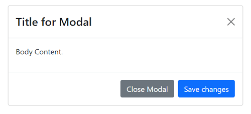
From the above output, we have created a modal container. However, it is a static container for now because we do not specify the open and close state for it. So it will be displayed on the web page. To hide it by default, we need to set its state to false by default; then, we will toggle it on the click of a component. Let's understand how to show and hide a modal. How to toggle Bootstrap Modal?To toggle a modal, we need to handle the modal state. We will create a state [show, setShow] using the useState hook to show and hide the modal component. Let's understand it with the below example: Output: The above code will render a button component because we have set the default state of the modal component is false. 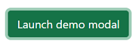
When we click on the Launch modal button, it will update the state of the modal and display it as follows: 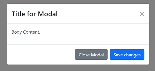
Similarly, when we click on the close button, it will update the modal state by using the modalClose function and close it. Thus, we can create and toggle a modal component using the React Bootstrap and the useEffect hook. Modal with Static BackdropBy default, Bootstrap's modal is designed so that if we click outside of the modal component, it will get closed. But, we can override this behavior by creating a static backdrop. To create the backdrop as static, we can pass the backdrop prop value as static. Once the backdrop is specified as static, the modal will not close when clicking outside the component. Consider the below example: Output: 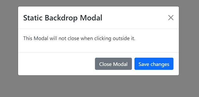
The above modal component will be opened by clicking the Launch Model button and will close only by clicking the close button or dismiss icon. It will close when clicking on the outside of the popup window. Remove Animation from Modal WindowBy default, if a Bootstrap modal is launched, it will open with ease animation. We can remove it by passing the animation prop value is false. To launch and close a modal without animation, pass the below value to the modal component: It will launch and close the animation without any animation. Consider the below example: Vertically Centered Aligned ModalWe can vertically center the modal window by passing the centered prop to the modal component. We do not need to manually write any CSS code for centering the modal popup. Consider the below example: Output: 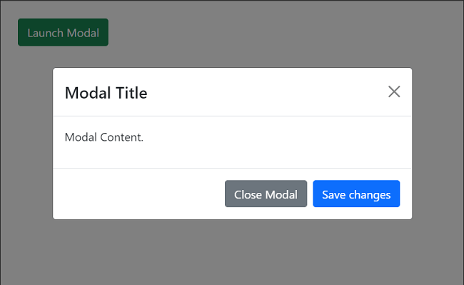
Modal SizesThe React Bootstrap allows us to specify the modal size by passing the size prop in the modal component. We can specify sm and lg as values to specify the size of the modal. Consider the below example: Small Modal: Output: 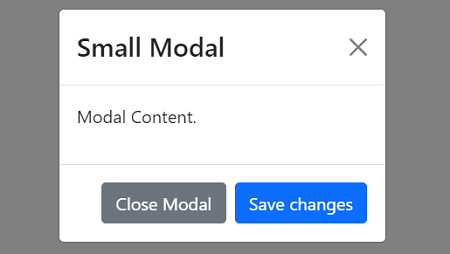
Large Modal: Output: 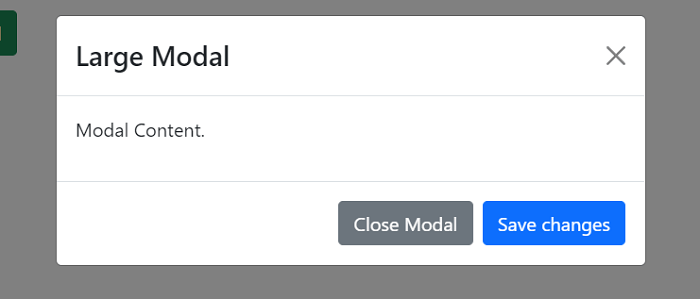
Full-Screen Modal: The fullscreen prop allows us to render the modal on full screen. In Bootstrap 5, we can specify different breakpoints to make the modal full screen. Consider the below example: Output: 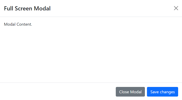
The above modal will be launched in a full screen mode. Thus, we can use the React Bootstrap Modal as per our need.
Next TopicReact Bootstrap Navbars
|
 For Videos Join Our Youtube Channel: Join Now
Feedback
- Send your Feedback to [email protected]
Help Others, Please Share


