 |
 Home
Home Java
Java Programs
 OOPs
OOPs String
 Exception
 Multithreading
 Collections
 JavaFX
 JSP
JSP
React Bootstrap NavbarsReact Bootstrap Navbar component supports a powerful, responsive navigation header. The Bootstrap Navbar supports the positioning of brands and navigations and more. The Navbar is a flexible container that comes with 100% width. We can use optional containers or margins to customize the horizontal width. We can also use the size and flex utilities to position the Navbar content more precisely. Let's understand how to use the Navbar component using React Bootstrap: How to Create Navbar Using React Bootstrap?React Bootstrap supports <Navbar />, <Navbar.Brands />, <Navbar.Toggle />, <Navbar.Brands />, and <Navbar.Collapse /> components to position a Nav menu. To use a Navbar component, import it as follows: Before starting, let's understand props supported in a Navbar component with their usage: Props in NavbarReact Bootstrap supports the following props for the < Navbar> component: NavBar Props: as: The as prop is a common prop in React Bootstrap, which allows rendering an element in a different type of element. bg: The bg prop allows to apply bg-* utilities in the Navbar component. collapseOnSelect: It is used to collapse the Navbar on click using the onSelect function, which is specified on a child <nav> element. expand: The expand prop is used to specify a breakpoint below which our Navbar will collapse. expanded: The expanded prop controls the visibility of the navbar body. fixed: The fixed prop is used to create a fixed navbar on a specific position. onSelect: The onSelect prop is used as a callback that is triggered when a descendant of a child <nav> is selected. onToggle: The onToggle prop is used as a callback function that is fired when the <Navbar> body collapses or expands. role: The role prop specifies the ARIA role for the Navbar. sticky: The sticky prop is used to specify the position sticky on top of the viewport. variant: The variant prop is used to apply the visual variant of the Navbar. Navbar.Brand Props: as: The as prop is a common prop in React Bootstrap, which allows rendering an element in a different type of element. href: The href prop is used to pass the href attribute for the navigation. Navbar.Toggle Props: as: The as prop is a common prop in React Bootstrap, which allows rendering an element in a different type of element. children: The children prop is used to define the toggle content. label: The label prop is used for the toggler button; it specifies an accessible ARIA label for the component. onClick: It is used as a callback function to trigger a click event. Let's understand a few examples of the React Bootstrap Navbar component: React Bootstrap Navbar ExamplesFollowing are few examples of the Navbar component: Basic Example: App.js: Output: 
From the above output, we can see a properly aligned navbar is rendered to our browser. We have specified the expand="md"> so it will be collapsed on the medium viewport. 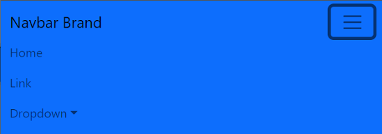
The toggle button will show and hide the navbar menu. Navbar Brand: Navbar brand allows us to add a brand logo or text. We can pass any style for the brand image by specifying the classname for the external stylesheet or inline style. Consider the below example: App.js: Output: 
Navbar PositionWe can use Bootstraps position utilities to position and align the Navbar on a specific position. We can use fixed and sticky props with different position values as top and bottom to fix the Navbar at the top or bottom or make it sticky at a specific position. Position fixed will fix the Navbar to the specified position, and it will be separated from other elements. We have to provide the padding-top to the underneath element to prevent it from overlapping. The sticky position will make it sticky while scrolling, but the sticky position is not supported by a few browsers. Consider the below example: App.js: Output: 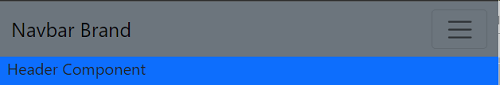
From the above output, we have placed the Navbar at the top with the position fixed, so we have to provide the margin-top to the header component underneath it. Scrolling BehaviorThe navbarScroll prop is used to enable the vertical scrolling within the toggleable contents of a collapsed navbar. To enable the vertical scrolling, specify the navbarScroll prop in Nav component and aria-controls="navbarScroll" in the Navbar.Toggle component. Consider the below example: The above example will enable the vertical scrolling within the toggleable contents of a collapsed navbar. Responsive NavbarWe can control the behavior of the Navbar component on different viewports. To control the toggleable Navbar, use the expand prop, Navbar.Toggle, and Navbar.Collapse components. We can also set the defaultExapanded prop to render the Navbar in expanded mode by default. We can also set the collpaseOnSelect to collapse the Navbar automatically when an item gets clicked. We can perfectly control the Navbar collapsing behavior by using the expanded and onToggle props. Consider the below example: App.js: Output: 
Offcanvas Navbar (Navbar Sidebar)We can transform our expanding and collapsing Navbar into an offcanvas drawer using the offcanvas component. To create an offcanvas that is always collapsed on all the viewports, we have to use the offcanvas component and set the expand prop as false. We can extend the offcanvas styles and expand prop to render a dynamic and flexible navbar sidebar. Consider the below example: App.js: Output: The above example will render the fully collapsed Navbar. 
When we click on the toggle button, it will open the sidebar from the right. 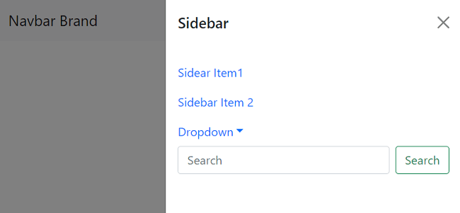
The height of the Navbar will be full window height. We can close it by clicking on the dismissal icon. Thus, we can precisely use the Navbar component to create different navigation menus with a variety of toggles and placement options.
Next TopicReact Bootstrap Navs
|
 For Videos Join Our Youtube Channel: Join Now
Feedback
- Send your Feedback to [email protected]
Help Others, Please Share


