 |
 Home
Home Java
Java Programs
 OOPs
OOPs String
 Exception
 Multithreading
 Collections
 JavaFX
 JSP
JSP
React Bootstrap Overlays (Tooltips & Popovers)React Bootstrap supports several components for positioning the beautiful overlays, tooltips, popovers, and other components. Primarily the overlay is used to position and control the visibility of tooltips and popovers. It acts as a wrapper for providing transitions and toggle functionality. In normal Bootstrap, the JavaScript behind these component's functionality is written in a popper.js file. But, in React Bootstrap, its related JavaScript is bundled with the overlay component itself. Following are some consideration points related to the Overlay component:
How to Create an Overlay?To create an overlay, we are required to have at least two elements which are overlay and target. The overlay specifies the element to be positioned, and the target specifies the element concerning the overlay. We have different options for the injected props, such as arrows to make the overlay more specific, but they are optional. To import the Overlay component, use the below syntax: To import the OverlayTrigger component, use the below syntax: To import the Tooltip component, use the below syntax: To import the Popover and its sub-components, use the following syntaxes: Let's understand it with an example: App.js: Output: 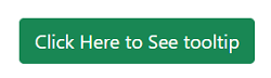
When we click on the button, it will toggle the tooltip visibility. 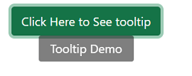
In the above example, we have taken an overlay component and created a tooltip in a div element using inline CSS. We are toggling it using the useState hook and targeting the element using React ref. If you are unaware of the React hooks and Refs, copy and paste the above code into your component file with the proper import statement. It will work fine as displayed output. OverlayTrigger ComponentThe <OverlayTrigger> component is optional to add additional functionality to the tooltips. Generally, the above example is pretty common among developers, but they prefer OverlayTrigger to add additional functionality such as delayed, show, hide, and other triggers. The Triggering component should be able to use the ref because when the <OverlayTrigger> component is loaded, it will try to add one. We can use the forwardRef() for adding functionality to the components. Consider the below example: App.js: Output: 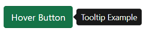
From the above output, we have added a tooltip on hovering the button using the <OverlayTrigger> component. How to Customize the Trigger Behaviour?We can customize the behavior of the <OverlayTrigger> component for more advanced features. These features accept a functioning child that passes in the injected ref and event handlers related to the configured trigger prop. We can manually specify the props to any element we want to split from a group of elements. In the following example, we will see how to position the Tooltip concerning a specific element. Consider the below example: App.js: Output: 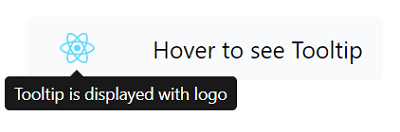
From the above output, when hovering on the button component, the Tooltip is displayed with the image. Similarly, we can bind the Tooltip with any component. Tooltips in React BootstrapThe tooltip component is used to create beautiful and properly aligned tooltips concerning a component. We can use Tooltip with any component; for example, we can specify the anchor tag if we want to use the Tooltip with an anchor tag. We can pass the overlay injected props straight to the Tooltip component to create a tooltip. Consider the below example: App.js: Output: 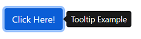
From the above output, we have created a Tooltip on button click using React useState and Overlay component. There is another way to create a tooltip is by passing a Tooltip element to the OverlayTrigger component instead. Consider the below example: App.js: Output: 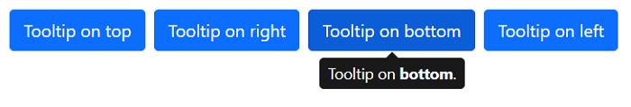
From the above output, we have rendered multiple tooltips with different placements by using the React map method. Popovers in React BootstrapThe popovers are a very useful web component that can make a website look and feel dynamic. They are created to display additional information about any component triggered on a mouse click event. In a popover component, when we click on any element that we have specified in our code, it will display a specified message with a pre-styled layout. The React Bootstrap popovers can be easily integrated using a <Popover> component. It also supports < Popover.Header> and <Popover.Body> component to specify the message title and content. Let's understand it with the following example: App.js: Output: 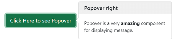
From the above output, we have created a beautiful message box using the popover component. It will be displayed with a click of a button. We can use any other component instead of the button. Like the Tooltip, we can control the placement of the Popover by specifying the placement prop. Consider the below example: App.js: Output: 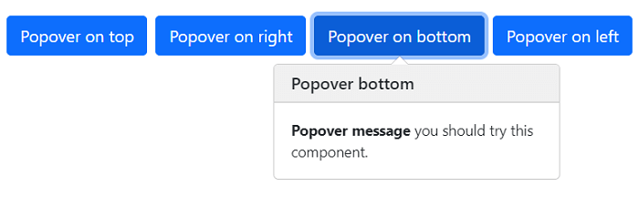
From the above output, we have used different message boxes with different positions using the popover component. Overlay with Disabled ElementsWe can also have the tooltips or popovers over the disabled elements. When we specify a disabled attribute in a component, all the actions such as hover or click are blocked. But, still, we can have a tooltip on it to provide the user a message. Consider the below example: App.js: Output: 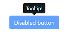
From the above example, we are displaying the user a message on the disabled button. Thus, we can use different types of tooltips and popovers using the Overlay, Tooltip, and Popover components. They are a very useful component from the user experience perspective. We can provide a meaningful message to the user by using these components. We can also update the position of the overlay dynamically concerning the updated size of the component. To do so, we have to use a popper prop with the scheduleUpdate() method with the Overlay component to reposition itself.
Next TopicReact Bootstrap Pagination
|
 For Videos Join Our Youtube Channel: Join Now
Feedback
- Send your Feedback to [email protected]
Help Others, Please Share


