 |

Responsive Resize in XDThe responsive resize feature allows us to create a responsive user interface for different size devices. The responsive resize feature drops a layout from desktop to tablet or mobile by shrinking the width of the artboard. It will automatically drop sizes for all the content within the artboard. It is one of the finest features of the Adobe XD which provides a real-time virtual tour for the application. Responsive resize is one of the features demanded by clients nowadays. Everyone wants their design to look beautiful on different devices. When an application is designed, then it is not just limited to one device only. Being a designer, you are responsible for creating the user interface for multiple devices. Hence, the responsive resize features save lots of time by making it adjustable on different devices. It will analyze the objects from the design by calculating the structure and layout and automatically resizes them on different size devices. Make sure to group the objects of the same section to make the XD understand the relationship between the objects. For example, for a navigation menu, keep the navigation links and icons grouped together so that XD can create a hierarchy between the objects. It is suggested to keep the responsive design in mind while creating any design and avoid the use of padding for aligning the objects. How to Create Responsive Design Using Adobe XD?To create the responsive design, turn on the responsive resize toggle icon from the property inspector area. There are a few other responsive resize control given in the layout section. The layout section defines how the group of objects is resized on different layouts. 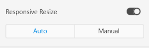
To apply the responsive resize option, select the element you would like to fit on different layouts and turn on the toggle switch. By default, the responsive resize feature is turned off for the artboards to let the users adjust their design as per their requirements. To turn on the responsive resize for an artboard, select the artboard and turn on the responsive resize feature using the toggle button. We can move the boundaries of the artboards to resize them. The responsive resize feature will automatically adjust the artboard content on a different layout when the responsive resize feature is on. Adobe XD provides two different options to customize the responsive results, which are auto and manual. The auto option will dynamically adjust the artboard content, and the manual option allows us to customize the responsive result. The manual option allows us to manually define the positions of the objects. We can easily select the objects to be adjusted and define their position. The manual option contains the following options: 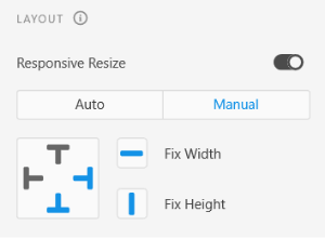
To adjust the object manually for different layouts, select the objects and change the responsive resize option from auto to manual. Now, use one of the given four options; top, right, bottom, left indicators, and other height and width buttons to make the desired changes. The Fix Width and Fix Height button allow us to set the fixed or variable width and height of the objects. The other four directional indicators buttons allow us to set the fixed or variable margin with the respective directions. Manual Resizing The manual resizing allows us to customize the responsive results; if you are not satisfied with the auto responsive behavior of the Adobe XD, you can edit the rules manually by making a few changes. To update the responsive rules, select the manual option from the responsive resize section and define the rules to determine how the objects behave on the different layout by adjusting their height, width, and margins. The manual resize option overrides the automatic behavior of the Adobe XD. We have the following control to specify the object position, height, and width on different layouts.
How to Override Responsive Resize for Groups By default, Adobe XD supports responsive resize for the group of objects. Though, we can customize it if needed. We can customize by using the following methods:
Summary: Nowadays, the world is full of different size gadgets. When an application is designed, then it is not just limited to one device only. Being a designer, you are responsible for creating the user interface for multiple devices. It is essential to consider the application for a wide variety of devices. To overcome this issue, Adobe XD supports a feature called responsive resize. It allows us to resize the objects while maintaining the relationship with other objects to adapt the visibility on different screen sizes.
Next TopicPadding in Adobe XD
|
 For Videos Join Our Youtube Channel: Join Now
Feedback
- Send your Feedback to [email protected]
Help Others, Please Share


