| |

Sunbrust Chart in ExcelVisualizing your Excel data using Charts that display hierarchical flows can help you convince your target audience and share your data quickly. Therefore, Microsoft Excel added Sunburst Chart in Excel 2016 because a Sunburst Diagram is an easy-to-interpret and provides an amazingly insightful visualization. It helps our brains to determinate high-to-low or low-to-high order information instantly. This tutorial will discover the newly introduced chart in Excel 2016 - Sunburst Chart, a step-by-step method to create this chart, format it, and its advantages and disadvantages. What is an Excel Sunburst Chart?"Sunburst Chart, also commonly known as the Sunburst Partition Chart, Ring Chart, or Radial Treemap, helps display hierarchy in your raw data through a series of concentric rings. Each circle in the Sunburst Chart represents a defined level in the hierarchy of data points segmented proportionally to define its constituent components." Excel Sunburst Chart is an inbuilt chart introduced with Excel 2016 versions that represent the hierarchical structure of your data in circular form. Unlike a doughnut chart, a Sunburst Chart's prime motive is to display a subpart of the entire dataset and compare the relative categories. The only difference between these charts is that Sunburst Chart can also show the relationships between different hierarchy levels. This is how the Sunburst Chart looks like in Excel: 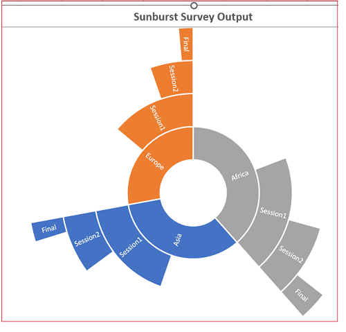
In the example above, Asia is defined by blue color, and different divisions represent the subgroups like Session1, Seesion2 and Final. One might wonder why Microsoft has named an Excel chart as Sunburst. Since this chart looks relatively like an exploding sun, therefore it is known as the Sunburst Chart, where a circle or ring describes each hierarchy level of this chart. The innermost circle denotes the top of the hierarchy level of your dataset, and the outermost circle denotes the last hierarchy of the data. A different color represents each group, and a division represents the subgroups for a Sunburst chart. Although Excel automatically selects a different color for different categories of the chart. But if you are not satisfied with the colors or the layout, you can change it by using the layout of the data labels to differentiate between different categories. However, a sunburst chart with multiple categories indicates how the outer circles relate to the inner circles. The sunburst chart is an apt choice when the user wants to show how one ring is split into its contributing parts. In contrast, a Treemap chart (another type of hierarchical chart) is excellent for comparing relative sizes. Advantages and DisadvantagesThe advantages of using Sunburst Chart in an Excel worksheet are as follows:
The disadvantages of using a Sunburst Chart in an Excel worksheet are as follows:
Sunbrust Chart: Tips & TricksThere are a few points the Excel user should keep in mind when they are working with Sunburst Charts in their Excel worksheet:
Steps to create a Sunburst ChartA company is running an IQ test program for its workers in different parts of the country. Each worker has to attend 3 exams, Session1, Session 2 and Final. Only the candidates who will clear the first exam are eligible to attend the next exam. 
In the above data, we can see that the company has 350 workers in the Asia region. Out of 350, only 200 cleared Session 1 then out of 200 only 110 passed Session 2, and 40 cleared the Final exam. The same concept flows for the candidates who gave exam in Europe and Africa region. Below given are the step-by-step procedure on how to create a Sunburst Chart in Excel worksheet: STEP 1: Select your data table and go to Insert > Hierarchy Charts. 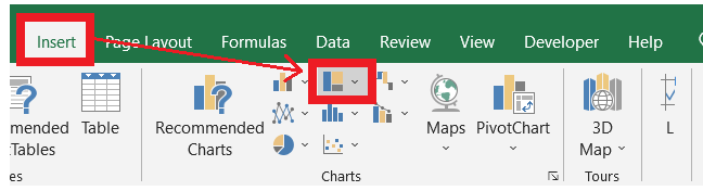
NOTE: You can also use the Recommended Charts -> All Charts option to create a sunburst chart.STEP 2: From the list of charts, select the Sunburst Chart option. 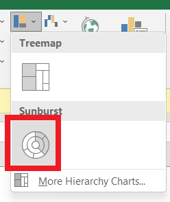
STEP 3: As a result, Microsoft Excel will create a Sunburst chart in your worksheet. The circles or rings represent each hierarchy level of the given dataset. The innermost circle denotes the top of the hierarchy level of your dataset, and the outermost circle denotes the last hierarchy of the data. A different color represents each group, and a division represents the subgroups for a Sunburst chart. 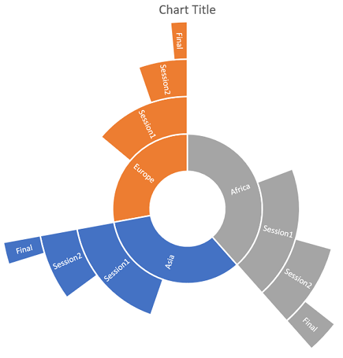
STEP 4: The best way to start customizing your charts is by providing an appropriate chart title to it. Whenever you create a new chart, Microsoft aligns the name 'Chart Title' to it by default. All you have to do is click on the text box, it will change to dotted lines and thereafter type a new name. 
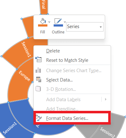
STEP 4: Although Excel automatically selects a different color for parent categories of the sunburst chart. But if you are not satisfied with the colors or the layout, you can change it by using the layout of the data labels to differentiate between different categories.
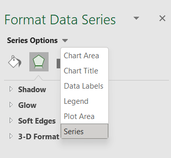
STEP 4: You can further customize the look and feel of your Sunburst Chart, by going to Chart Tools > Design / Format. Note: You can also use the Chart Design and Format tabs to customize your Sunburst chart's appearance and look and feel. Sometimes both these tabs are not activated. Click anywhere in the Sunburst chart to activate those tabs.Since you know how to create your Sunburst chart from the given set of hierarchical data, you can now quickly present to your management the data series in the most efficient way. Interpretation of Sunburst ChartSo, now we have learned the steps to create a Sunburst chart. But how do we interpret it? The sunburst chart is likely similar to a pie/donut chart. The bigger part-owns most of the share of the total data. From the above example, you can conclude that Africa contains most of the total. We can notice how many workers from the African region have passed session 1 and then how many workers have clear level 2 and then final. When to use Sunburst Chart over Treemap
Next TopicTreemap in Excel
|
 For Videos Join Our Youtube Channel: Join Now
Feedback
- Send your Feedback to [email protected]
Help Others, Please Share


