| |

Tableau Bubble ChartA bubble chart is visualizing the measures and dimensions in the form of bubbles. A bubble chart is a group of circles. Each value of the dimension field represents the circles, and the value of measure represents the size of those circles. The color of bubbles is set to differentiate the members present in a dimension. Here is the procedure to create a bubble chart as follows. For example, consider a data source such as sample-superstore, and if you want to find the Profits for different Ship Mode. Then, Step1: Drag the measures Profit and drop into the "Size" pane. Step2: Drag the dimensions Ship Mode and drop into the "Labels" pane. Step3: Also drag the dimension Ship Mode into the "Color pane" under the "Marks" card. 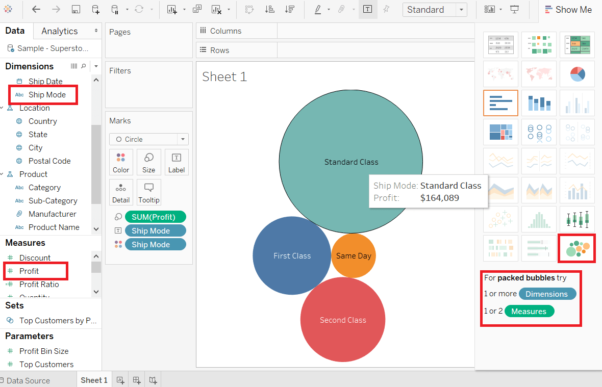
Bubble Chart with Measure ValuesAlso, you can show the value of the measures field that decides the size of the circles. First, drag the measure Sales into the "Labels" pane. Show the following screenshot. 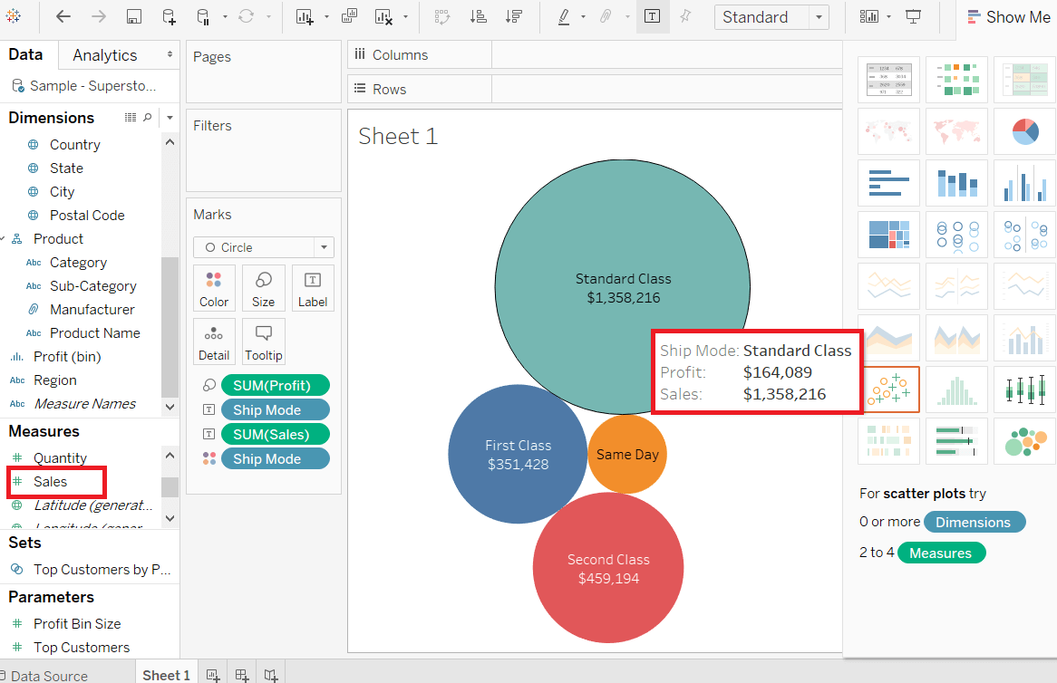
Bubble Chart with Measure ColorYou can also use the same color with different shades for all the different size circles. For this, drag the measure Sales into the "Color" pane. The darkest color shows the largest size of the circle and the lighter color shows the smallest size of the circle shown in the below screenshot. 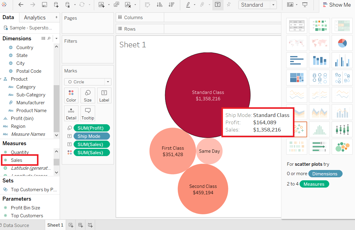
Next TopicTableau Bump Chart
|
 For Videos Join Our Youtube Channel: Join Now
Feedback
- Send your Feedback to [email protected]
Help Others, Please Share


