| |

Tableau Heat MapThe heat map is used to visualize the data in the form of size and color on different measures. Two different measures are visualized simultaneously using a heat map. One measure is assigned to size, whereas another measure is attached to the color of the heat map. For example, consider the data source such as the Sample-Superstore and its dimensions and measures. The procedure to create a heat map is given step by step as follows: Step 1: First, go to the worksheet. Step 2: Hold the Ctrl key in the keyboard. Step 3: Select the dimension Sub-Category and measure Sales as shown in the following screenshot. 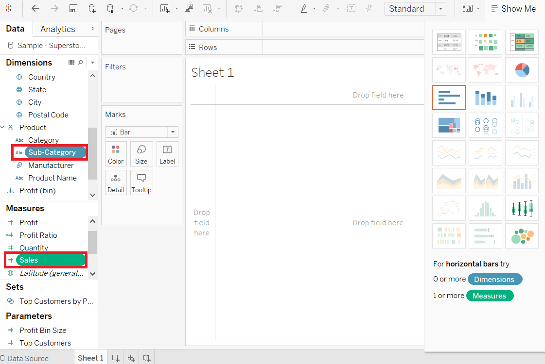
Step 4: Click on the "show me" button of the worksheet. Step 5: And select the Heatmap icon, as shown in the following screenshot. 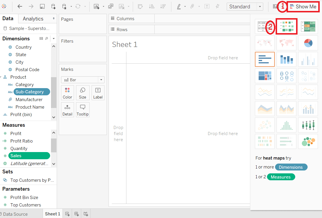
Step 6: Drag measure Profit and drop into the Color shelf under the Marks pane. 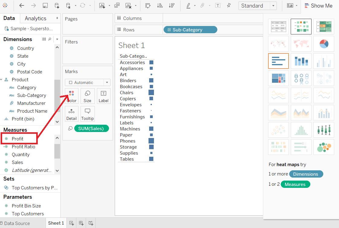
Step 7: Drag the dimension Region and drop into the column shelf. 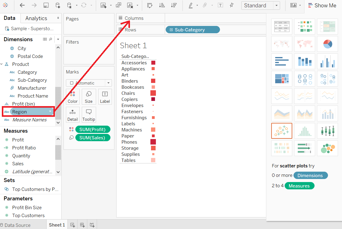
After completing all the above steps, it creates the Heatmap, which is used to visualize the Sales field and Profit field across different the dimension. 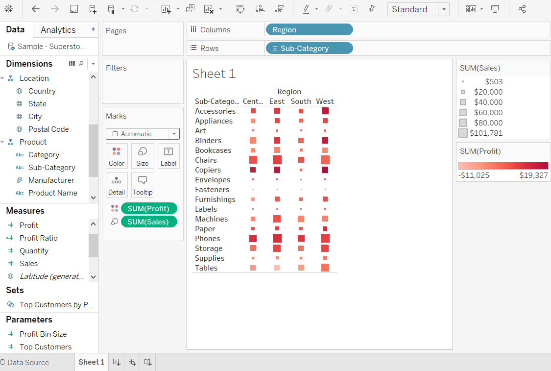
Next TopicTableau Tree Map
|
 For Videos Join Our Youtube Channel: Join Now
Feedback
- Send your Feedback to [email protected]
Help Others, Please Share


