 |

WPF ComboBoxComboBox control is an item control that will work like the ListBox control. But there is the difference between the ComboBox and the ListBox control is that we can choose only one item from the collection of a ComboBox. At a time, only one item will be visible in the ComboBox. After clicking on the ComboBox, items of the collection will be visible, and then the user will pick the item from the collection. ComboBox does not give us the functionality to choose the multiple selections from the collection of items. Here we have to choose one item at a time. ComboBox control is a collection of three controls, which includes the Button, TextBox, PopUp. The use of the button is that this control will show or hide us the items contained by the ComboBox. The purpose of the Popup is that this will display the items, and after that, we will select one item from the items contained by the ComboBox. TextBox control will show us those items which we have chosen. Hierarchical Inheritance of the ComboBox is as shown below: 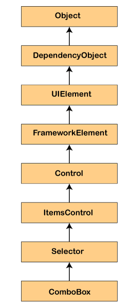
Used Properties of ComboBoxHere is the list of the properties used in the ComboBox
Methods used in ComboBox
Events used in WPF
Element of the ComboBox will show the ComboBox control in XAML. Syntax to represent the ComboBox <ComboBox></ComboBox> The height and width property of the ComboBox shows the width and height of the ComboBox. The property x: Name will display the name of the control. Name is known as the unique identifier of the control. We will use the Margin property for setting the location of the ComboBox on the parent control. Horizontal and vertical properties are used to set the vertical and horizontal alignments. Now we will write a code where we will set the height, width, and name of the control. 
DataBindingFor DataBinding, we will use a key DataGrid of the ItemSource property. With the help of this property, we can bind any data source which implements the IEnumerable. Row of the Data Grid will bind to the data object of the data source and every column of the Data Grid will bind to the property of the data source. Here we will take an example which will create the object of the collection and bind to the Data Grid control. MainWindow.xaml MainWindow.xaml.cs OUTPUT 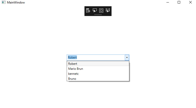
Add item to the ComboBoxComboBox control hosts the collection of the ComboBoxItem. Now we will write a code to add the items to the ComboBox control at the time of designing by using the XAML. OUTPUT 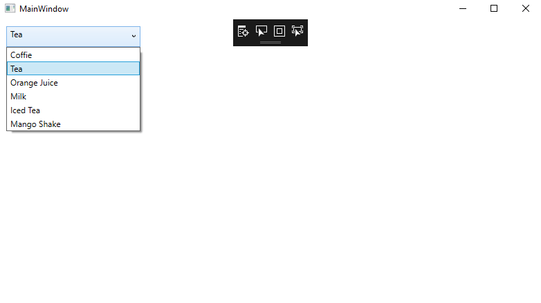
Add and delete the ComboBox item at the Run timeNow we have to add the items to the ComboBox at the time of the designing from the XAML. Now we want to add the items to the ComboBox at run-time. The itemsproperty of the ComboBox will show the items of the ComboBox. ItemProperty is the object of the ItemsCollection. If we want to add and remove the items from the collection then we will use Add and Remove or RemoveAt method of the itemscollection. Now we will change the UI and add the TextBox and a button control to the page. Now we will add the XAML code to add the TextBox and button to the page. MainWindow.XAML Output 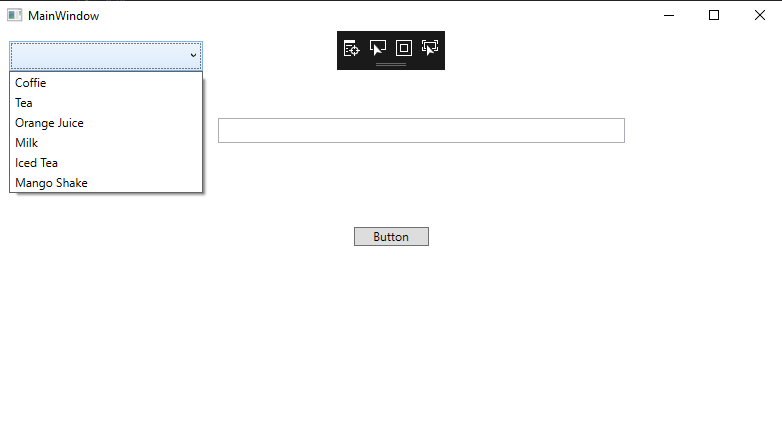
After clicking on the button, we will add the content of the textbox to the comboBox on calling the ComboBox.items.Add Method. Now we will write a code through which we will add the item of the text of the textbox after clicking on the Add button to the ComboBox. MainWindow.XAMLMainWindow.XAML.csNow we will enter a text in a textbox and click on the Add item button, this will add the contents of the textbox to the comboBox as shown in the below screenshot: OUTPUT 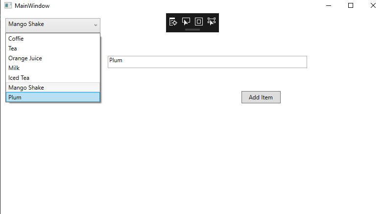
Delete Item from the ComboBoxTo delete the item from the ComboBox, we will use the ComboBox.items.RemoveAt method to delete the items from the collection of items in the ComboBox. RemoveAt method will use the item's index in the collection. Before applying the delete functionality, output is shown in the below screenshot: 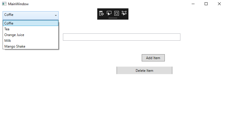
Before the deletion of the item output shows us like as shown in the below screenshot: 
Now we will add one more button which is delete button. The XAML code for this button is as shown below: C# coding to delete the item from the ComboBox. MainWindow.XAML.cs After applying the delete functionality output will shows us like as shown in the below screenshot: Output 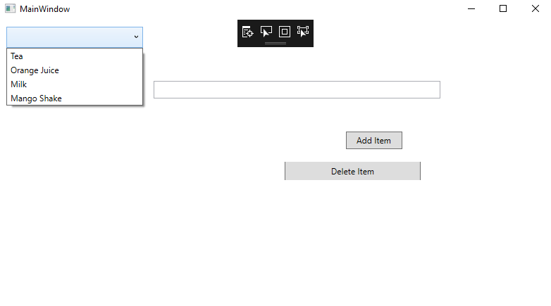
From the above screenshot the item coffee is deleted. Add Image in the ComboBoxWe can put any control inside the ComboBox like image and text. For displaying the image along with the text for that we will use Image and TextBlock control inside the StackPanel. The Image.Source property includes the name of the image which we want to show on the Image Control and TextBlock. Text property will include the String which we want to display on the TextBlock. MainWindow.XamlOUTPUT 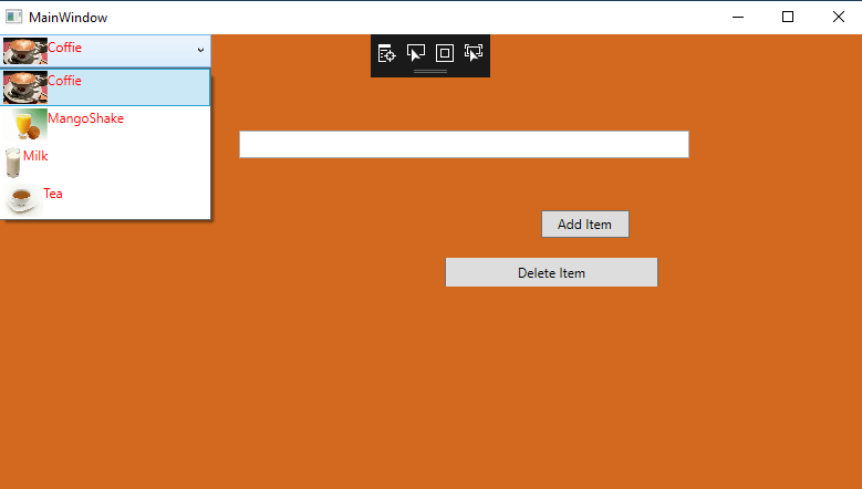
Add CheckBox in the ComboBoxWhen we add checkbox inside the comboBoxItems, then we will generate a ComboBox control along with the checkbox in it. CheckBox can host the control inside it as well. Also, we can put the image and the TextBlock as the content of the checkbox. For that, we will write a code to add the checkbox along with the image inside it. Now we will change the Code of the ComboBoxItem, and will add the CheckBox and images to all the items. The name of the checkbox can be set by using the Name property. When there is a need arises to access the checkboxes, we will access them by using the Name property. To add the CheckBox to the ComboBox, we will write the below code: OUTPUT 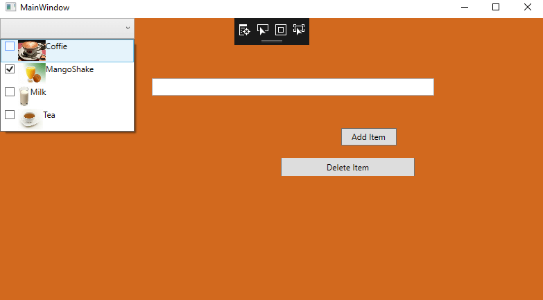
Wrap UpHere in the above we show the functionality of the comboBox . Create the comboBox , add item to the comboBox, delete the item, Use of CheckBox, Insert Images along with the text.
Next TopicStackPanel Control
|
 For Videos Join Our Youtube Channel: Join Now
Feedback
- Send your Feedback to [email protected]
Help Others, Please Share


