 |

WPF in C#WPF is known as Windows Presentation Foundation. Windows Presentation Foundation is known as the development framework. WPF is also known as the sub-system of the .Net framework. Windows Presentation Foundation framework can build the Windows Client Application. Windows Application can run on the Windows Operating System. We use XAML language for the frontend and C# language as the backend. In the .NET framework, WPF was present as a Windows library. Windows client apps can be built through the Windows library. Windows library can also be used to generate the next generation of the Windows Form. Currently, we are using the 4.5 version of the WPF. We can also call the WPF as the engine. By using the Windows Presentation Foundation, we can create, display, and manipulate the user-interfaces (UI), documents, movies, images, and media in windows7 and Windows Operating Systems. WPF contains the set of the library. Library of WPF provides the functionality through which we can build, run, execute, and through the WPF library, we can manage all the Windows Client Applications. WPF employs XAML, which is an XML based language. XML is used to define and link the various elements. An application that is developed with the use of the WPF, we can deploy them as the Standalone desktop programs, or we can host the WPF applications as the embedded object on a website. The WPF application aims to do the unification of the user interface elements. All these include fixed and adaptive documents, 2D/3D rendering, run-time Animation, pre-rendered media. WPF run-time libraries include all the versions of the Microsoft Windows. Functionality provided by the Microsoft Silverlight, is the subset of the WPF, which provides the embedded Web Controls as compared to the Adobe Flash. Features of WPF in C#
Features of WPF are as:1. Direct3DGraphics include desktop items such as windows. Graphics are rendered using Direct3D. Through this, we can display sophisticated graphics and custom themes. With the use of the Direct3D, we can offload graphic tasks to the GPU in Windows. The use of Direct3D reduces the workload on the CPU. We optimize the GPU for parallel pixel computation. By using the Direct3D feature of the WPF, the screen can be refreshed easily and can decrease the compatibility in the markets where we do not need the GPUs as powerful, such as the netbook market. Windows Presentation Foundation is Microsoft's UI framework used to create the application with rich user experience. The focus of the WPF is mainly on the vector graphics, where we will allow the controls and elements to be scaled without any loss in the quality or pixelization. 2. XAMLThe use of the XAML language is one of the features of the WPF. XAML is also known as the XML based language. The purpose of the XAML in the WPF is to design the presentation logic. The XAML enables the programming model. With the use of the XAML, we can split the presentation logic and business logic. After the design of the application, we can handover to the developer for the integration and business logic of the application. This approach will be more readable and will be shorter than the code. 3. Control SetWPF contains the lots of controls set through which we can enable the quick assembling of the user interface. The rich control set is also the feature of the WPF. Most of the controls are similar to the windows forms control with the small changes in the controls.
The Listbox in windows form contains the text value only. In ListBox, we can't display the list of the images with the text. Example of the ListBox The ListBox class in C# and WPF shows the Listbox control. ListBox in WPF has contained the collection of the items in the ListBox. Here we will show how to add the items, remove the item from the Listbox, and bind the Listbox to the data source. The height and width properties will show us the width and height of the Listbox. The name property of the ListBox will show us the name of the control. Name is known as the unique identifier. Margin property of the ListBox shows us the margin of the Listbox on the parent control. Horizontal and VerticalAlignment properties of ListBox are used to set the horizontal and vertical alignment. The below code is used to set the name, height, and width of the ListBox Control. Here we will perform the different functions on the Listbox. Statically addition of the item to the ListBox ControlListBox control is a collection of the ListBox item. To add the item in the ListBox control, we will write the following code: To add the item in the ListBox control in WPF, we will follow the following steps: For the WPF application click on File->New->Project as shown in the below screenshot: 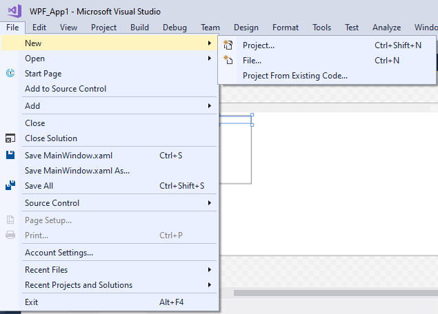
After this, the following window will appear as shown in the below screenshot: 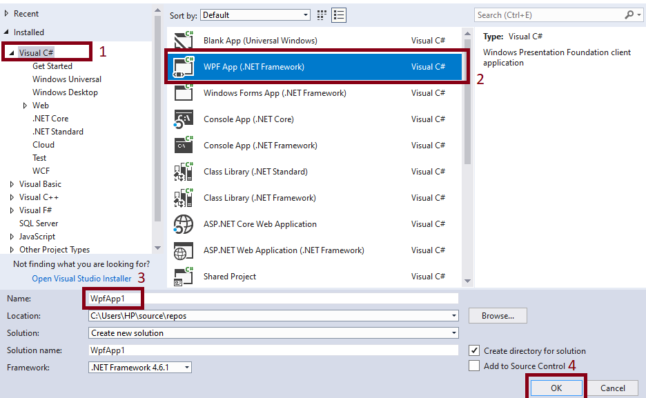
As per the above screenshot, click on Visual C#->WPF App (.NET Framework)->Name of App (WPF_App1)->Click OK. After this, the following window will appear as shown in the below screenshot: 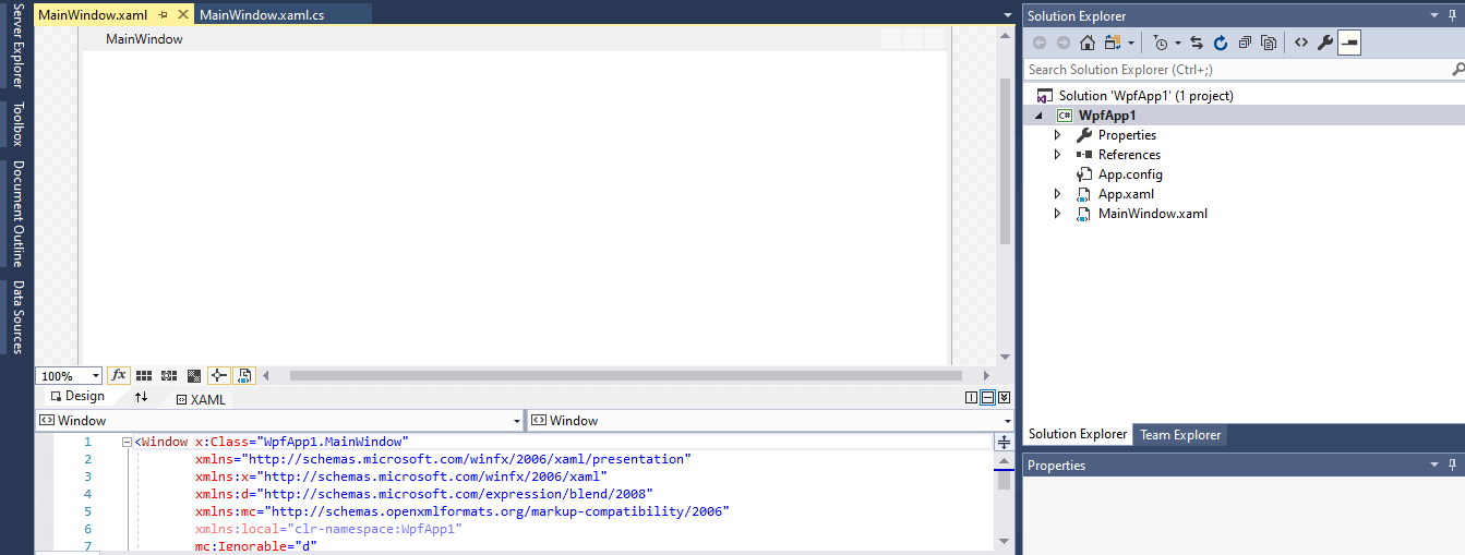
To add the ListBox control statically, we will write the following code in the MainWindow.XAML window: Design of the above code is as shown below: 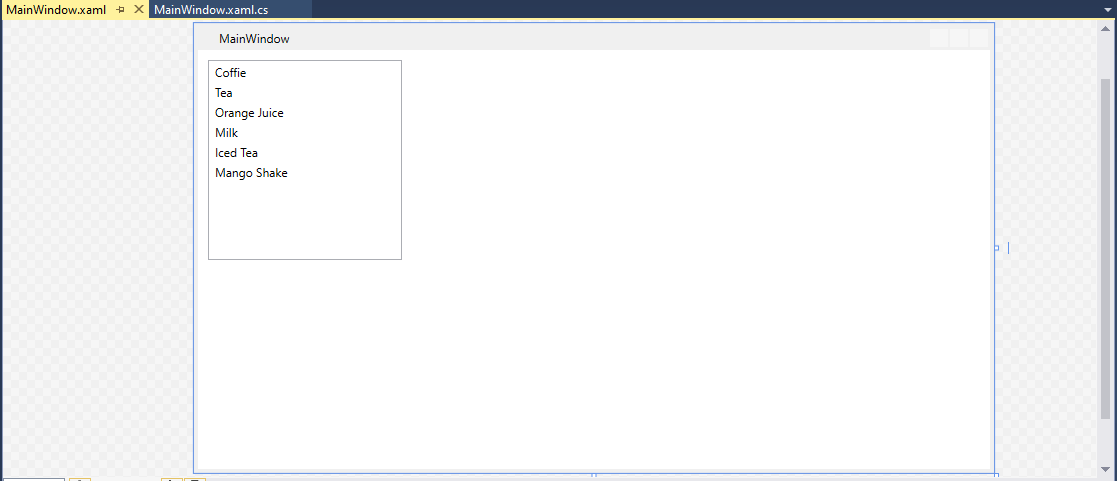
In the above code, we add the item in the ListBox at the time of the design from XAML. OutPut 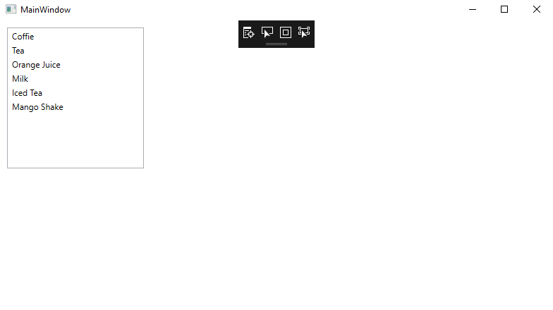
4. Independent Screen ResolutionIndependent Screen Resolution is a clear feature of the Screen Resolution. In the form of the Independent screen, the resolution user interface of WPF will look better even on the low-resolution screen. For the Screen Resolution of the WPF independently, screen resolution uses the DirectX component, and the Windows Form application uses the 32 components of the machine. To talk with the DirectX component, WPF uses the Media Integration Layer (MIL). The direct component will show the vector-based graphics on the user interface of WPF. With the help of the below screenshot, we can easily find out the difference between the Windows Forms UI and WPF UI in the presence of the low-resolution screen. 
Here in the above screenshot if we see the character 'W' at the lower resolution we found that the Windows Forms looks like the distorted image and the vector based WPF looks like elegant. 5. Control inside the controlIn the WPF along with the text, we can also define the control as a content of another basic control. For example: like as button. This feature of WPF is really an astonishing fact for the developer and through this we know about the power of the WPF when we talk about the user interfaces. Here is the XAML code for the control inside the control for the Window is: OUTPUT 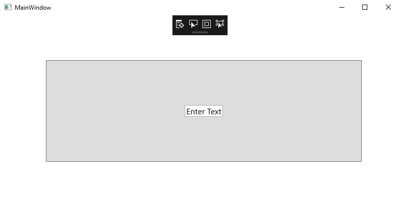
6. ontrol TemplateIf we want to change the shape of the button with WPF we can change the shape of the button. Here we will take an example of WPF where we can declare the button and can change the shape of the elliptical. OUTPUT 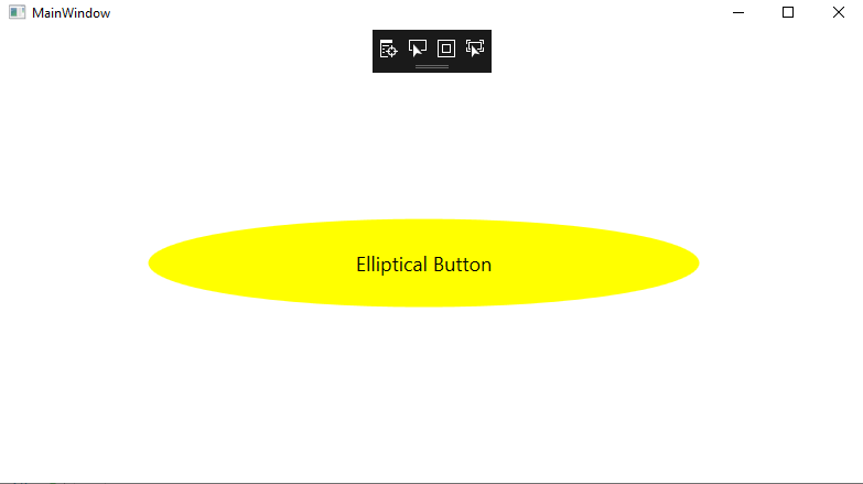
7. AnimationsWPF supports the animations, which is time-based, in contrast with the frame-based approach. This separates the speed of the system from the performance of the system. WPF supports the Animation at a low level by timers and also supports the high-level abstraction by the animation classes.
8. DocumentsThe WPF supports the pagination of the documents. DocumentViewer class of the WPF is used to read the fixed-layout documents. View of the page is shown by the FlowDocumentReader class through which we can see the different modes of the opinions like scrollable, per-page, and flow of the text after resizing the viewing area. WPF supports us with the XML paper specification documents. It also supports the reading and writing of the paginated documents using the Open Packaging Conventions. 9. InteroperabilityWindows Forms can be used with the ElementHost and WindowsFormsHost classes. To use the Windows Form, we will execute the below WPF C# code: 10. Availability of the Different LayoutsWe used the layouts to separate the controls on the User Interface logically. With the use of the layouts, we show the controls on the window clearly. There is a powerful layout control of set in the WPF. Layouts in the WPF are: 1. Stack Panel: The StackPanel is a simple and the useful layout panel in WPF. StackPanel contains the elements in the form of the stack where the elements can be arranged below or besides each other and the stack of the elements depend on the orientation. StackPanel is used to create the list of any types. For the use of the internal layout panel, we used the WPF items controls like ListBox, Combo Box or Menu . OUTPUT 
Horizontally place the Stack Items.To place the item horizontally in Stack Panel we will take the example of two buttons "OK"," Cancel" buttons of the dialog window, because the size of the text can change if the user changes the font-size or switches the language we should avoid the fixed size buttons, both buttons depend on their size. If the button needs spaces, they will get it automatically. 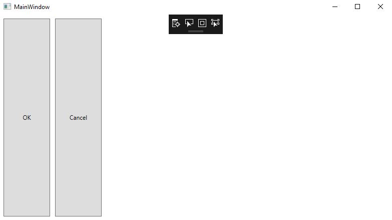
2. Grid LayoutGrid is a layout panel; with the help of the Grid Layout we can arrange child controls in a tabular structure which contains the rows and columns. The grid layout will work like as the HTML table but this layout is flexible. A cell can have multiple controls in it. Controls can span over the multiple cells and can overlap themselves. Controls can resize themselves with the use of the HorizontalAlignment and VerticaAlignment properties, and these properties are defined by the anchors. The distance between the anchor and the grid line is defined by the margin of the control. Define Rows and ColumnsBy default, grid contains one row and one column. We will add the RowDefiniton items to the collection of RowDefinition and the ColumnDefinition items to the ColumnDefinition collection. Here we are taking an example which shows the grid with three rows and two columns: The size can be defined as the absolute amount of the logical units as the percentage value or logical units: Fixed: Fixed shows the fix size of the logical units (1/96 units). Auto: With the auto, it takes the space how much they needed for the control. Star (*): This will take the available space. Grid is known as the powerful and useful layout in WPF. In Grid, we have to arrange the child elements in cells in rows and columns. When the XAML document is added or when we create a new WPF project in Visual Studio, Visual Studio automatically adds the Grid as the first container in the window element. We can create Rows and Columns in the two ways: First Method: By XAML codeBy default, Grid contains the one Row and one Column. We can add the more rows and columns with the use of the RowDefinition element for each row inside the Grid.RowDefinition property and for the column element used the ColumnDefinition property inside the Grid.ColumnDefinition property. Grid is invisible. For showing the GridLines, we set the ShowGridLines property as true. GridLines are helpful for the debugging to determine the element in which cell they are situated. Here we will take an example where we have to create the 3 rows and 3 Columns. Now we can add the 9 TextBlock and maintain the position of the TextBlock in the Grid by defining the Grid.Row and Grid.Column values. If the Grid.Row and Grid.Column property are not defined then in that case we can place the element in Grid.Row="0" and Grid.Column="0". In other words, we can say that we can place the element in the first row and first column. To show the rows and columns in the grid we will write the following code: OUTPUT 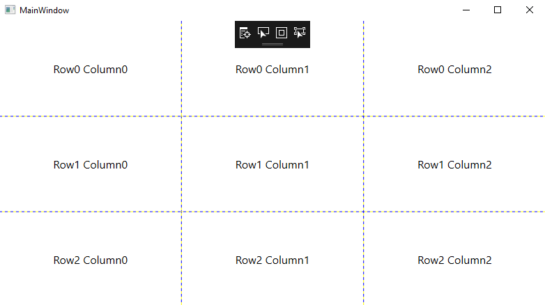
Adding the control to the GridFor adding the controls to the Grid Layout, we just have to put the declaration between the opening and closing tags of the Grid. The row and columndefinitions must proceed the definition of child control. Grid Layout panel provide us the two attached properties Grid.Column and Grid.Row. These two properties define the location of the control. For adding the control in the Grid in WPF, we will write the following code: OUTPUT 
3. Dock PanelDockPanel is used to define the area where we can arrange the element relative to each other. We can arrange the elements either horizontally or vertically. With the dock panel, we can easily dock the child elements at the top, bottom, right, left, and on the centre using the dock Property. The dockside of the element is defined by the attached property, which is DockPanel.Dock. The LastChildFill property must be set to true. With the LastChildFill property, this will fill the remaining space of the last child element. The hierarchical dock panel class is as shown below: 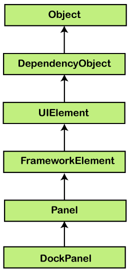
To set the dock element each side, we will write the following code for that: OUTPUT 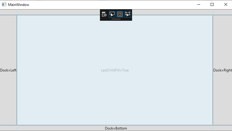
Properties of DockPanelHere we have the most commonly used Dock Property. Here is the list of the DockPanel properties:
Most commonly used method of Dock PanelHere are the most commonly used methods of DockPanel:
Here we are going to take an example to show how to add the child element to the DockPanel.For this we are going to take an XAML example for creating a button inside the panel.Example:MainWindow.XAMLThe implementation of XAML code in C# is as: After clicking on any button, this will display the message. Here we will take an example when we click on any button, we click on the centre button then it displays the message as shown below: OUTPUT 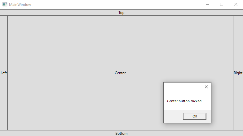
3. Canvas PanelCanvas is the most basic layout panel in WPF. Canvas Layout allows us to arrange the child elements by using the coordinates, which are very similar to the Windows Forms Application. With the help of the canvas, we can specify the coordinates which are related to any corner. We can use the attached properties (Top, Bottom, Left, and Right) for adjusting the position of the Child elements inside the Canvas. Canvas is a lightweight container. We cannot resize the child element of the canvas when we resize the window at the running time, and this thing makes it less useful during the creation of the forms. Canvas is helpful in those scenarios when we need to work on the Graphics. The Panel is used to group the 2D graphic (like an ellipse, rectangle) elements. It is not used to layout the user interface elements. The hierarchical inheritance of canvas panel is as shown below: 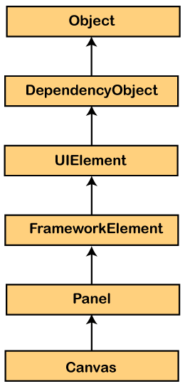
The most commonly used properties of the canvas class are as shown below:
Method of CanvasThe commonly used method of Canvas is as shown below:
Example: Here we have an example which shows how to add the child elements in the Canvas. Here we will write a code which creates an ellipse inside the Canvas which is having the different offset:MainWindow.XAMLOutput 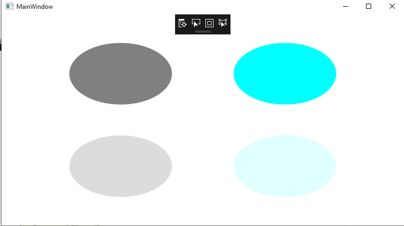
Canvas Property used for the positioning
Example of the Canvas layoutCanvas layout is used for the correct position of the element, alignment of the element. If we do not use the canvas property, then the element will overlap them. Here we are going to take an example when we haven't used the canvas property. Now the output will look like as shown below: OUTPUT 
When we assigned the Canvas PropertyFor the absolute position, most of the time we use the canvas property like canvas.Top and Canvas.Left property. MainWindow.XAMLOUTPUT 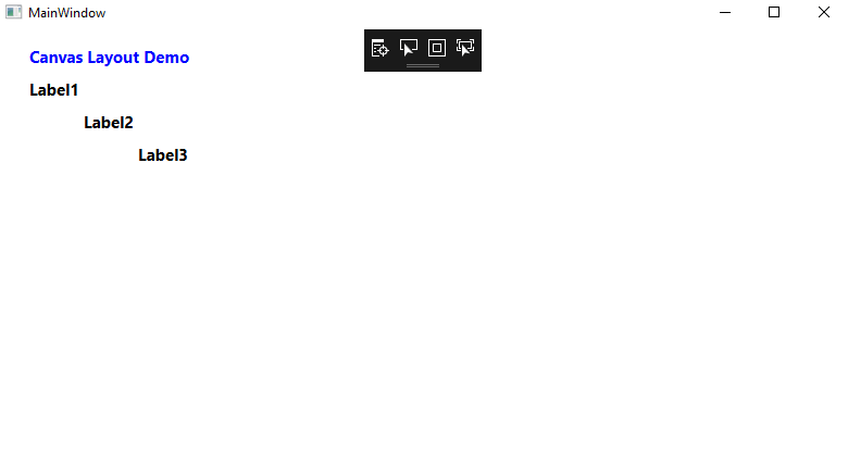
5. WPF Wrap PanelWPF WrapPanel control is a panel which locates the child elements in the sequential position by default from left to right. If the stacked child element does not fit in a row or column where they are in right now then the remaining elements will wrap the remaining space in the same sequence. Here we are going to take an example of two wrap panel where the one is in horizontal and the other is in vertical. The WrapPanel element in XAML shows the Wrap Panel WPF Control. Here we have a code snippet which declares the WrapPanel in XAML which sets the height, width, and background property. Here we have a code for the Wrap Panel as shown below: OUTPUT 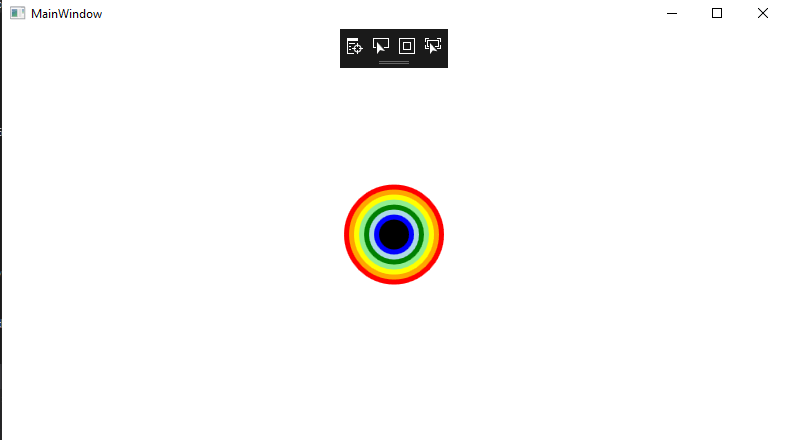
6. ViewBox in WPFViewBox is a beneficial control in WPF. ViewBox fit itself to the available size. It does not resize the content but transforms itself. ViewBox is another standard of WPF control. ViewBox contains the only one child control. If we want to add more than one child control to the ViewBox, this will give us an error. ViewBox elements shows the WPF ViewBox control in XAML as shown below: ViewBox has a Stretch property which shows how the contents are fit in the space and we can fill its value. Here we are going to take an example. Now we will create a New WPF application with the name ViewBoxDemo. OUTPUT 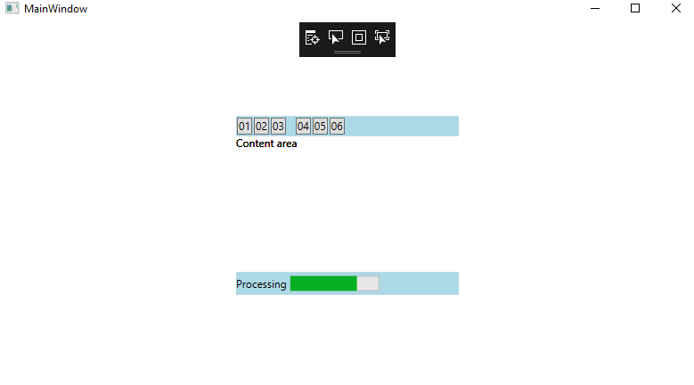
Data Binding in WPFData Binding provides us a simple and powerful way to auto-update the data between the business model and the user-interface. We called this mechanism Data Binding. When we change the data of our business model, this will automatically reflect the changes to the user-interface and vice-versa. To bring the data to the user interface, we use this method. DataBinding can be unidirectional, which can be from the source to target or can be from target to Source or Bidirectional, which is Source to Target or Target to Source. For the properly working of the data binding, we have to provide the change notification on both of the sides, which shows us when we have to update the target value in the DataBinding. In the .NET properties, we do the DataBinding by raising the event PropertyChanged of the INotifyPropertyChanged Interface. Typically, we do the data binding in XAML by using the markup extension. Data Binding gives us a mechanism that provides us a simple and easy way for the Windows Runtime apps to shows the interaction of the data. Through Data binding, we can do the flow of data between the UI element and the data object on the user interface. When the binding is done and the data or our business model changes after that, this will reflect the changes automatically on the User Interface element and vice versa. There are two types of Data Binding:
One Way DataBindingIn the one-way binding, we can bound the data from the source (source is an object which holds the data) to the target (target is known as that object through which we can see the data). To understand the one-way binding, we will take the following example: To understand the one-way binding, we will create the WPF project whose name is WPFData. For that we will write the XAML code where we will create the two labels, two textboxes, one button and will initialize them with the use of some property. MainWindow.XAMLMainWindow.XAML.csWe can easily run this application after that we will see the output of the MainWindow. We can bound the Name and Age of the person easily. OUTPUT 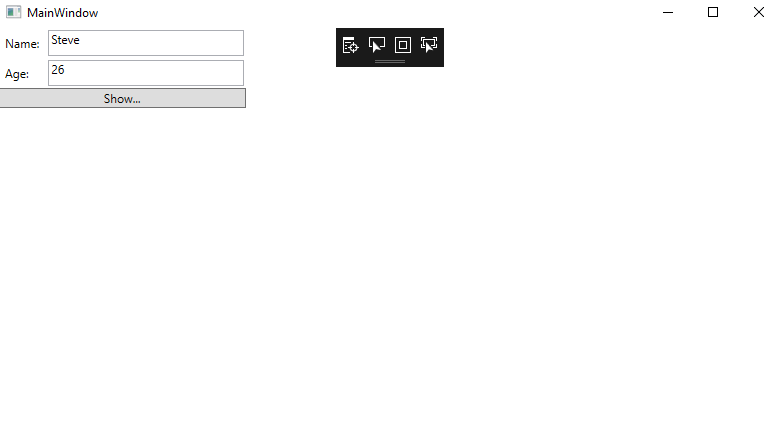
After clicking on the Show button, this shows the name and age on the message box. 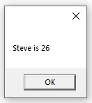
In the dialogue box, we can modify the Name and Age of the person. 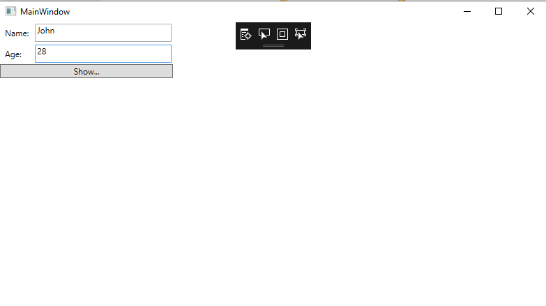
But after updating the values, we will see the same message again. 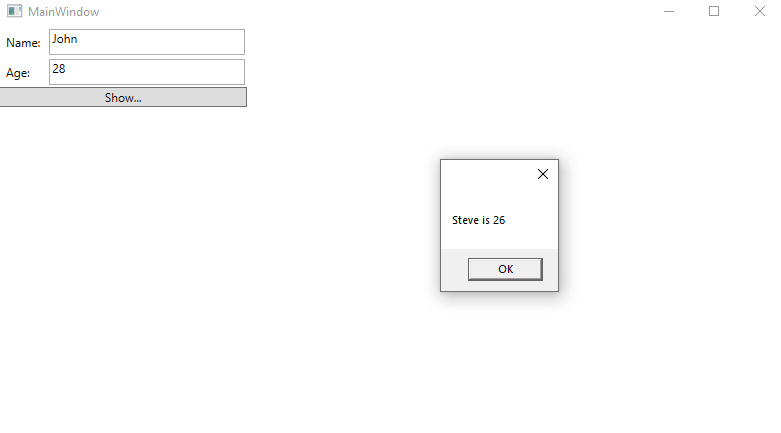
This is because of we set the data binding mode to one-way in XAML. If we want to show the updated data, we need to understand the two-way data binding. Two-way Data BindingIn the two-way Data Binding, we can update the data through the Graphical User Interface and can get the updated data in the source. If we change the source at the time of the viewing and we want that view to be updated. Here we will take an example where we will change the binding mode from one-way to two-way binding through the XAML code: MainWindow.XAMLMainWindow.XAML.csWhen we run this application, this will show us the output as shown below: OUTPUT 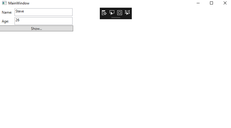
After clicking on the show button, this will show us the message in the dialog box. 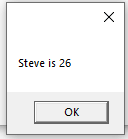
Now we want to change the value of the Name and Age through the user interface: 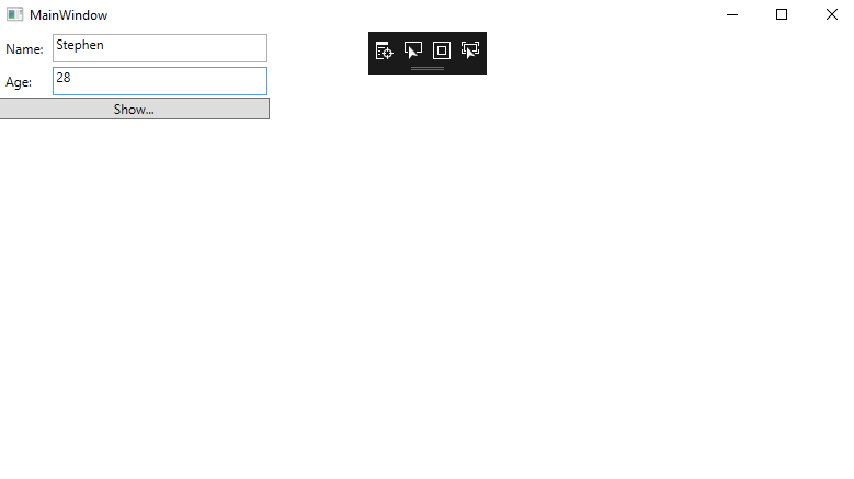
This will show us the updated value in the dialog box: 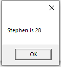
Here in the above section, we have described all the basic concepts about the WPF.
Next TopicWPF ListBox
|
 For Videos Join Our Youtube Channel: Join Now
Feedback
- Send your Feedback to [email protected]
Help Others, Please Share


