 |

Xamarin.Forms LayoutXamarin.Forms Layout classes allow us to arrange and group the UI controls. To choose the layout class, it requires the knowledge of how to arrange the position and size of the child elements. Stack LayoutStack Layout organizes the element in the one-dimensional stack horizontally or vertically. The orientation property determines the direction of the elements, and the default orientation is Vertical. Stack Layout is typically used to arrange the subsection of the UI on a Page. Here are the following XAML shows how to create a vertical StackLayout containing three label objects. MainPage.XAML Output 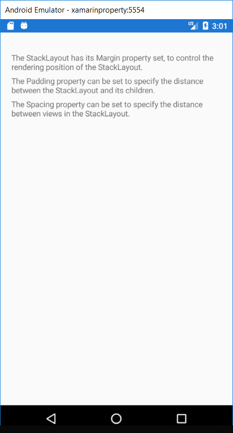
Grid LayoutStack Layout often used as a parent layout, which contains other child layouts. However, a StackLayout should not be used to reproduce the Grid Layout by using a combination of Stack Layout objects. Without the use of GridOutput 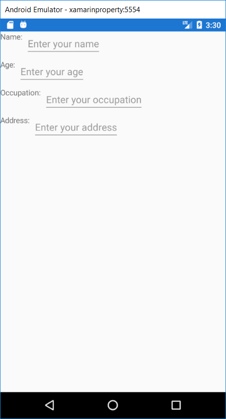
This type of layout is wasteful because unnecessary layout calculations are performed. We can achieve the better-desired layout using Grid. Grid LayoutA Grid is used to display the elements in rows and columns, which can have proportional or absolute sizes. A grid's rows and column are specified with the RowDefinitions and ColoumnDefinitions properties. For the position of the elements in specific grid cell, use the Grid. Column , and Grid. Row attached property. To make elements connected across multiple rows and columns, use the Grid.RowSpan and Grid.ColumnSpan attached properties. Grid Supports views to arrange into Rows and Columns. Rows and Columns can be set to proportional sizes or full sizes. The Grid Layout should not be confused with traditional tables and is not intended to present tabular data. The grid does not have the concept of the row, column, or cell formatting. Unlike HTML tables, Grid is purely intended for laying out the content. In the Grid Layout, we can divide our screen into rows and columns to make our layout more attractive. Grid Layout is mostly used in the photo gallery and in other things where grids are used. The grid looks like this: 
PurposeThe grid can be used to arrange the views into a Grid. This is useful in many cases:
UsageUnlike traditional tables, Grid does not interfere with the number of the sizes of the rows and columns from the content. Instead, Grid has RowDefinitions and ColumnDefinition Collection. These hold the definition of how many rows and column will be laid out. Views are added to the Grid with specified rows and column indices, which identity the column in a view should be placed in. Rows And ColumnsRow and Column information are stored in Grid's RowDefinition and ColumnDefinitions properties in which each collection of RowDefinition and ColumnDefinition objects, respectively. RowDefinition has a single property Steps to remind while making the grid layout:
MainPage.XAML Output 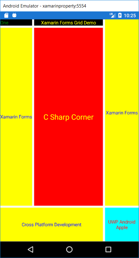
Flex LayoutA FlexLayout is similar to a StackLayout in that it displays child elements either horizontally or vertically in a stack. However, a FlexLayout can wrap its children also if there are too many to fit in a single row or column, and also enable the more granular control of the size, orientation, and alignment of its child elements. Here, are the XAML which shows how to create the FlexLayout which displays its single view in a single column. MainPage.XAML Output 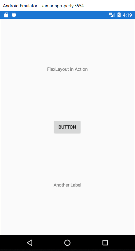
Absolute LayoutAbsolute Layout is used to position the child elements at the absolute requested position. Absolute Layout is used when we want to move away from all the layout restriction and make the layout different. We can use proportional and absolute values to set the height, width, X-axis, and Y-axis of the element. Example: Here, we will take the practical implementation of an absolute layout. Here, we are going to make the boxes and place them wherever we want by setting their x-axis and y-axis. Here, we will make the box and set it on our background page. Here are the few things that should be kept in mind. In absolute bound, we always set layout bounds and layout flags. Layout Bounds In Layout bounds, we will set the values of width, height, x-axis, and y-axis in the sequence of X-axis, Y-axis, Width, Height. The first value we set in Layout bound would become the value of x-axis and so on. Layout Flags In Layout Flags, we will declare whether the value in the bound layout is proportional or not. The minimum proportional value is 0, and the maximum is 1. MainPage.XAML Explanation Of Code Here, we get the idea of Layout bounds and Layout Flags. As in the above code, we set the width and height to the maximum and declare that these values are proportional in Layout flags. Here the box covers the whole and acts as a background of our app. Output 
Here, we see that it works perfectly fine. Here we make a box and set it to the background of our app. Now we will make another box and will place it in the center of our page. Explanation Of Code: We already have one box, now we want to add another box in which the proportional value of X-axis and Y-axis is set to 0.5, which means 50% and our new box is in the center of the page. We can change the value of x and y-axis to see the movement of the box. Output 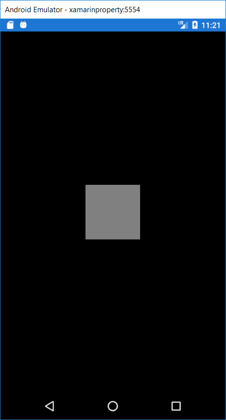
Here we see another box created in the center of the page. Now we will create a Label and will place it in the bottom of the page. Explanation Of Code: Here, in the label, we set the absolute value for its height and proportional value for the x-axis, and width. Y-axis is set 1 so that it shows on the bottom of the page. Output 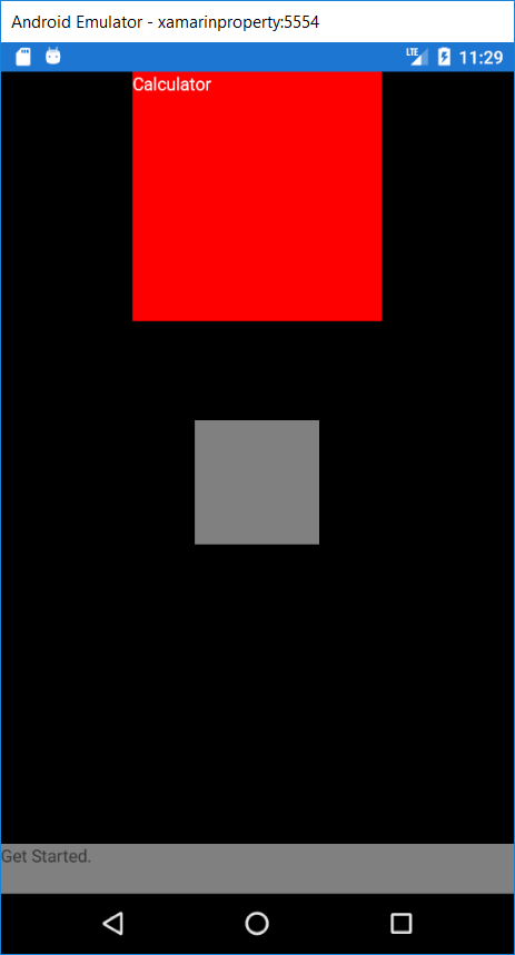
Relative LayoutPurpose Relative Layout can be used to position the views on the screen corresponding to the overall layout or other views. Usage Understanding the Concept Positioning and sizing the view within a RelativeLayout is done with constraint. Constraint information may contain the following information. Type The constraint is related to the parent or another view. Property Which property we should have to use as the basis for the constraint. Factor Which factor we have to apply on the property value. Constant Which value we have to use as an offset of the cost. Element Name The name of the view with which the constraint is related. Output 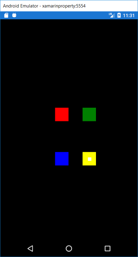
Here, we will explore the complex layoutEach layout has its strength and weakness for creating a particular layout. Here, we will create a sample app with the same page implementation using three different layout. MainPage.XAML Output 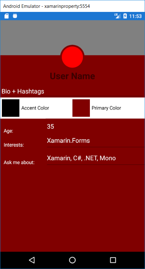
Scroll ViewScroll View contains the layouts and enables them to scroll offscreen. Scroll View is also used to allow the views to move to the visible portion of the screen when the keyboard is showing. Purpose Scrollview ensures that more extensive views can be display well on small phones. For Example: A layout which works on an iPhone 6s may be shared on an iPhone 4s. Scrollview allows the shear portion of the layout to be displayed on the smaller screen. MainPage.XAML Output 
Wrap UpIn generally speaking, we found the structure of the layout of Xamarin is similar to the other XAML framework. They are designed to work in a Cross-Platform situation. Each Layout solves the specific problem. Once we understand how each one work, we can layer them together to build the UI of our dreams.
Next TopicViews in Xamarin
|
 For Videos Join Our Youtube Channel: Join Now
Feedback
- Send your Feedback to [email protected]
Help Others, Please Share


