| |

Difference between Histogram and Bar GraphData must be combined and presented after collection and verification in a form that makes the key components obvious to users. The statistical analysis can only be done if it is presented properly. There are three ways to show data: textually, tabularly, and diagrammatically. As it appeals to both the knowledgeable and illiterate segments of society, the diagrammatic depiction of data is among the best and most attractive methods of presenting data. 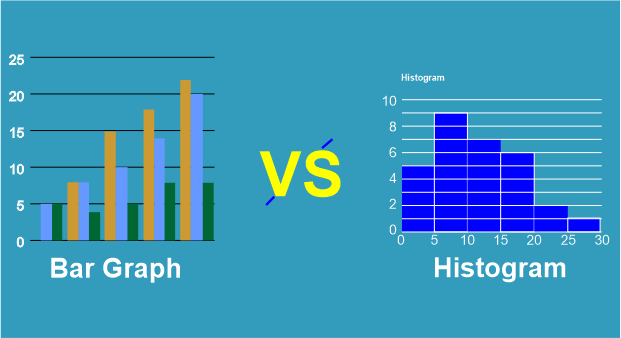
The two methods for diagramming data are the bar graph and the histogram. Both histograms and Bar graph uses bars to convey data, so it might be difficult for people to tell the difference between them. Before differentiating, let us start by knowing each one of them individually. Histogram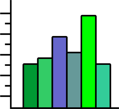
In statistics, a histogram is a visual representation of the distribution of data. The histogram is displayed as a set of adjacent rectangles, where each bar represents a distinct kind of data. Many diverse areas apply statistics, as part of mathematics. The frequency of numbers in statistical data is referred to as frequency; it may be shown as a table and is called a frequency distribution. The histogram is one of the several graph forms that may be used to represent a frequency distribution visually. Types of HistogramBased on the frequency distribution of the data, the histogram can be divided into many forms. These numerous categories of distributions may all be represented by a histogram. The histogram also has types, which include:
Uniform Histogram A uniform distribution indicates that there are insufficient classifications since each class has the same number of objects. There could be multiple peaks in the distribution involved. 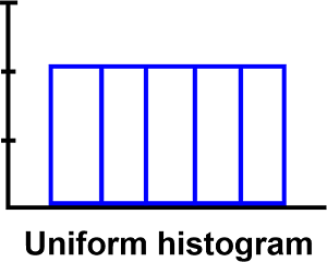
Biomodal Histogram When observations are taken on two different types of individuals or combined groups, bimodality will be present in the data set if the centers of the two unique histograms are sufficiently far from the variability in both data sets. 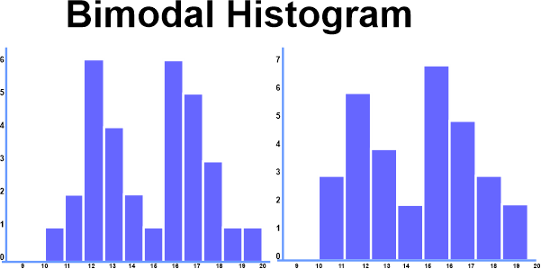
Symmetric Histogram It is also known as a bell-shaped histogram when it is symmetrical. The term "symmetric" refers to a histogram with two sides of the same size and form when the vertical line is drawn across the center of the histogram. The diagram is entirely symmetrical if the image's right and left halves are identical. The term "skewed" refers to histograms that are not symmetrical. 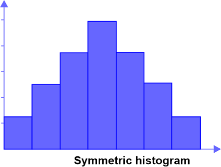
Probabilistic Histogram 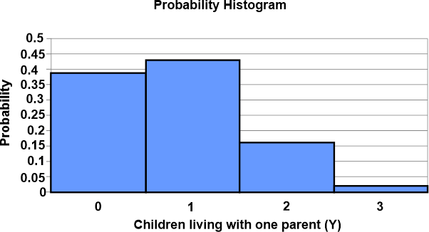
In a probability histogram, a discrete probability distribution is represented graphically. The area of each rectangle corresponds to the probability that the associated value of x will occur. A rectangle represents each value of x. You may begin the probability histogram diagram by selecting the classes. Each scenario's probability is shown by the heights of the bars in the histogram. Bar GraphA bar Graph (also called a bar chart) is a visual representation of a group of data in the form of rectangles, columns, or bars, with the length of the bar corresponding to the data measurement. 
The variable amount is shown on one of the axes and is represented by uniformly wide bars. The other axes also display the variable's measure. These graphs are used to compare several data points since the heights or lengths of the bars indicate the variable's value. Bar charts make it simple to calculate and comprehend data and can be used to display frequency distribution tables quickly. Bar graphs include the following three key features:
Types of Bar GraphNormally, bar graphs group categories and numerical data in class intervals. They are made up of an axis and several marked horizontal or vertical bars. The bars show the frequency of different values of a variable or, more often, the different values themselves. In a bar or column chart, the scale is the number of x-axis or y-axis values. Bar charts come in the following varieties:
Let's talk about the four sorts of bar graphs now. 1. Vertical Bar Graphs 
Vertical bar graphs are graphs that use bars to display grouped data vertically in a chart or graph, with the bars serving as a measure of the data. The data is shown on the graph's y-axis, and the height of the bars represents the values. 2. Horizontal Bar Graphs 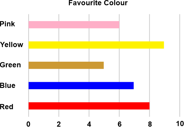
A horizontal bar graph is one that uses bars to represent the grouped data horizontally in a chart while displaying the measure of the data as shown by the bars. The graph's x-axis is used to represent the data, while the bars' lengths serve as values. 3. Grouped Bar Graph 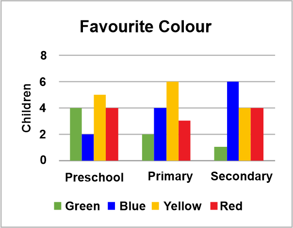
The clustered bar graph sometimes referred to as the grouped bar graph, is used to display the discrete value for a number of items that fall into the same category. Each bar in this style of bar graph represents the overall number of occurrences. Or a grouped bar graph is a particular kind of bar graph in which various sets of data items are contrasted. This specific series is marked throughout the set with a single color. Use horizontal or vertical bar charts to see the grouped bar graph. 4. Stacked Bar Graph 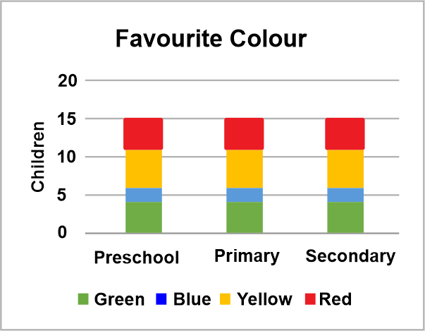
The composite bar chart, which divides the aggregate into components, is another name for the stacked bar graph. This bar graph style enables the portrayal of each element using a unique color, making it simpler to differentiate between the numerous categories. Specific labeling is needed to clearly display the many components of the bar in the stacked bar chart. In a stacked bar graph, each bar symbolizes the complete object, and each segment represents one of the many parts that make up the object as a whole. Key Distinctions Between a Histogram and a Bar GraphThe following factors make it easy to distinguish between a histogram and a bar graph:

Comparison Between Histogram and Bar Graph
ConclusionSince both the bar graph and the histogram employ vertical bars to depict data and both have an x-axis and y-axis, they initially appear to be similar. The amount of data in the element and its relative frequency determines the height of the bars. Additionally, skewness affects a histogram but not a bar graph regarding interpretation.
Next TopicDifference between
|
 For Videos Join Our Youtube Channel: Join Now
Feedback
- Send your Feedback to [email protected]
Help Others, Please Share


