PrimeFaces SelectOneRadio
It is used to choose a single item from a list of options. It is an extended version with theme integration. The <p:selectOneRadio> component is used to create list of radio buttons. It is useful when we want a single input from the user. It has various attributes that are listed below.
SelectOneRadio Attributes
| Attribute |
Default value |
Type |
Description |
| id |
null |
String |
It is an unique identifier of the component. |
| rendered |
true |
Boolean |
It is used to specify the rendering of the
component.
|
| value |
null |
Object |
It is used to set value of the component referring to a List. |
| required |
0 |
Boolean |
It is used to mark component as required. |
| valueChangeListener |
null |
MethodExpr |
It is used to refer a method for handling a value change event. |
| converterMessage |
null |
String |
It is used to set message to be displayed when conversion fails. |
| disabled |
false |
Boolean |
It is used to disable the component. |
| label |
null |
String |
It is used to set label for the component. |
| layout |
line
Direction
|
String |
It is used to set layout of the radio button. |
| columns |
0 |
Integer |
It is used to set number of columns in grid layout. |
| onchange |
null |
String |
It is used to execute method on value change. |
| style |
null |
String |
It is used to set inline CSS of the component. |
| tabindex |
null |
String |
It specifies the tab order of element in tab navigation. |
| plain |
false |
Boolean |
It displays plain mode of radiobuttons. |
Example
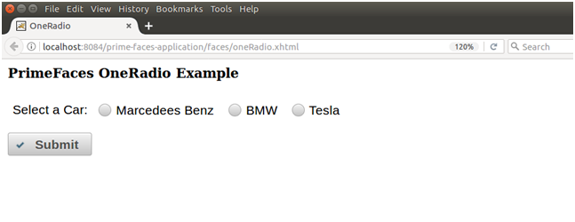
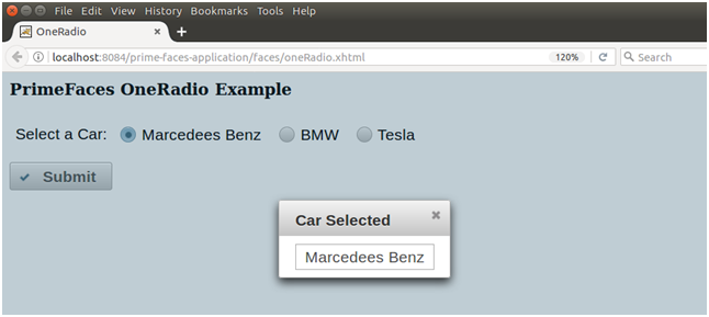
Here, in the following example, we are implementing <p:selectOneRadio> component. This example contains the following files.
JSF File
// oneRadio.xhtml
ManagedBean
// OneRadio.java
Output:
| 

 For Videos Join Our Youtube Channel: Join Now


