| |

Excel's Clustered Bar ChartIn this tutorial, we will discuss what clustered bar chat is with its clear examples and a step-by-step process. This makes you understand the concept explicitly, and by the end of the tutorial, you can perform this clustered bar chart in Excel. Without delay, let's dive into the concept. Excel's clustered bar chart, which compares values across categories, is displayed in horizontal bars parallel to the X-axis. It is accessible from the Insert menu within the Bar Chart Section's Charts section. It is offered in two- and three-dimensional chart formats. We need two values for a single parameter to generate a clustered bar to compare the values before and after or for a different time frame. Excel Bar Chart TypesExcel 2010 offers a total of five different bar chart formats.
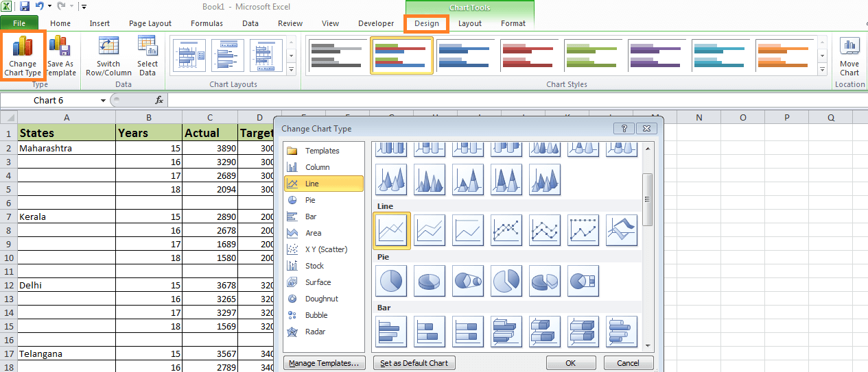
How to draw a clustered bar chart in Excel?It is quite straightforward and user-friendly. Now, using a few examples, let's examine how to make a clustered bar chart. Example 1:I have four years of data in this example, broken down by quarter annually. Step 1: This is how the dataset ought to appear. 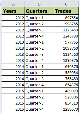
Step 2: Choose Data > Select Bar Chart > Clustered Bar Chart from the Insert menu. 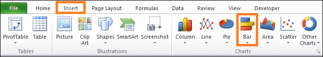
This is how the chart will seem as quickly as you insert it. 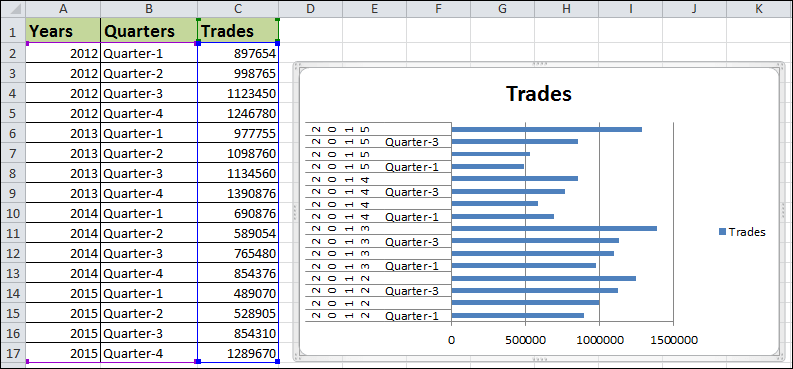
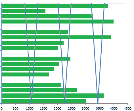
Whoa! Man, this looks so terrible. We must give it more beauty. Step 3: Choose the format data series by right-clicking on the bar. Choose Vary colours by point under Fill. 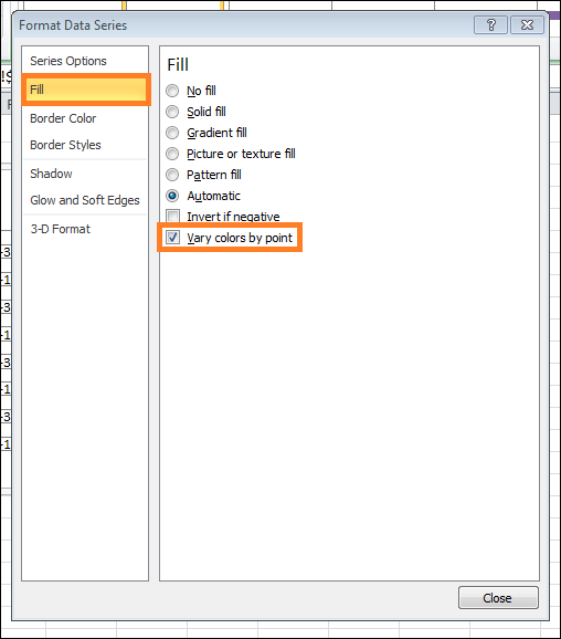
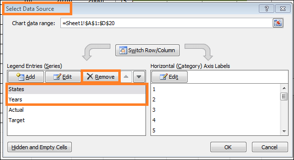
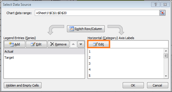
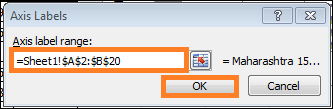
Step 4: Currently, it appears more attractive than the last one. To format the vertical axis, we must first. The data must be rearranged, as the graphic below illustrates. 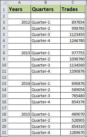
Step 5: Your chart should look like this after completely rearranging data. 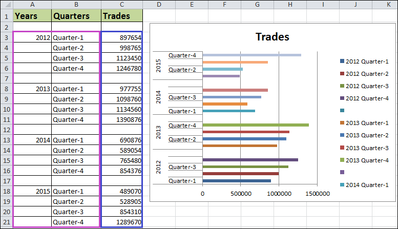
Step 6: Choose the format data series by right-clicking on the bar. Set the Gap Width to zero. To 0%, the series overlap. 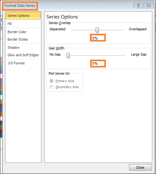
Now that the clustered bars chart is complete, we only need to view the data directly from the graph. Analysis of the Chart:
This is how our final seems. 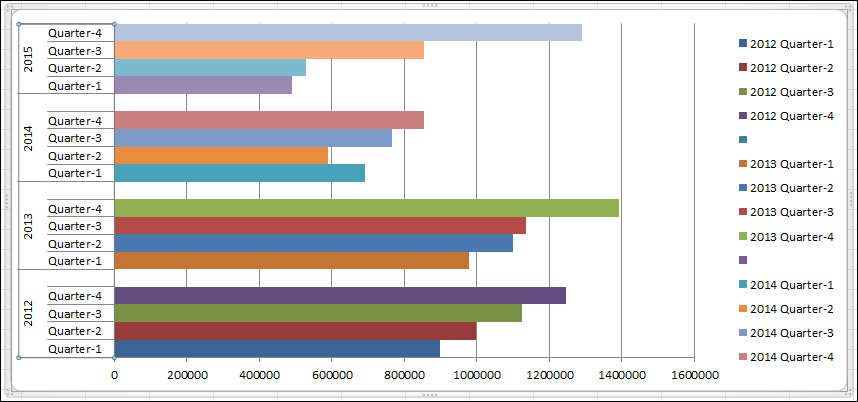
Example 2: Step 1: Organize the data in the below format 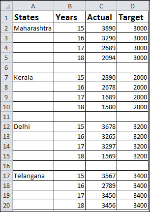
Step 2: Use the insert section to insert the chart. Navigate to Bar Chart and choose Clustered Bar Chart. 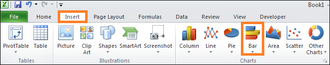
This is how your chart appears at first glance. 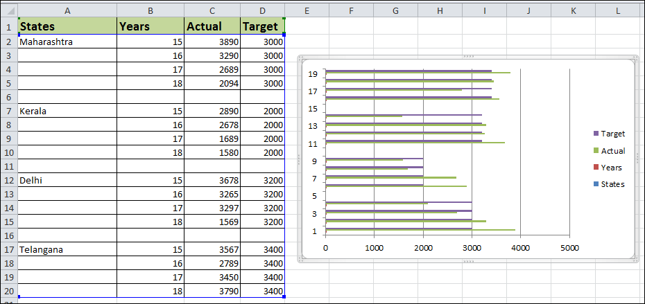
Follow the steps listed below to complete the formatting.
You will now see the following chart in your system. 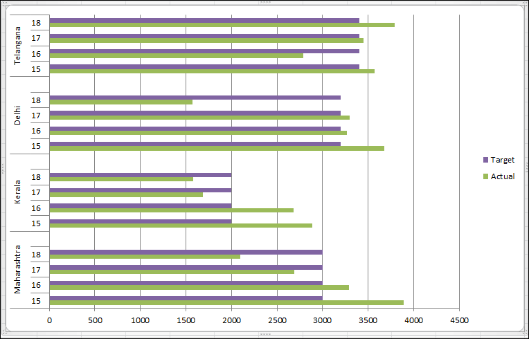
Advantages
Disadvantages
Points to Keep in Mind
Next TopicControl charts in Excel
|
 For Videos Join Our Youtube Channel: Join Now
Feedback
- Send your Feedback to [email protected]
Help Others, Please Share


