PrimeFaces SelectBooleanCheckbox
PrimeFaces provides <p:selectBooleanCheckbox> component to create boolean checkbox. It is used to get a boolean value from the user. It is an extended version of the standard checkbox with theme integration.
SelectBooleanCheckbox Attributes
The following table contains attributes for the SelectBooleanCheckbox component.
| Attribute |
Default value |
Return type |
Description |
| id |
null |
String |
It is an unique identifier of the component. |
| rendered |
true |
Boolean |
It is used to render component. It takes boolean value. |
| binding |
null |
Object |
It is used to set an expression that maps to a server side UIComponent
instance in a backing bean
|
| value |
null |
Object |
It is used to set value of the component referring to a List. |
| converter |
null |
Converter/String |
It is used to set text that defines a converter for
the component.
|
| required |
false |
Boolean |
It is used to make component as required. |
| widgetVar |
null |
String |
It is a name of the client side widget. |
| disabled |
false |
Boolean |
It is used to disable the component. |
| label |
null |
String |
It is used to set user presentable name. |
| onchange |
null |
String |
It is used to call script on value change. |
| style |
null |
String |
It is used to set CSS of the component. |
| styleClass |
null |
String |
It is used to set style class of the container. |
| itemLabel |
null |
String |
It is used to set label displayed next to checkbox. |
| tabindex |
null |
String |
It is used to specify tab order for tab key navigation. |
| onfocus |
null |
String |
It is used to execute script when checkbox receives
focus.
|
| onblur |
null |
String |
It is used to execute script when checkbox loses focus. |
| title |
null |
String |
It is used to set tooltip information. |
SelectBooleanCheckbox Skinning Attributes
| Style Class |
Applies |
| .ui-chkbox |
It is a main container element. |
| .ui-chkbox-box |
It is a container of checkbox icon. |
| .ui-chkbox-icon |
It is used for checkbox icon. |
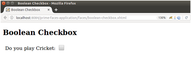
Example
Here, in the following example, we are implementing <p:selectBooleanCheckbox> component. This example contains the following files.
JSF File
// boolean-checkbox.xhtml
ManagedBean
// BooleanCheckbox.java
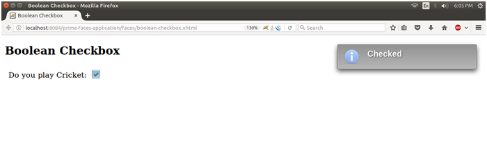
Output:
It shows message, when we check it as giving below.
| 

 For Videos Join Our Youtube Channel: Join Now


