| |

SSRS Tutorial
SSRS tutorial provides basic and advanced concepts of SQL Server Reporting Services. Our SSRS tutorial is designed for beginners and professionals. SQL Server Reporting Services (SSRS) is a reporting tool provided by Microsoft which is used to produce formatted reports such as graphs, tables of data, and charts. Here, we are going to cover the following topics in this tutorial:
What is SSRS?SSRS stands for SQL Server Reporting Services. It is a reporting tool developed by Microsoft that comes free with the SQL Server. It produces formatted reports with the tables of data, graph, and reports. Reports are hosted on a server and can be configured to run using parameters supplied by users. When we run the reports, the current data appears from the database, XML file or other data source. It provides the security features that controls who can see which reports. What is Data visualization?Data visualization is the virtual access to the data that we have. A well-designed data can be a graph, charts or a report, and visual representation of the data is the simplest and most powerful representation of any data. For example, I am a Business Analyst, so I am used in working with the numbers since I have started, but if I want to show the information with respect to the business to the owner, then I need to provide the visual representation of a data which is easier to understand. Why do we need visualization?Nowadays, we create close to 2.5 Quintillion bytes of data every day, which is a huge set of data. We need to understand what this data means, so we need the data to get into a visual format. Data visualization is preferred as our eyes perceive better than our reading. The main purpose of data visualization is that the human mind understands the data better than reading. A human can analyze the data or information through charts and graphs better than analyzing the data using spreadsheets. Data visualization is a quick and easy way to convey concepts in a universal manner. Data visualization is useful because of the following reasons:
Why SSRS?SSRS is useful because of the following reasons: 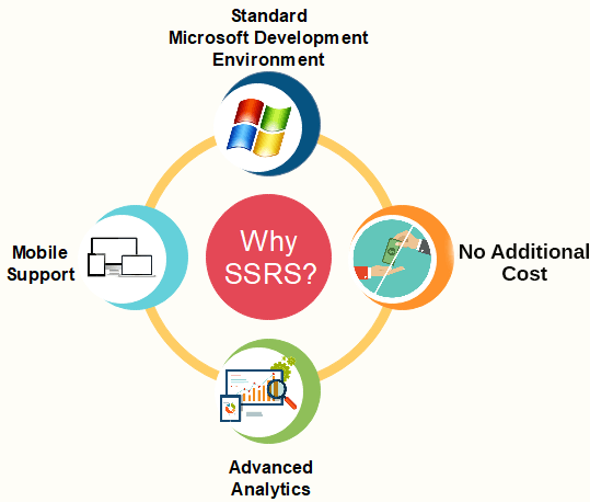
Standard Microsoft Development environmentIt is a standard environment where whole the data is processed. It consists of three services:
When you are using the complete product, then it ensures the overall quality of the product and standardization that other tools do not provide. For example, Tableau or Power BI used to retrieve the data from a single data source or multiple data sources, then it performs the Quality checks, i.e., checking the inconsistency of the data. If you use the SSRS, it provides the complete standard process means that the data you are working with is already gone through other services that perform quality checks, so reporting service does not need to perform the quality checks. Mobile SupportWhen you publish the report on any URL then it is visible to everyone even if you want to see the report on mobile, then you can also view the report by opening the URL. Suppose my client is sitting in the US and wants a report from my side, then I publish the report and provide the report details to him so that he can view the report. No Additional costSSDT(SQL Server Data tools) comes free with the SQL Server package on the installation of the SQL Server. Cost is the most important factor to be considered in an organization. As an organization, if you are paying for the reporting tool, then it becomes a hindrance as you are already paying for the data processing and data integration service. The major advantage of SSRS is that it does not incur any cost as it comes free with the Microsoft SQL Server. You only need to purchase the license of SQL Server then all the services are free of cost. Advanced AnalyticsYou can also do advanced visualization and analytics. SSRS also allows you to filter or process the data as per your requirements before going for visualization. SSRS Architecture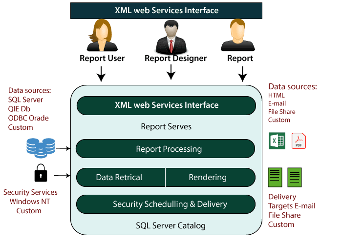
There are three types of users of reporting services:
Now let's understand the architecture of SSRS architecture. There can be any data source, such as Oracle, MySQL, SQL Server, etc. You can link any of these data sources to the Microsoft SQL Server. Once you attached the data sources to the SQL Server, then data retrieval and rendering process happen. Rendering is the process of filtering and analyzing the data to meet the requirements. Report processing: Report processing comes after Rendering. Report processing is the process of publishing, filtering, and modifying the existing reports. XML web service interface: When you publish the report then the report is published to the website, it is possible through the XML web service interface. Security and Scheduling and delivery come with the SQL Server. Reporting LifecycleEvery organization follows some methods to generate a report known as a reporting lifecycle. Reporting lifecycle can be divided into three phases: 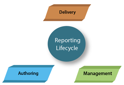
AuthoringReport authors define the layout and source of the data. The syntax in which the report is defined is known as report definition language. Some are the tools used for authoring are report builder, etc. ManagementManagement is the second phase in Reporting lifecycle. It involves managing the published reports which are public, and at present, they are available in the web services. The reports which are currently available at the web interface, you need to create the role-based security models. It is used to identify who needs to access the report, who can view the report. The major responsibility in the management phase is to have control over the execution, i.e. when the report should have got the data. All the report should be updated in real time as well. The data taken from any data source must be updated on a regular basis. It is trivial to work with static data. When we are working with the dynamic data, then you should define when the updation is to be happen. It could be either in a day, hours or weeks. DeliveryIn the Delivery phase, we determine when the reports to be delivered to the client. It could be either an On-demand basis or a pre-defined schedule. You can also add an automatic subscription feature which can create and sends the reports to the client automatically. Requirements for Reporting ServicesThe following are the requirements to install the Reporting services: Install the SQL ServerFollowing are the steps to install the SQL Server: Step 1: Click on the link which is given below to download the SQL Server: https://www.microsoft.com/en-us/download/details.aspx?id=29066 Step 2: Select the language and then click on the Download button. 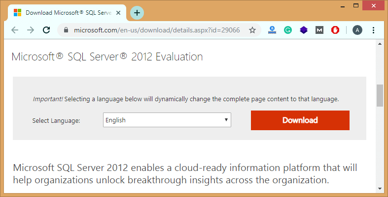
Step 3: Choose the option that you want to download and then click on the Next button. 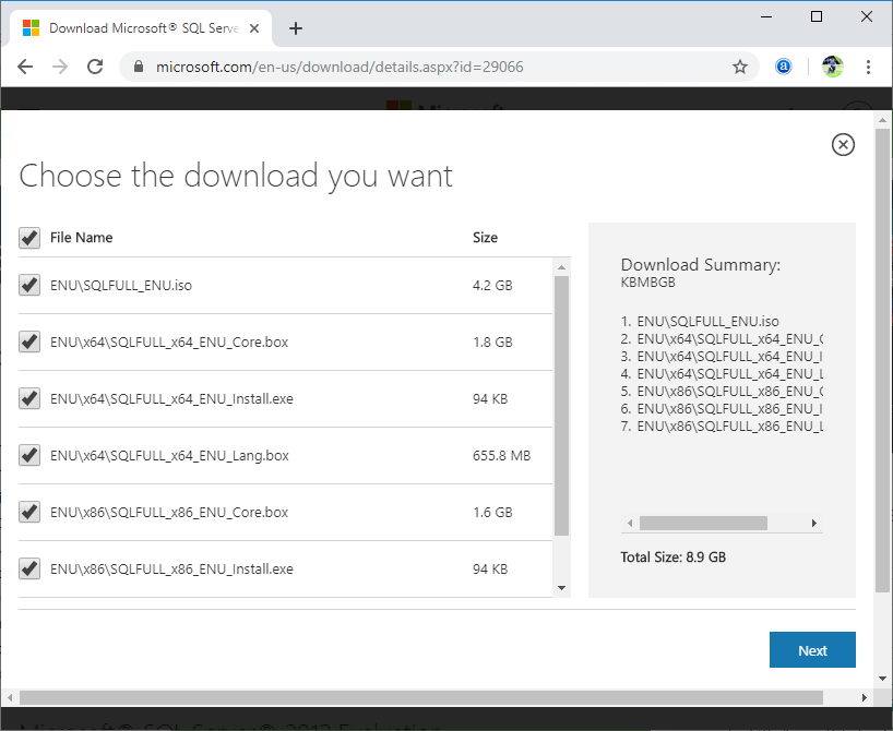
Step 4: Click on the SQLFULL_x64_ENU_Install file that has been downloaded in your computer. After clicking on the file, the screen appears, which is shown below: 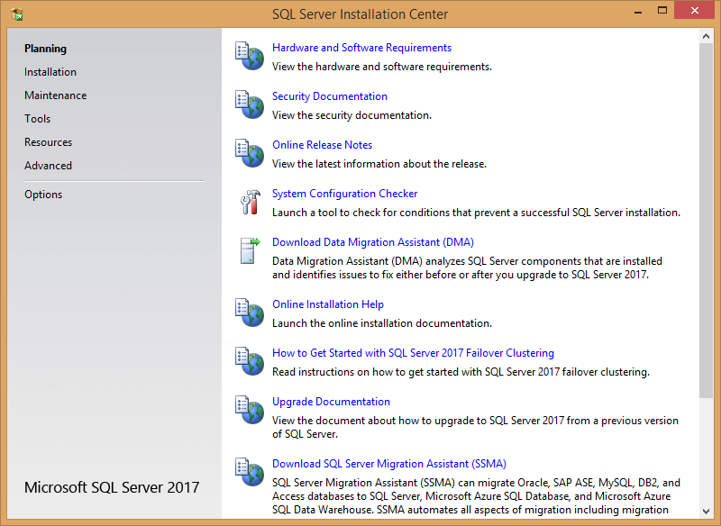
Step 5: Click on the installation appearing at the left side of the panel. 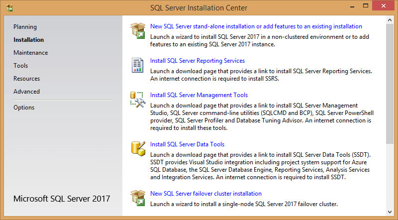
Step 6: Click on the first option, i.e., New SQL Server stand-alone installation. 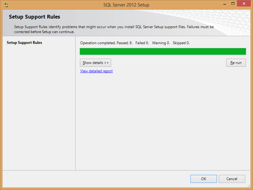
Step 7: Click on the OK button. Step 8: Click on the product key option and then click on the Next button. 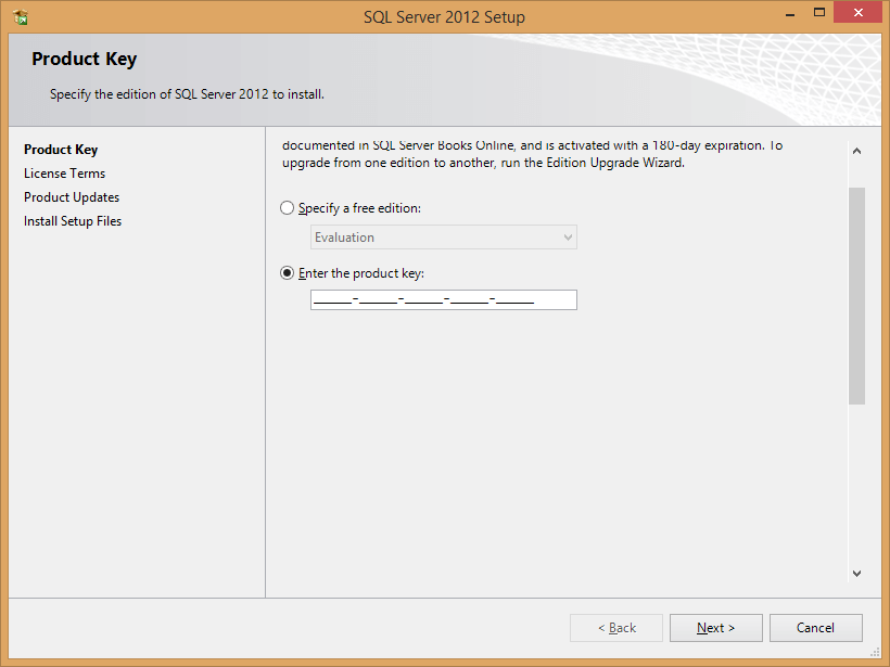
Step 9: Check the box of "I accept the license terms". 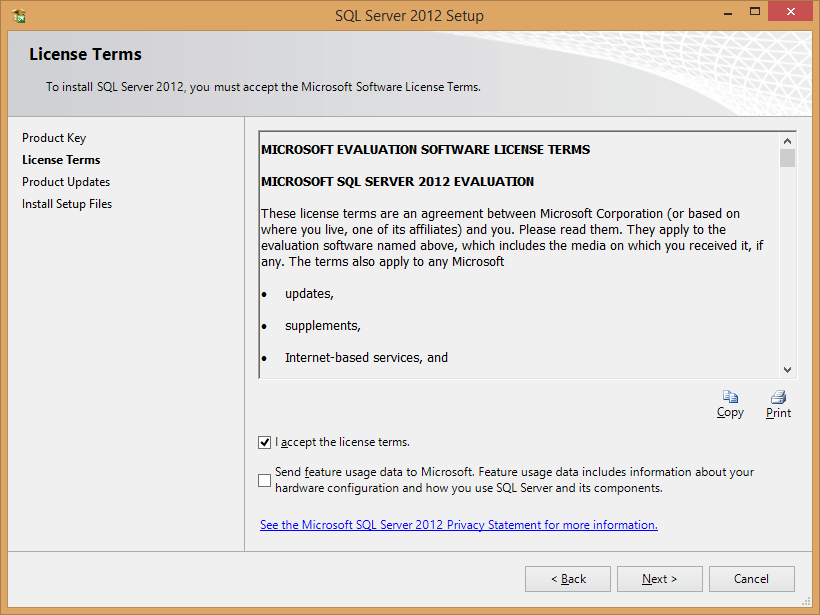
Step 10: Select the SQL Server Installation. 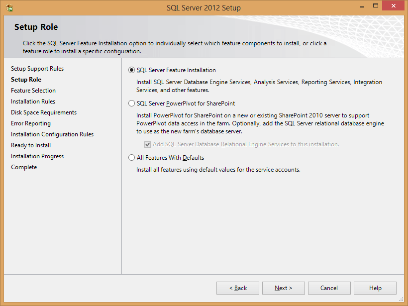
Step 11: Select the Database Engine Services and then click on the Next button. 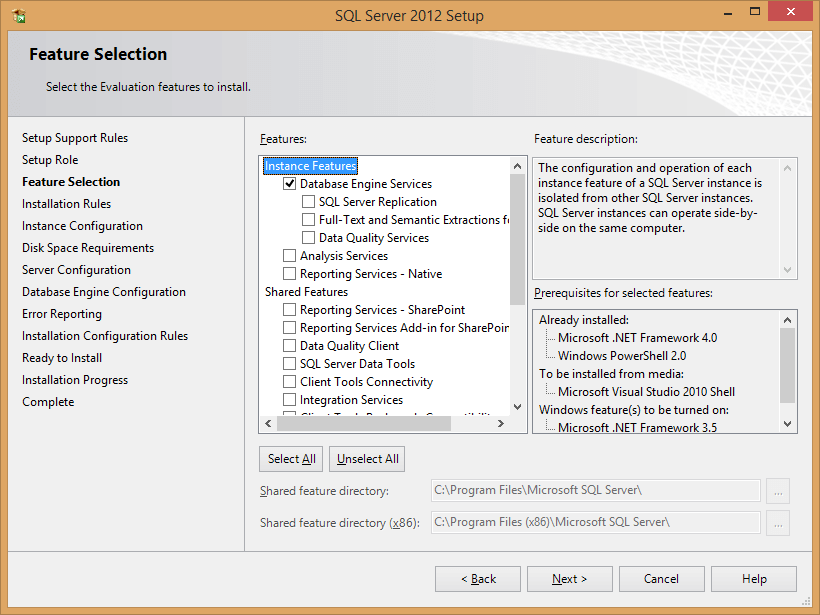
Step 12: Choose the named instance and enter the name of the instance. Click on the Next button. 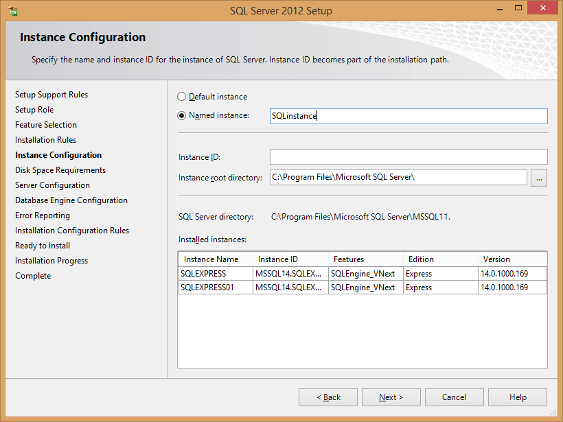
Step 13: After clicking on the Next button, the screen appears, which is shown below: 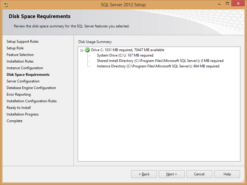
Step 14: When you click Next on the above screen, the screen appears, which is shown below: 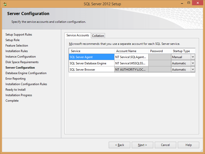
Step 15: Select the windows authentication mode and atleast one administrator. 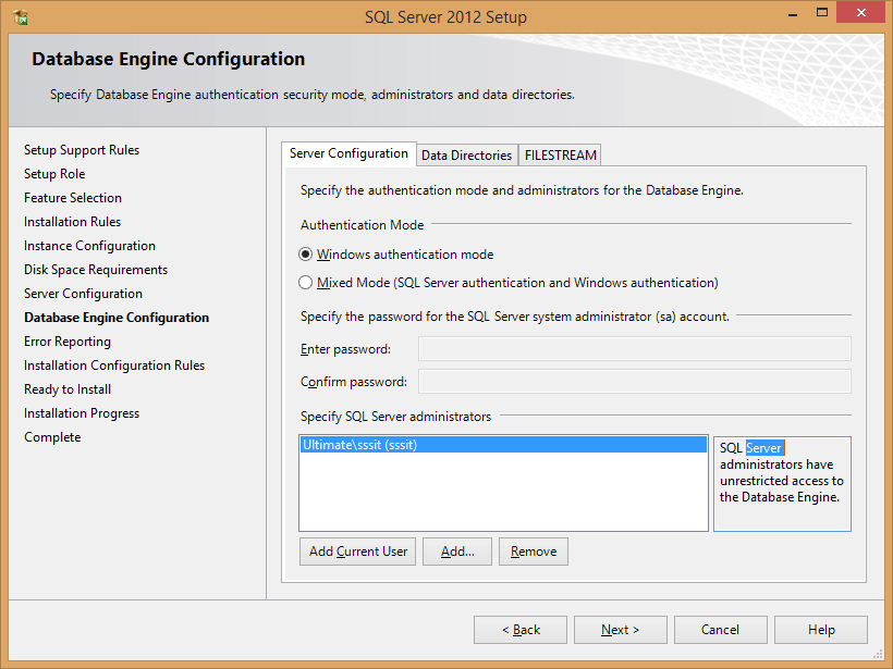
Step 16: Click on the Next button on the screen, which is shown below: 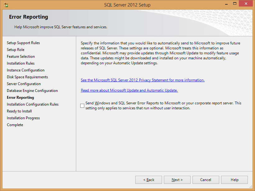
Step 17: Click on the Next button. 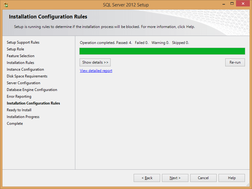
Step 18: Click on the Install button, as shown in the below screenshot: 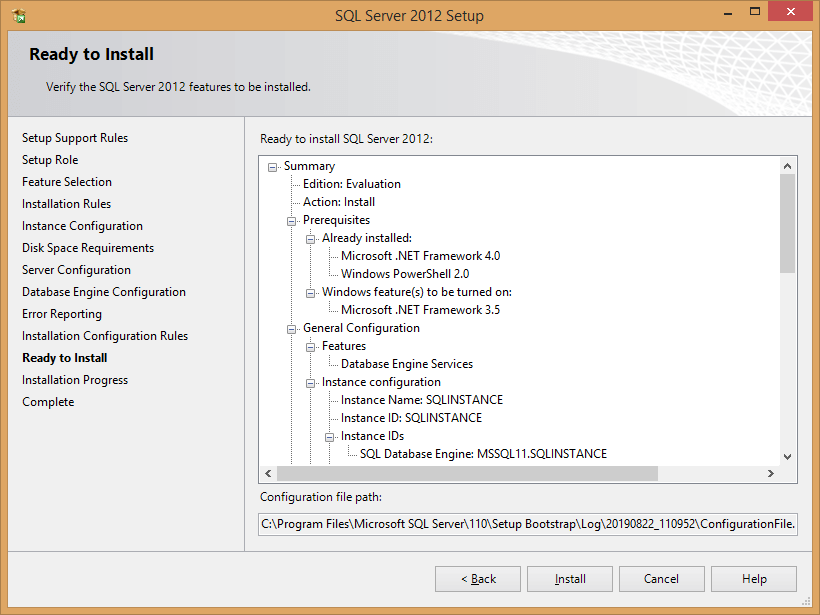
The second requirement is to install the visual studio and then add the Reporting Services to it.Follow the below steps to install the Reporting services in visual studio: Step 1: Open the visual studio. Step 2: Click on the Tools appearing at the menu bar and then select the option Extensions and Updates. 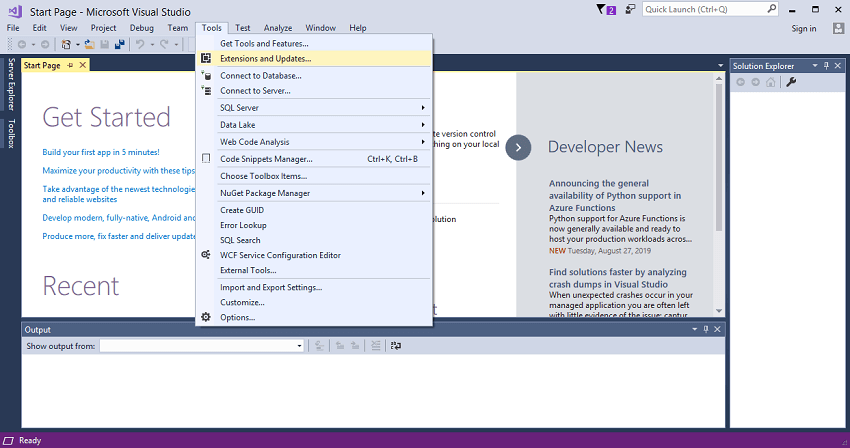
Step 3: Select the Microsoft Reporting Services Projects option for installation. 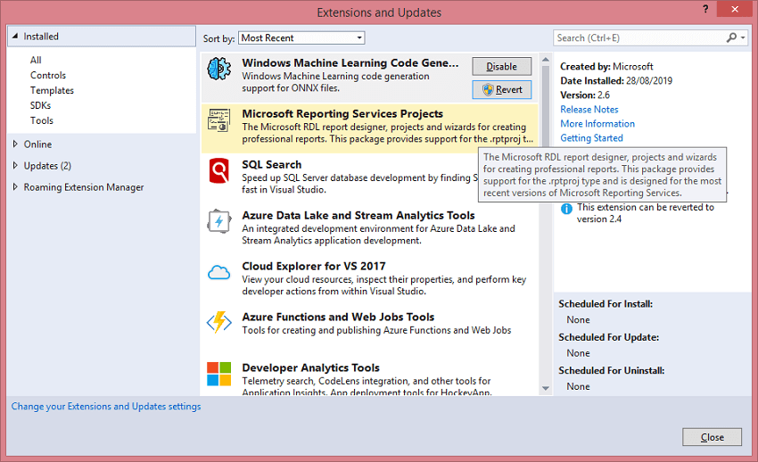
Reports in SSRSThere are six types of reports in SSRS: 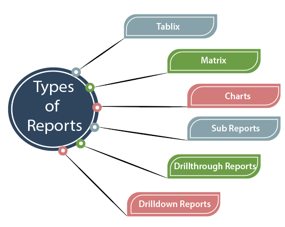
TablixTablix report format is similar to the table format. It represents the data in the form of a table. It is usually a single data source table that you are representing it. MatrixIt is quite similar to the Tablix report. But the difference is that here we are working with more than a single value. Both the column and rows pertain to some specific data. It is used to group the data by using multiple fields in the row and column group. In matrix report, when the data is combined at the run time then the report grows horizontally and vertically. You can even format the rows and columns group on which you want to emphasize. For example, we want to know the sales volume of a product, and also we want to know the sales volume with respect to the regions then we go for the matrix report rather than tablix report. ChartsThe Chart consists of different types of visual representation, such as bar chart representation, pie chart representation, line chart representation, and so on. All these graphical representations represent the charts. Depending upon the type of data, the graphical representation is chosen. For example, if we have a series of data then the bar chart is chosen as bar chart represents the graph horizontally, pie chart represents the proportion as a whole such as you want to represent the ratio between male and female members or you want to represent the ratio of different items sold whereas Line chart consists of a series of points connected to a single line and it evaluates the data over a continuous period of time such as sales volume over a constant period of time or to evaluate the number of employees over a fixed period of time. Sub ReportsSub Report is a report itself. It is basically embedded in another report. It is an independent report. Based on your requirements, it can be either related to the report that you are currently working on or can be worked as an independently. Suppose you are working on a major report, i.e., telling the overall sales volume and you also want to know the sales volume with respect to the regions then we use a sub report. Drilldown ReportsDrilldown reports depend on how the data is processed. It shows the relationship between the top level and the sub levels. You can put data in a variety of ways to show the relationship between the top level and sub levels. You can arrange the data in a report, but you need to set it hidden until the user clicks on it to reveal details. You can display the data in a data region such as tables or charts, which is nested inside another data region such as tables or matrix. Drillthrough ReportsDrillthrough reports also depend on how the data is processed. It is a report that the user can view by opening the link within another report. Drillthrough report shows all the details of an item which is contained in another report. For example, a sales report contains the lists of all the sales orders, and when you click on any sales order, then you will see the report containing the details of a sales order. Now we will start by creating three types of reports, i.e., Tablix, Matrix, and Charts. First, we will create the Tablix report. How to create a Tablix reportStep 1: To create a Tablix report, we need first to launch the visual studio data tools. The below screen shows how the visual studio looks like: 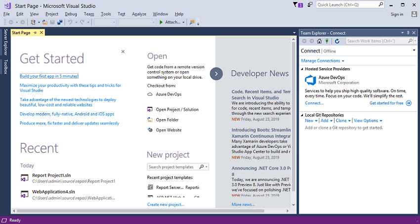
Step 2: First, we will create a new project. Click on the file -> New->Project. 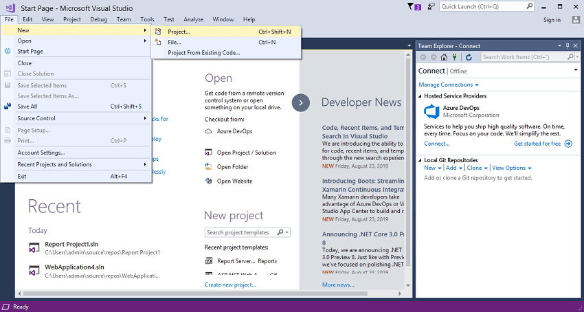
Step 3: When you click on the Project, the New Project window appears in which we select the Reporting services and then click on the Report Server Project. 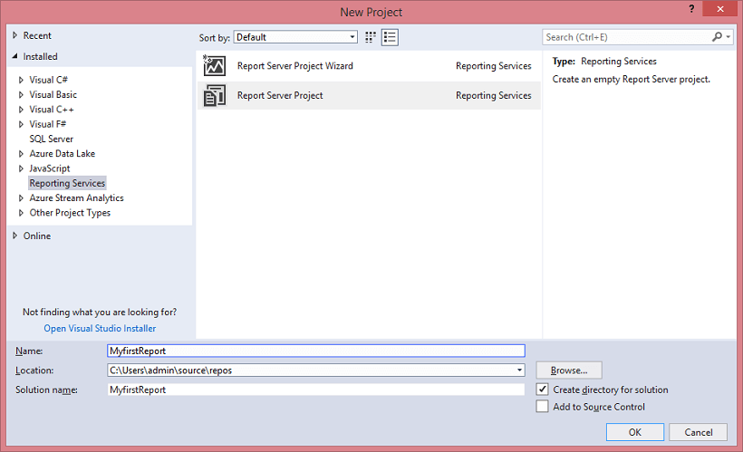
Step 4: When you click on the OK button in the above screen, the screen appears, which is shown below: 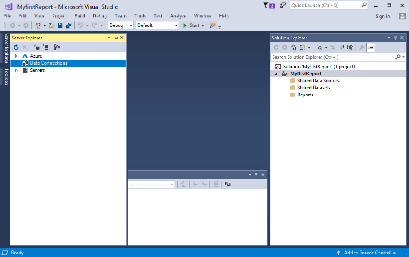
In the above screen, the rightmost screen represents the solution explorer, the leftmost screen represents the server explorer, and the bottom screen is the output screen. Step 5: In this step, we will create the data source. Right-click on the shared data source and then click on Add New Data Source. 
Step 6: On clicking on the Add New Data Source option, the screen appears, which is shown below: 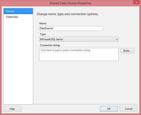
In the above screen, you need to enter the following fields:
When you click on the Build button, the screen appears shown below: 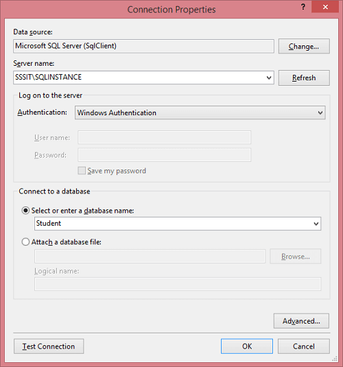
Step 7: Till now, we have created the data source, but we do not want to work on all the tables of a database so, we will create the datasets. Right-click on the shared datasets, and then click on Add New Dataset. 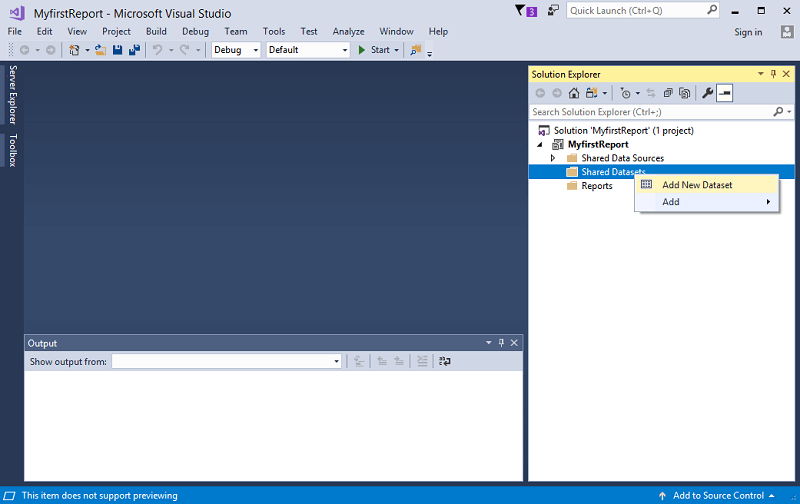
Step 8: When you click on the Add New Dataset option, the screen appears, which is shown below: 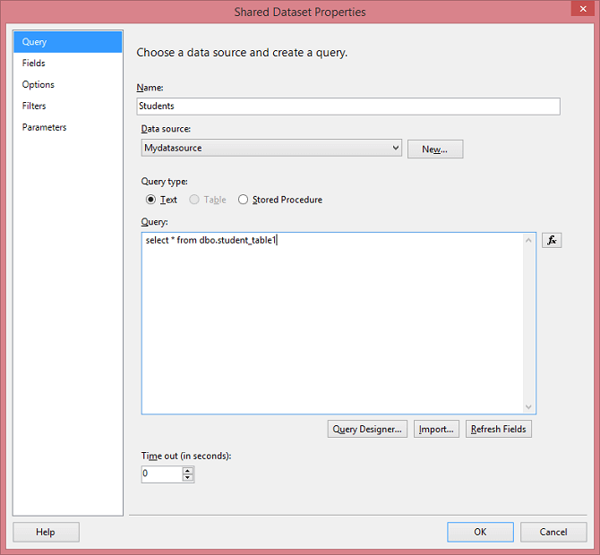
Step 9: Click on the OK button. Step 10: Now, we create a report. Right-click on the Reports folder, and then click on the Add New Report option. 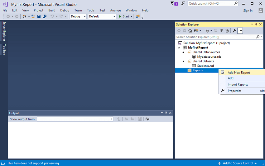
Step 11: After clicking on the Add New Report option, the screen shown below appears: Click on the Next button. 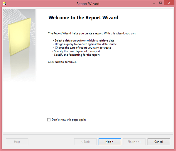
Step 12: Click on the Next button. 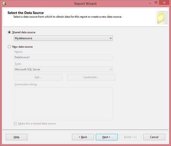
Step 13: Click on the Query Builder button. 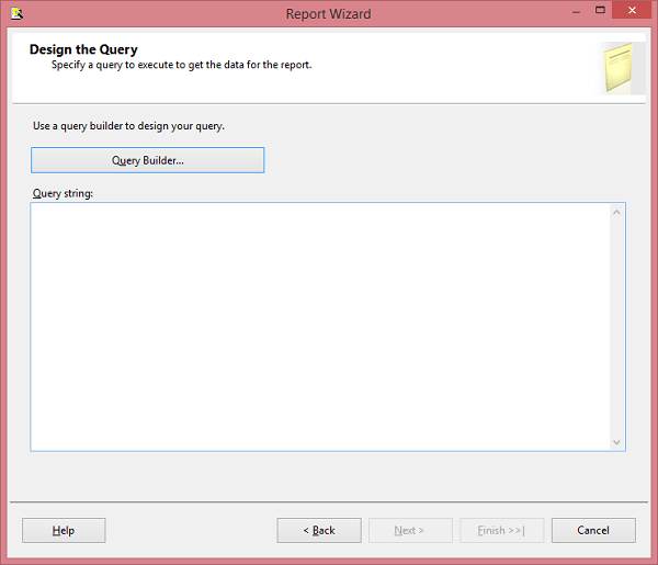
Step 14: Click on the OK button. 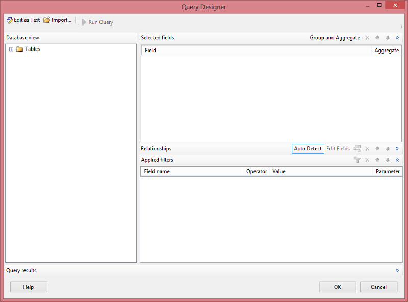
Step 15: Right-click on the Reports then move to the Add option and click on the New item option. 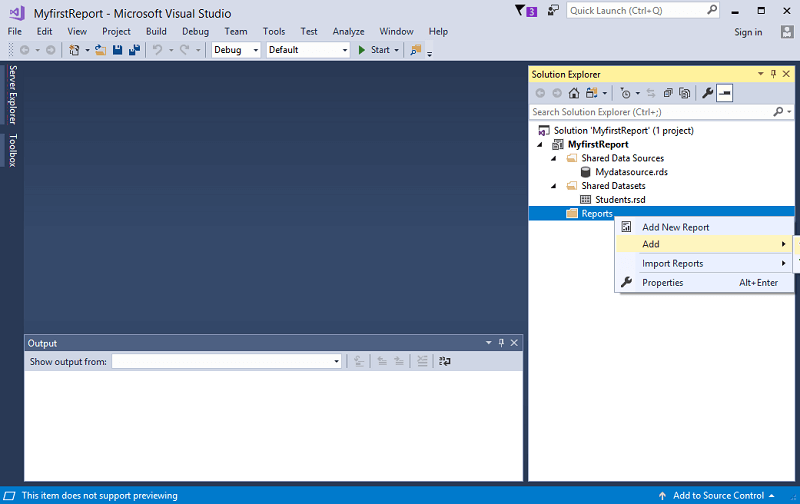
Step 16: After clicking on the New item option, the screen appears, which is shown below: 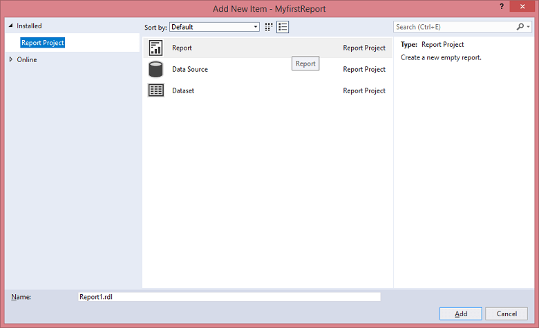
Step 17: Click on the Report option shown in the above screenshot. When you click on the Report, the screen appears shown below: 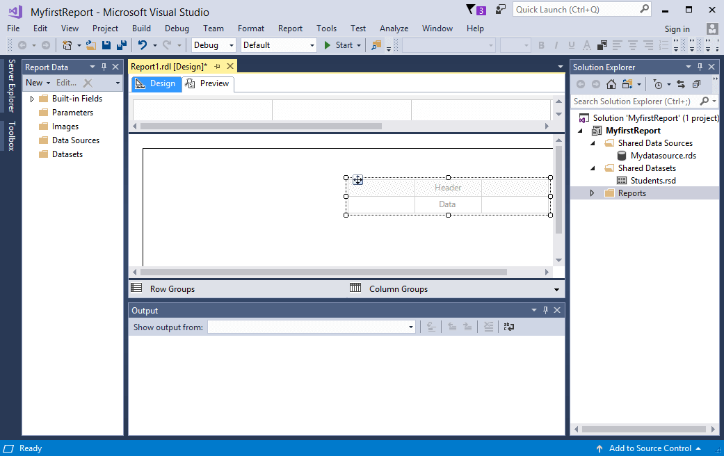
In the above screen, the middle screen represents Report workspace, where we create the design of the Reports. Step 18: Now, we will choose the type of the visual that we want for our report. To create the Tablix report, Right-click on the workspace, select the insert option and then click on the Table. 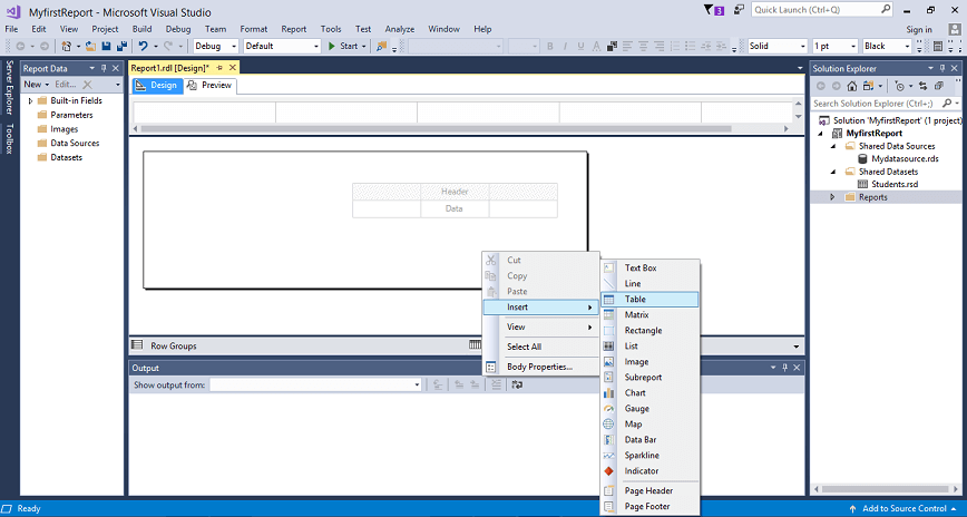
Step 19: In the Design tab, we create the design of the Report on how our report should look like. We have designed the report in which I have added the four fields of a Student table (student id, student name, marks, place). 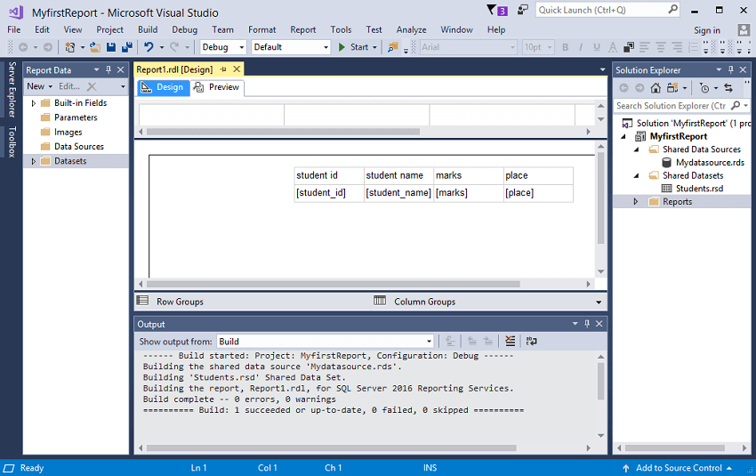
Preview tab shows how the report looks like before it gets published. Step 20: Click on the Preview tab. In the Preview tab, we can view our report as shown in the below screenshot 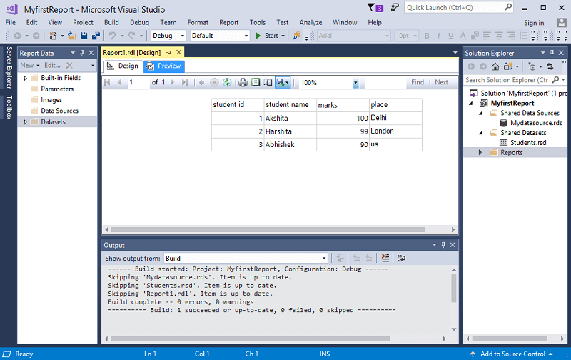
How to create the Matrix reportStep 1: Create the data source same as we created in the Tablix report. Step 2: Create the dataset in the same way we created in Tablix report. Step 3: Right-click on the Reports and add a new item. When you click on the New item, the screen appears which is shown below: 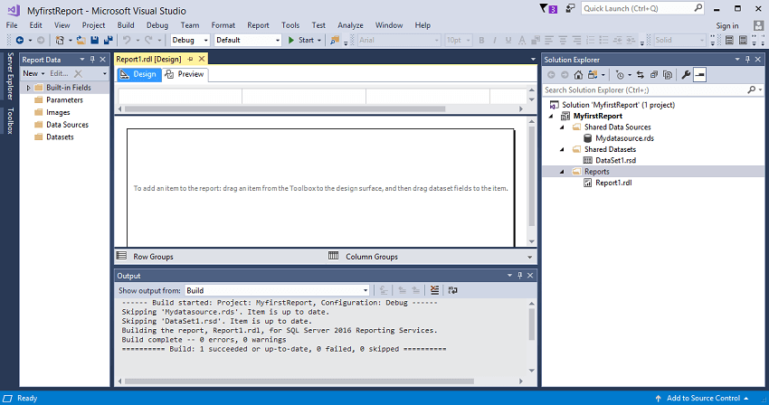
Step 4: Right-click on the Report workspace, select the insert option and then click on the Matrix. 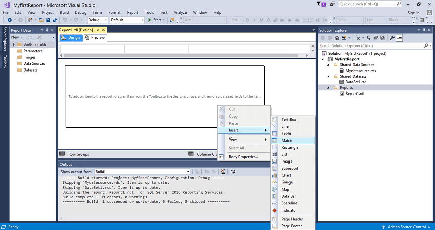
Step 5: Now, I add the two fields of a student table (student name and city) in a matrix report. 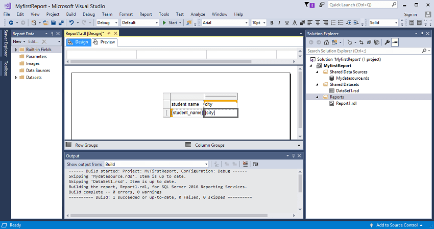
Step 6: Now, I want to group the students based on their countries, so I drag the country column from the Datasets and add it to the blue line shown in the below screenshot: 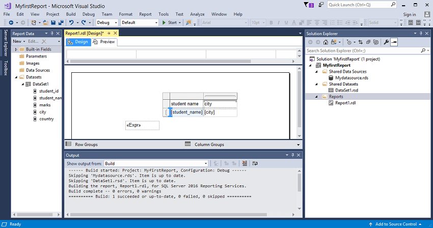
Step 7: After adding the country column to the Report, the design would appear as shown below: 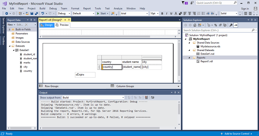
Step 8: Click on the Preview tab. 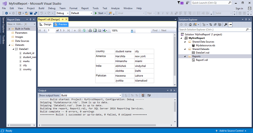
The above screen shows that students are categorized with respect to their countries. So, we conclude that the matrix report is used when classification is required. How to create chartsStep 1: I created a new table, i.e., employee having three fields, i.e., employee_id, employee_name, and gender in SQL Server. Now, we need to create a new data source in a similar way we created in other reports. Step 2: Create a new dataset. Step 3: Add a new item in Reports. Step 4: Right-click on the Report workspace, select the insert option and then click on the Charts. 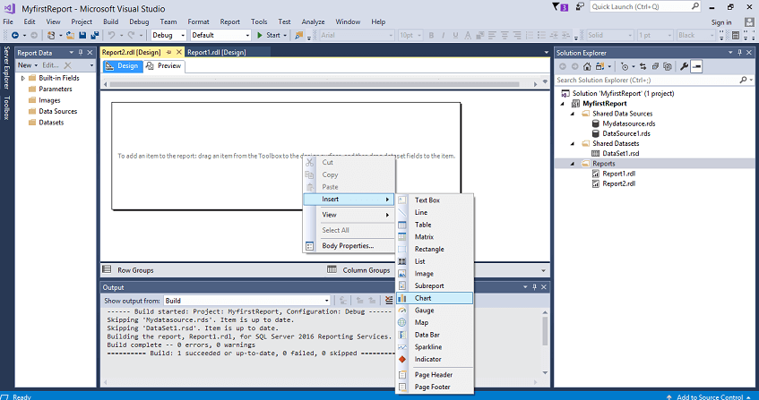
Step 5: Choose the chart type. 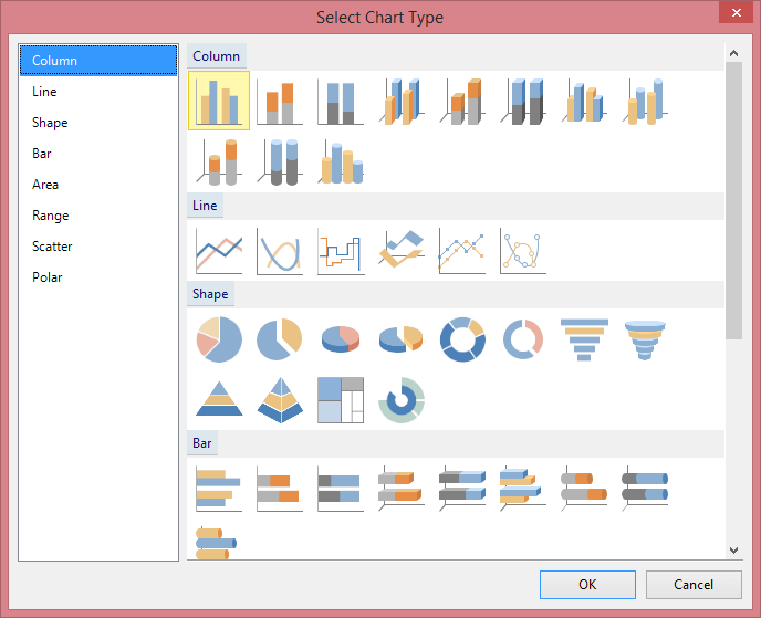
I selected the Pie chart. Step 6: When you select the pie chart, the screen appears, which is shown below: 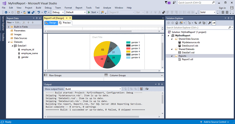
Step 7: Add the gender column to the categories group and values in the chart data. 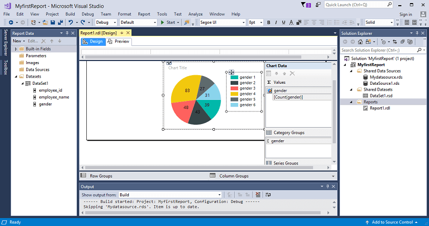
Step 8: Click on the dropdown icon of the gender and select the show data labels option. 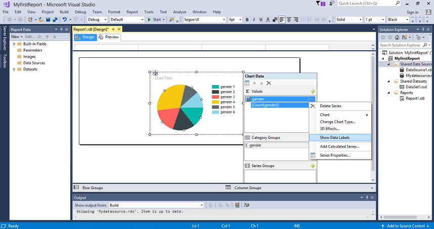
Step 9: Click on the Preview tab to view the Report. 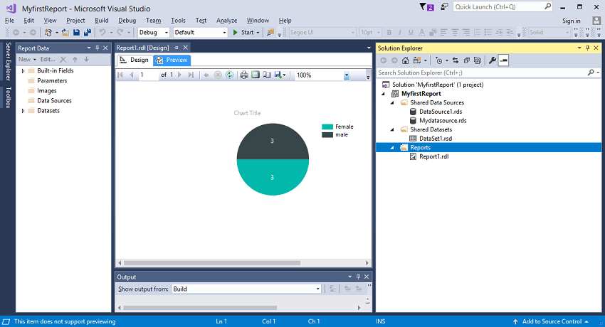
In the above screen, the pie chart shows that 3 are males and 3 are females. PrerequisiteBefore learning SSRS, you should have a basic understanding of SQL Server and Visual Studio. AudienceOur SSRS Tutorial is designed to help beginners and professionals. ProblemsWe assure that you will not find any problem in this SSRS Tutorial. But if there is any mistake, please post the problem in a contact form. |
 For Videos Join Our Youtube Channel: Join Now
Feedback
- Send your Feedback to [email protected]
Help Others, Please Share


