 |

Angular Material (MAT) Form-FieldIntroductionThe <mat-form-field> is a component that is used to wrap multiple MAT components and implement common text field styles of the form-field such as hint message, underlines, and floating label. These five MAT components are designed to work inside the form-field:
API reference for Angular Material form-field Example 1: Simple Form 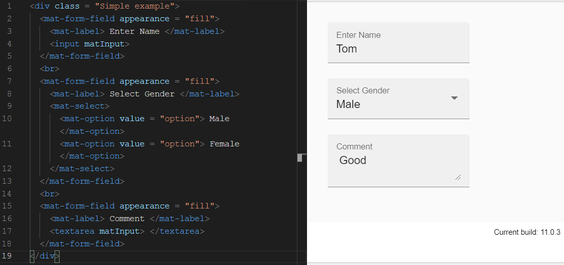
Form field appearance variantsThe <mat-form-field> supports four different appearance forms that can be set through appearance input.
Example 2: Form-field appearance variants 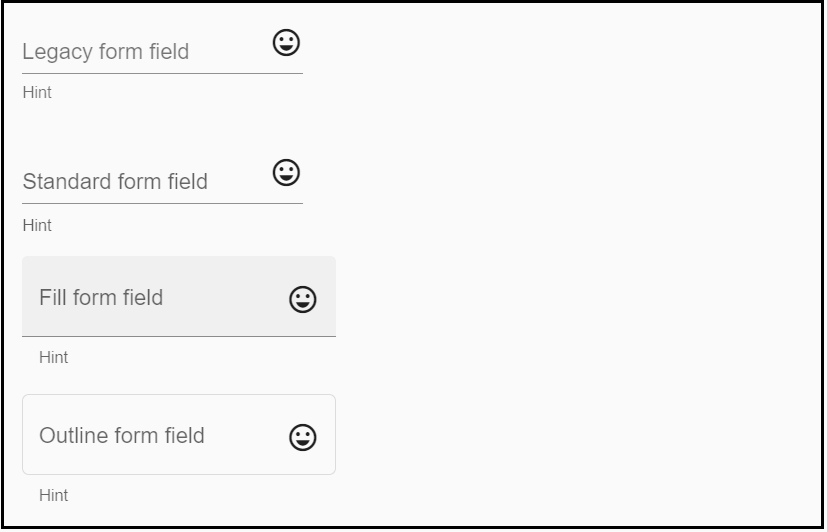
Hint labelsHint labels are additional descriptive-text that appears below the underline of the <mat-form-field>. It contains two hint labels: first start-aligned and the other end-aligned. Hint labels are specified in two ways.
When multiple hints are added to the same page, the probability of error on that page increases. Example 3: Form field with hints 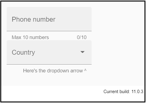
Error messagesThe error message can be shown under the form field by adding the <mat-error> module. The errors are initially hidden that is displayed on the invalid entry after the user interacts with the element, or the original form is submitted. If the form field can contain more than one error condition, it is up to the consumer to display which messages first. It can be done with ngSwitch, ngIf, or CSS. If required, multiple error messages may be displayed at the same time, but <mat-form-field> only has enough space to display one error message at a time. Example 4: Error message form 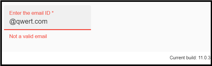
Theming and Font-SizeThe <mat-form-field> has a color-palette that can be set the color of the form fields. It sets the color of the form field based on your application's theme colors. The <mat-form-field> derives its font-size from its parent element. It can be overridden in a clear shape using CSS. Example 5: Form field theming and font-size HTML Code CSS Code: 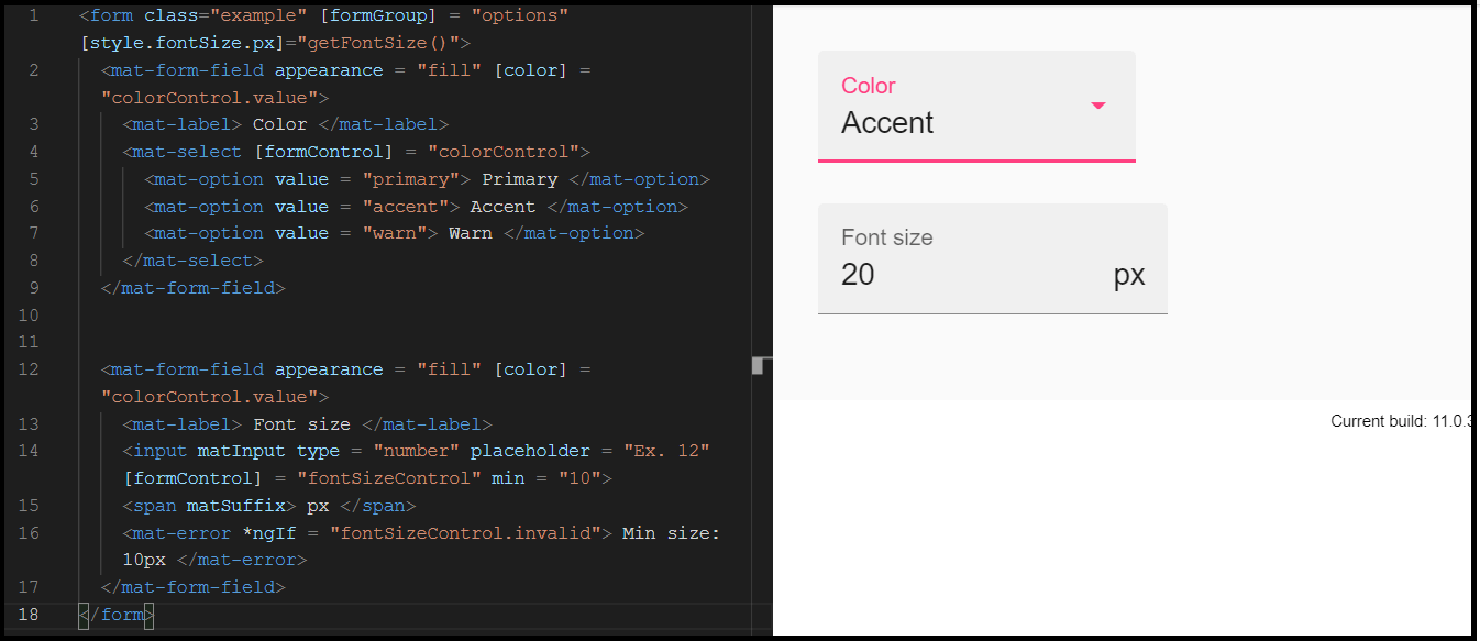
Prefix & suffixThe input of the text field can be included before and after the input tag, as a suffix or prefix. The text field view will be included within the container that wraps the form control according to the content specification. If you want to add a text-prefix element to the text field, you must use the matPrefix directive inside the <mat-form-field>. Similarly, if you want to add a text-suffix element to the text field, you must use the matSuffix directive inside the <mat-form-field>. Example 6: Prefix & Suffix form field 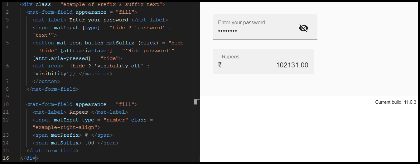
Next TopicResearch Tools
|
 For Videos Join Our Youtube Channel: Join Now
Feedback
- Send your Feedback to [email protected]
Help Others, Please Share


