 |

Toolbar in ComputerA toolbar is a horizontal or vertical row of clickable icons which perform specific application and operating system functions. Toolbars are normally found in word-processing applications, web browsers, websites and operating system. A Toolbar in a computer means a group of buttons or icons which are part of the open window or software program's interface. If a toolbar is a part of the software program's interface, then the toolbar normally sits directly under the menu bar. For example, a toolbar included in Adobe Photoshop permits us to adjust each selected tool's settings. If we select the paintbrush option, then the toolbar provides the options to change the size of the brush, flow and opacity. The toolbar included in Microsoft Word permits us to open, print, and save documents and we can also change the style, font and size of the text. Just like several programs, we can customize the Word toolbar by adding or deleting the options. We can also move the toolbar to the various portions of the screen. The toolbar may also exist in the open window. For example, in Mac OS X, every window contains a New Folder button, View Options, a Get Info button and back and forward buttons; we can also modify the toolbar of the Mac OS X window. A toolbar is also known as a standard toolbar or bar. A toolbar is defined as a row of boxes which is mostly present at the top of the application window and handles the functions of the software. The boxes frequently contain pictures that match the function they handle or control, as shown in the below image. 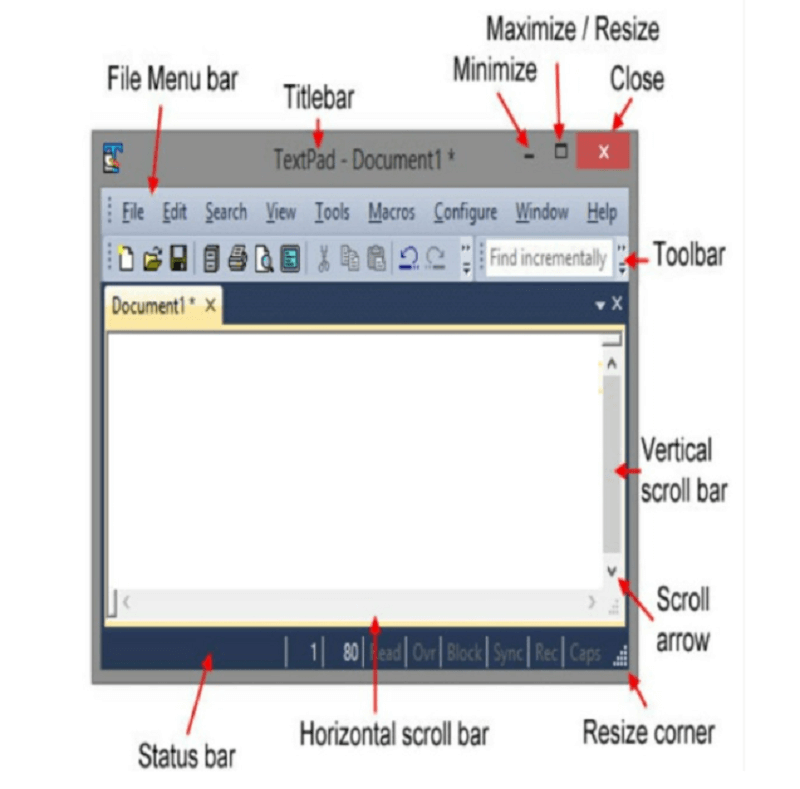
Common Computer Software ToolbarsThere are various common computer software toolbars:
1. App Bar: - The toolbar of Windows 8. 2. Bar chart: - A bar chart contains the horizontal or vertical bars. 3. Barcode: - A Barcode is a sequence of the line which recognizes a product, address or other information. 4. Bookmarks Bar: - A bookmark bar is the bar that displays often visited bookmarks or favorites. 5. Command Bar: - A command bar is the bar that shows the commands which are available in the program. 6. Formatting Toolbar: - A formatting toolbar is a toolbar that displays the options of text formatting. 7. Formula Bar: - Formula bar is the bar which is present in the spreadsheet program. With the help of the formula bar, we can edit the formula. 8. Menu Bar: - Menu Bar is present at the screen's top, and it gives access to other menus. 9. Navigation Bar: - Navigation Bar provides access to all the navigation features in the browser. 10. Places Bar: - Places bar comprises folders, like Desktop, Networks, History, Favorites, My documents and other custom shortcuts, which is helpful in file access. 11. Progress Bar: - A progress bar is a graphical control component that can be used to visualize the progression of an all-encompassing computer operation, for example, installation, download, etc. 12. Scroll Bar: - Scroll bar is used to scroll the page, and it is present at the screen's side or the bottom of the screen. 13. Split Bar: - A split bar is the bar which is used to split the windows into various parts. 14. Status Bar: - A status bar is present at the window's bottom. The Status bar displays status information. In other words, the status bar is defined as a graphical control component that represents a data region normally found at the window's bottom. It can be separated into segments to group information. Computer Hardware BarsThere are various types of computer hardware bars:
1. Port Bar: - A port bar is a bar through which we can connect our laptop or PC to other devices. 2. Spacebar: - Spacebar is a key on the keyboard which is used to create space. Floating ToolbarA floating toolbar is a toolbar which we can move around the screen. A floating toolbar is not like an old-style toolbar, which is fixed in one place. Different Types of Toolbars on a WindowThere are various types of toolbars on a window:
1. Application Toolbar: - Application toolbar is the toolbar that works like a Windows taskbar. The software programs use an application toolbar extensively. The application toolbar is anchored to section a window's edge that separates it from a palette, frequently a dialog box which appears with a right-click. Usually, the application toolbar contains buttons which provide access to other Windows, shortcuts or applications inside the program like "Update", "View", and "Home". 2. Quick Access Toolbar: - However the toolbars and menus were deleted by Microsoft in Office 2010 instead of "Ribbon," the Quick Access Toolbar is prominently still exist. A customizable toolbar, which we are able to find either above or underneath the Ribbon, is a bunch of our often-used commands. It doesn't make a difference on which ribbon the command is discovered; it generally shows up for your simple access. 3. Search Toolbar: - There are various search engines like Google, Bing, and Yahoo!, provide clients a toolbar in order to attach to the browser window's top. On the basis of the likings which we select, we can utilize the toolbar to rapidly search or access the features of the search engine which we liked including mail, news and climate. These types of toolbars also give us access to the functionality which is like various processing programs like "File", "Save", and "Edit". There are various browser toolbars which offer spam controls, email and instant message access. 4. Bookmarks Toolbar: - Called bookmarks in Firefox and Chrome and favorites in Internet Explorer, most of the browsers contain a spot to show often accessed bookmarks. At the point when we save a bookmark, we can select to put it on the bookmark bar, or we can move it there sometime in the future. Save websites, feeds and folders on the toolbar and organize them simply. A "Top choices" icon, for example, a star, is frequently included with the Bookmarks toolbar, offering us with simple access to the websites which we liked most. 5. Thumbnail Toolbar: - A thumbnail toolbar discovered solely in Windows 7 that gives immediate access to the window's key commands via an embedded toolbar in the thumbnail. In this toolbar, the limit of maximum buttons is seven. It is just accessible if the designer of the application has comprised the feature of the toolbar; it is not a toolbar which you can decide to show. Is this the Right User Interface?To decide this, consider the following questions: 1. Are the Commands Well Represented by the Icons?Generally, rather than text labels, icons are used to represent the toolbar buttons (even though various toolbar buttons use both), while in order to represent the menu commands, text is used. If command icons are not self-explanatory and high quality then the menu bar is a good choice. 2. Are there a Small number of Frequently used Commands?Like menu bars, the toolbar cannot handle many commands, so it works well to proficiently access a small number of efficiently used commands. 3. Is the Window a Primary Window?For primary windows, the toolbar work well but if we talk about secondary windows, it is generally heavier. For secondary windows, menu buttons, command buttons and links are used. Toolbars vs. Menu BarsIn the following ways, toolbars are different from menu bars:
Usage Patterns of ToolbarsThere are various usage patterns of toolbars:
1. Primary Toolbars: - Primary toolbars are the toolbars which are designed to work without a menu bar, either removed or hidden. 2. upplemental Toolbars: - The toolbars which are created to work with a menu bar are known as supplement toolbars. 3. Toolbar Menus: - Toolbar menus are the toolbars which contain commands mainly split buttons, and menu buttons with only some direct commands. 4. Customizable Toolbars: - The toolbars which can be customized by the users are known as customizable toolbars. In customizable toolbars, users can add or remove toolbars, modify the location and size of the toolbars. 5. Palette Windows: - It is a modeless dialog box which presents an array of commands. The palette windows are the unlocked toolbars. Toolbars have the following styles:
1. Unlabeled Icons: - Unlabeled icons style is used when the program is used frequently, or there are various buttons to the label. With unlabeled icons style, programs with complex usefulness can have numerous rows, and consequently, this style is the only style which should be modifiable. Using this style, if some command buttons are frequently used then it can be labeled. 2. Large Unlabeled Icons: - Large unlabeled icons is a row of large unlabeled icon buttons. We can utilize this style for easy utilities, which are simply identifiable icons and commonly run-in small windows. 3. Labeled Icons: - Labeled icons is a row of small labeled icons. This style is used if there are only few commands or if the program is not used often. In this style there is always one row. Labeled icons are also used in those toolbars which contains some buttons where each button may have a text label. 4. Partial Toolbars: - Partial toolbars are a partial row of small icons which is used to save space if the complete toolbar is not needed. For Windows, we can use this style with a search box, navigating buttons and tabs to remove unnecessary weight at the Window's top. 5. Large Partial Toolbars: - In this style, there is a partial row of large icons and in order to save a space it is used, if the complete toolbar is not required. We can utilize this style for easy utilities, which contains navigation buttons and a search box in order to remove needless weight at the Window's top. Toolbar controls have various usage patterns:
1. Command Icon Buttons: - When we click on the command button, it will take instant action. 2. Mode Icons Buttons: - Clicking a mode enters the selected mode. 3. Property Icon Buttons: - The status of the property button indicates the status of the presently selected objects, if any. The alteration to the selected objects is applied by clicking on the button. 4. Labeled Icon Buttons: - Labeled icon buttons are used for those toolbar buttons which are not self-explanatory enough and are frequently used. 5. Menu Buttons: - The menu buttons are a common button that is used to present a small group of relevant commands. 6. Split Buttons: - Split button is a command button which is used to consolidate command variations particularly if some command is used frequently. 7. Drop-Down Lists: - It is used to display and modify a property. Toolbar's Controls and Commands1. Select direct controlsUse the buttons of the toolbar in the following sequence:
2. Select the most often used commandsFor Primary Toolbars, Give Complete Commands The primary toolbar does not need to be completely like the menu bars, yet they need to give all the commands that are not promptly searchable somewhere else. The commands are not required for the primary toolbar:
For Supplemental Toolbars, Offer Commands Which are Used Most Often: Menu bar commands are those commands which are the superset of the toolbar's commands. Therefore, we do not need to give it all. Concentrate on the fast, appropriate access of the command and rest of others are skipped.
Next TopicTransformer MCQ
|
 For Videos Join Our Youtube Channel: Join Now
Feedback
- Send your Feedback to [email protected]
Help Others, Please Share


