 |

User Interface DesignUser interface design is also known as user interface engineering. User interface design means the process of designing user interfaces for software and machines like a mobile device, home appliances, computer, and another electronic device with the aim of increasing usability and improving the user experience. The aim of user interface design is to make user experiences as easy as possible while still being successful in achieving user goals (user-centered design). A well-designed user interface design makes it easier to complete the task in hand without drawing needless attention to itself. Graphic design and typography are used to influence its utility by influencing how the consumer interacts with it and improving the design's aesthetic appeal. Design aesthetics can increase or decrease the user's ability to use interface's functions. The design process should balance technical functionality as well as visual elements (for example, mental model) in order to build a system that is not only operational but as well usable and adaptable to evolving user requirements. Interface design is used in various projects, including computer systems, commercial planes, automobiles; many of these projects include many of the same basic human interactions, but they often include certain special skills and experience. Consequently, whether it is software design, industrial design, user research or web design, designers prefer to specialize in those types of projects and have skills- based around their experience. Choosing Interface ComponentsUsers have become aware of interface components acting in a certain manner, so try to be predictable and consistent in our selections and their layout. As a result, task completion, satisfaction, and performance, will increase. Interface components may involve: 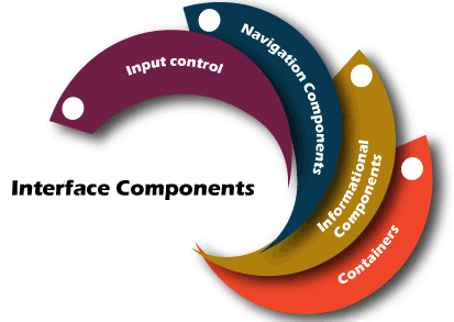
Input Controls: Input Controls involve buttons, toggles, dropdown lists, checkboxes, date fields, radio buttons, and text fields. Navigational Components: Navigational components contain slider, tags, pagination, search field, breadcrumb, icons. Informational Components: Informational Components contain tooltips, modal windows, progress bar, icons, notification message boxes. Containers: Containers include accordion. Many components may be suitable to display content at times. When this happens, it is crucial to think about this trade-off. For example, sometimes, components that may help you space, place more focus on the user, forcing them to guess what the dropdown is or what the element might be. Best Practices for Designing an InterfaceIt All starts with getting to know your users, which contains understanding about their interests, abilities, tendencies, and habits. If you have figured out who your customer is, keep the following in mind when designing your interface:
Create Consistently and Use Common UI ComponentsUsers would feel more at ease and be able to complete tasks more easily if we use common components in our UI. It's also important to generate pattern in language, design, and layout across the website in order to help with productivity. If a user has mastered one ability, they should be able to apply it to others areas of the website. Use Typography in Order to Make Hierarchy and ClarityThink about how we are going to use the typeface. Text in various sizes, fonts, and arrangements in order to help increase readability, legibility, and scanability. Make Sure that the System Communicates What's HappeningAlways keep your user up to date on their change in state, location, errors, actions, etc. Using various UI components to communicate status and, if needed, the next steps will help your user feel less frustrated. Use color and Texture StrategicallyUsing contrast, light, color, and texture to our benefit, we can draw attention to or draw attention away from objects. Keep the Interface SimpleMostly the great interfaces are not visible to the user. They avoid needless components and use simple terminology on labels and in messaging. Be Purposeful in Page LayoutTake into account the spatial associations between the objects on the page and organize the page on the basis of importance. Carefully positioning objects can aid scanning and readability by drawing attention to the most appropriate pieces of information. Designing User Interfaces for UsersUser interfaces are the points of interaction between the user and developer. They come in three different types of formats:
1. Graphical User Interface (GUIs) In the Graphical user interface, the users can interact with visual representations on the digital control panels. Example of GUI, a computer's desktop. 2. Gesture-Based Interfaces In gesture-based interfaces, users can interact with 3D design spaces by moving their bodies. Example of Gesture-Based Interfaces, Virtual Reality (VR) games. 3. Voice-Controlled Interfaces (VUIs) In, Voice-controlled interfaces (VUIs), users can interact with the help of the voice. Example of Voice-Controlled Interfaces (VUIs), Alexa on Amazon devices, and Siri on iPhone. User Interface Design ProcessesThe user-interface design necessitates an in-depth understanding of user requirements. It primarily focuses on the platform's requirements and user preferences. There are several stages and procedures of user interface design, some of which are more demanding than others depending on the project. 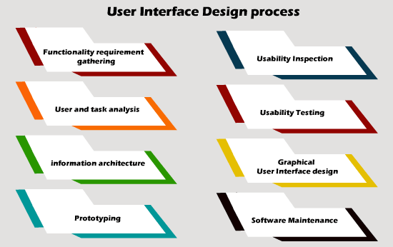
Functionality Requirements GatheringCreates a list of device functionalities that are needed to fulfil the user's project goal and specification. User and Task AnalysisIt is the kind of field research. It is the research of how the system's potential users perform the tasks that the design would serve, and perform interviews to learn more about their goals. Typical questions involve:
Information ArchitectureProcess development or the system's information flow (means for phone tree systems, this will be a choice tree flowchart for phone tree systems, and for the website, this will be site flow that displays the page's hierarchy). PrototypingThe wire-frame's the development either in the form of simple interactive screens or paper prototypes. To focus on the interface, these prototypes are stripped of all look and feel components as well as the majority of the content. Usability InspectionAllowing an evaluator to examine a user interface. It is typically less expensive to implement as compared to usability testing, and in the development process, it can be used early. It may be used early in the development process to determine requirements for the system, which are usually unable to be tested on the users. There are various usability inspection procedures such as a cognitive walkthrough, which focuses on how easy it is for new users to complete tasks with the system for new users, pluralistic walkthrough, which involves a group of people step through a task scenario and discussing usability issues, heuristic evaluation, that uses a series of heuristic to find usability issues in the UI design. Usability TestingPrototypes are tested on a real user, often using a method known as think-aloud protocol, in which we can ask the user to speak about their views during the experience. The testing of user interface design permits the designer to understand the reception from the viewer's perspective, making it easier to create effective applications. Graphical User Interface DesignIt is the actual look and feel of the design of the final graphical user interface (GUI). These are the control panels and faces of design; voice-controlled interfaces contain oral-auditory interaction, while gesture-based interfaces users involve with 3D design spaces through physical motions. This can be based on findings developed during user research and refined to correct and usability problems found via the testing's results. This process typically includes some computer programming in order to validate forms, establish links, or perform a desired action, depending on the type of interface being developed. Software MaintenanceAfter a new interface is deployed, it may be necessary to perform routine maintenance in order to fix software bugs, add new functionality or fully update the system. When the decision is taken to update the interface, the legacy system will go through a new iteration of the design process. The stages of the interface life cycle will continue to repeat. User Interface Design RequirementsThe dynamic characteristics of a system are defined in terms of the dialogue requirements contained in 7 principles of part 10 of the ergonomics standard, the ISO 9241. This standard provides a system of ergonomic "principles" for the dialogue techniques along with the high-level concepts, examples, and implementations. The principles of the dialogue reflect the interface's dynamic aspects and mostly thought of as the interface's "feel." The following are the seven dialogue principles: 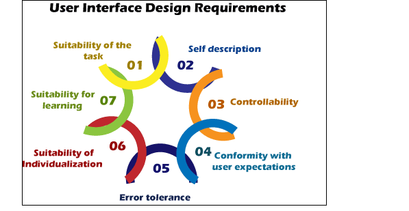
1. Suitability of the Task The dialogue is appropriate for the task when it helps the user in completing the task efficiently and effectively. 2. Self-Descriptiveness When each dialogue phase is instantly understandable due to system feedback or clarified to the user upon request, the dialogue is self-descriptive. 3. Controllability When the user is capable to initiate and monitor the course and speed of the interaction until the aim is achieved, then dialogue is controllable. 4. Conformity with User Expectations If the dialogue is reliable and corresponds to the characteristics of the user, like experience, education, task awareness, and generally accepted conventions, it conforms to user experience. 5. Error Tolerance If, despite obvious errors in input, the desired outcome can be accomplished with no or limited action from the user, then the dialogue is error-tolerant. 6. Suitability for Individualization If the interface software can be changed to meet the job needs, individual interests, and abilities of the user, the dialogue is able of individualization. 7. Suitability for Leaning The dialogue support for learning as it assists and guides the user in learning how to use the system. The ISO 9241 standard defines usability as the effective performance and the satisfaction of the consumer. The following is an explanation of usability found in Part 11.
Usability factors include effectiveness, efficiency, and satisfaction. In order to assess these factors, they must first be split into sub-factors and then into usability measures. Part 12 of the ISO 9241 standard specifies the organization of information such as alignment, arrangement, location, grouping, arrangement, display of the graphical objects, and the information's coding (colour, shape, visual cues, size, abbreviation) by seven attributes. The attributes of the presented information reflect the interface's static aspects and can be referred to as the interface's "look." The attributes are defined in detail in the standard's recommendations. Each of the seven qualities is supported by one or more of the recommendations. The seven-presentation characteristic are as follows:
The user guidance in part 13 of the ISO 9241 standard states that it should be easily distinguishable from other shown information and must be precise for the use of present context. The following five methods can be used to provide user guidance:
How to Make Great UIsRemember that the users are people with needs like comfort and a mental capacity limit when creating a stunning GUI. The following guidelines should be followed:
Principles of User Interface DesignThe following are the principles of user interface design: 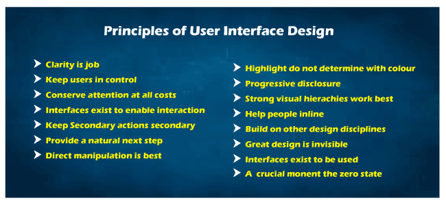
1. Clarity is JobThe interface's first and most essential task is to provide clarity. To be effective in using the interface you designed, people need to identify what it is, regardless of why they will use it, understand what the interface is doing in interaction with them. It assists them in anticipating what will occur as they use it. And then effectively interact with it in order to be effective. In interface, there is a space for mystery ad delayed gratification, but not for uncertainty. Clarity instils trust and encourages continued use. One hundred uncluttered screens are superior to one cluttered screen. 2. Keep Users in ControlHumans are most at ease when they have control of themselves and their surroundings. Unthoughtful software robs people of their comfort by dragging them into unexpected encounters, unexpected outcomes, and confusing pathways. Maintain user control by surfacing system status regularly, explaining causation (what will happen if you do this), and providing insight into what to expect at each turn. Don't be concerned with stating the obvious... the obvious rarely is. 3. Conserve Attention at All CostWe live in a world that is constantly interrupted. It is difficult to read in peace these days without anything attempting to divert our focus. Attention is a valuable commodity. Distracting content should not be strewn around the side of your applications… keep in mind why the screen exists in the first place. Allow someone to finish reading before displaying an advertisement if they are currently reading. If you pay attention, then your readers will be happier, and your performance will be higher. When the primary aim is to make something useful, paying attention is a must. Preserve it at all costs. 4. Interfaces Exist to Enable InteractionInteraction between humans and our world is allowed by interfaces. They can support, explain, allow, display associations, illuminate, bring us together, separate us, handle expectations, and provide access to service. Designing a user interface is not an artistic endeavour. Interfaces are not stand-alone landmarks. Interfaces perform a function, and their efficiency can be calculated. However, they are not just utilitarian. The best user interfaces can encourage, mystify, evoke and deepen our connection with the world. 5. Keep Secondary Actions SecondaryMultiple secondary actions may be added to screens with a single primary action, but they must be held secondary. Your article presents not so that individuals can post it on Twitter but so that people can read and comprehend it. Secondary action should be secondary by giving them a lighter visual weight or displaying them after the primary action is completed. 6. Provide a Natural Next StepFew interactions are intended to be the last, so consider designing the last move for every interaction used with your interface. Predict what the next interaction will be and design to accommodate it. Just as we are interested in human conversation, offer an opportunity for more discussion. Don't leave anyone hanging because they did what you wish them to do…. Provide them with a natural next move that will assist them in achieving their objectives. 7. Direct Manipulation is BestThere is no need for an interface if we can directly access the physical objects in our universe. We build interfaces to help us interact with objects because this is not always easy, and objects are becoming increasingly informational. It is simple to add extra layers than required to an interface, creating overly-wrought buttons, attachments, options, graphics, windows, preferences, chrome, and other cruft, causing us to manipulate the interface. Instead of focusing on what matters, UI components ae includes, rather go back to your target of direct manipulation…design an interface with the smallest possible footprint while recognizing as many natural human movements as possible. In an ideal world, the interface is so light that the user feels as though they are directly manipulating the object of their focus. 8. Highlight, Don't Determine, with ColourWhen the light changes, the colour of the physical object changes. In the full light of day, we see very different tree outlines against a sunset. As in the real world, where colour is a multi-shaded object, colour does not decide anything in an interface. It can be useful for highlighting and directing focus, but it should not be the only way to distinguish objects. Using light or muted background colours for prolonged screen time, saving brighter hues for accents. Of course, there is a time and place for bright or vibrant background colours; just make sure they are suitable for the target audience. 9. Progressive DisclosureOn each screen, just show what is needed. If people must make a decision, give them sufficient information in order to make that decision, then go into more details on a subsequent screen. Avoid the popular trap of over-explaining or showing all at once. Defer decisions to subsequent screens wherever possible by gradually revealing information as needed. Your experiences would be clearer as a result of this. 10. Strong Visual Hierarchies Work BestWhen the visual elements on a computer are arranged in a simple viewing order, it creates a powerful visual hierarchy. This means when users consistently see the same objects in the same order. The weak visual hierarchies offer some guidance related to where one should gaze and relax and feel disorganized and confused. It is difficult to maintain a clear visual hierarchy in fast-changing environments because visual weight is relative; if nothing is bold or everything is bold. If a single visually heavy element is included in a screen, then the designer has to reset the visual weight of all other elements in order to achieve a strong hierarchy once more. 11. Help People InlineHelp is not needed in ideal interaction because the interface is usable and learner. The step below that, fact, is one in which assistance is inline and contextual, accessible only when and where it is required and concealed at all other times. When you ask people to go help and find an answer to their question, you are putting the responsibility on them to understand what they want, rather than incorporate assistance where it is needed. Only make sure it is not in the way of people who are already familiar with your interface. 12. Build on Other Design PrincipleVisual and graphic design, visualization, typography, information architecture, and copywriting all of these disciplines are the part of the interface design. They may be briefly discussed or trained in. Don't get caught up in turf battles or dismiss other disciplines; instead, take what you need from them and keep moving forward. Incorporate ideas from apparently unrelated fields as well… what can we learn from bookbinding, publishing code, skateboarding, karate, firefighting? 13. Great Design is InvisibleThe interesting thing about good design is that it usually goes unobserved by the people who use it. One reason for this is that if the design is effective, then the user will be able to concentrate on their own objectives rather than the interface…They are happy when they achieve their goal and do not essentially reflect on the condition. As a designer, this can be difficult since we receive less praise when our work is successful. Great designers, on the other hand, are comfortable with a well-used design and understand that satisfied users are always silent. 14. Interfaces Exist to be UsedInterface design, like most design disciplines, is effective when people use what you have created. Design fails if people choose not to utilize it, just like a beautiful chair which is painful to sit in. As a result, interface design can be more related to building a user-friendly experience as it is about designing a useful artifact. It is not sufficient for an interface to fulfil the designer's ego: it has to be used! 15. A Crucial Moment: The Zero StateThe first time a user interacts with an interface is critical, but designers often ignore it. It's better to plan for the zero state, or the state where nothing has happened yet, to great support our users get up to speed with our designs. This is not supposed to be a blank canvas…it should give you direction and point you in the right direction for getting up to speed. The initial context is where much of the friction of contact occurs…people have a much better chance of succeeding once they grasp the rules. Mistakes to Avoid in UI DesignThe following are the mistakes that we have to avoid in UI design:
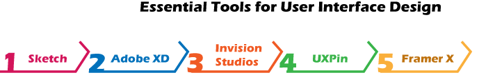
Essential Tools for User Interface DesignThere are various essential tools for user interface design:
1. SketchIt is a user design tool mainly used by numerous UI and UX designers to design and prototyping mobile and web applications. The Sketch is a vector graphics editor that permits designers to create user interfaces efficiently and quickly. 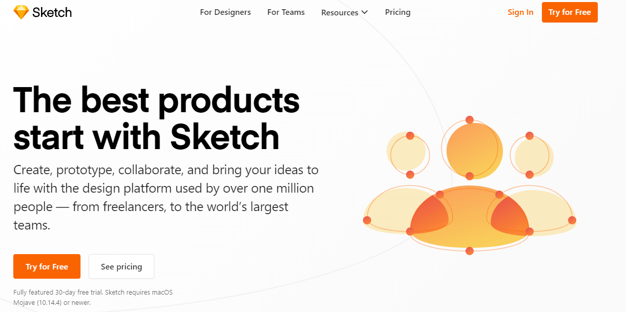
There are various features of Sketch:
2. Adobe XDIt is a vector-based tool. We use this tool for designing interfaces and prototyping for mobile applications as well as the web. Adobe XD is just like Photoshop and illustrator, but it focuses on user interface design. Adobe XD has the advantage of including UI kits for Windows, Apple, and Google Material Design, which helps designers create user interfaces for each device. 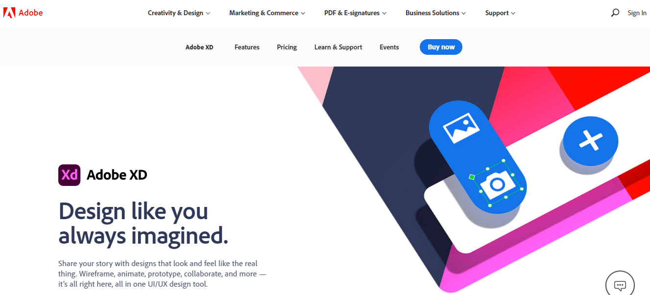
Features of Adobe XD There are various features of Adobe XD:
3. Invision StudiosIt is a simple vector-based drawing tool with design, animation, and prototyping capabilities. Invision studios is a relatively new tool, but it has ready demonstrated a high level of ambition through its numerous available functionalities and remarkable prototyping capabilities. The ability to move and open files from sketch to Invision is an added benefit, allowing you to create more immersive user interfaces than you could with sketch alone. 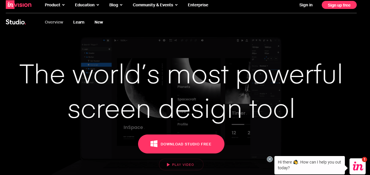
Features of the Invision Studios There are various features of Invision studios:
4. UXPinAnother amazing tool for the design user interface is UXPin that comes with the abilities of designing and prototyping. In contrast to other user interface tools, this tool is recommended to be a better fit for large design teams and projects. UXPin also comes with UI element libraries which give you access to Material Design, iOS libraries, Bootstrap, and variety of icons. 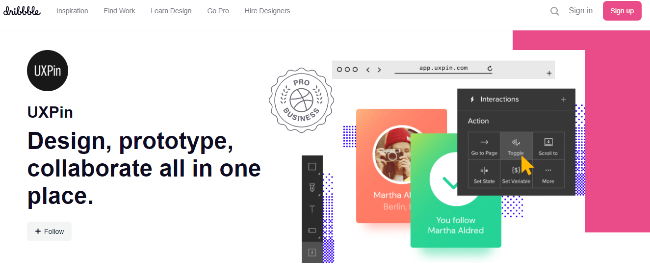
Features of UXPin There are various features of UXPin:
5. Framer XFramer X was released in 2018. It is one of the newest design tools which is used to design digital products from mobile applications to websites. The interesting feature of this tool is the capability to prototype along with the advanced interactions and animations while also integrating the code's components. The React.js users feel that they are able to design and code on the same platform. Furthermore, Framer X allows users to build highly realistic prototypes that can be used to show clients or stakeholders the final product. 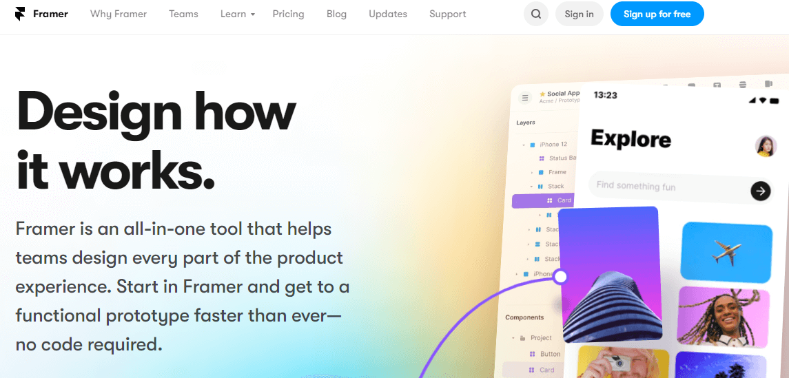
Features of the Framer X The following are the features of the Framer X:
Next TopicWhat is Project Report
|
 For Videos Join Our Youtube Channel: Join Now
Feedback
- Send your Feedback to [email protected]
Help Others, Please Share


