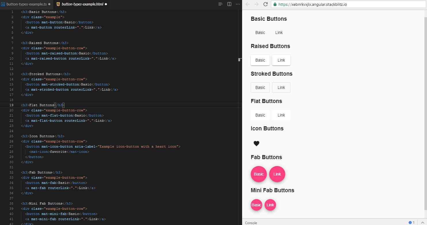
Angular Material (MAT) ButtonWhat is the MAT Button?The <mat-button> module enhances the user experience compared to normal buttons. The <mat-button> elements are always used to provide the most direct and accessible experience for users. When the user wants to perform an action in the web-page, it uses the <mat-button>. There are several types of buttons in angular material, and each button has its own specialty:
Themes of the button The background color can be set to Primary, Pronunciation, or Warning using the color property to reference the current theme of the button. Button Text Capitalization Material design requires capitalizing the spectral button text, although we have not opted to capitalize the button automatically via text-transformation:uppercase, as this can cause problems in some places. API reference for Angular Material button Example: All buttonsTS Code CSS Code HTML Code 
|
 For Videos Join Our Youtube Channel: Join Now
Feedback
- Send your Feedback to [email protected]
Help Others, Please Share


