 |

Angular Material (MAT) Card and PaginatorWhat is the MAT Card?<mat-card> is a content container for works, photos, and text about a subject. Basic card sections Basic card requires only the <mat-card> element with only some content. Although, it provides several preset sections that you can use inside <mat-card>:
<mat-card> works as pre-styled content without any additional APIs. Although, the align property can be used to perform actions at the 'start' or 'end' of a <mat-card-actions> container. Card headers The card header gives the ability to add a rich header to a card section. The header can contain all of these sections:
API reference for Angular Material card Example: Card with multiple sections HTML Code: TS Code: CSS Code: 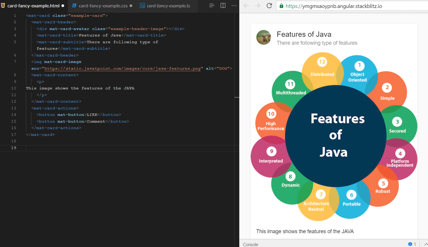
MAT Paginator<mat-paginator> provides navigation for page information, which is commonly used along with the table. Basic use of Paginator
The default value of the page index is 0, but it can be explicitly set via pageIndex. When the user interacts with Paginator, the PageEvent is fired because that PageEvent is used to update any related data views. Page size options It helps the user to display a dropdown page to select the option. This option can be set with the help of PageSize options. It allows you to change the following controls
Accessibility The aria-labels can be set for the first page, last page, previous page, and next page buttons in the <mat-Paginator>. API reference for Angular Material paginator Example of Configurable paginator HTML Code: TS Code: CSS Code: 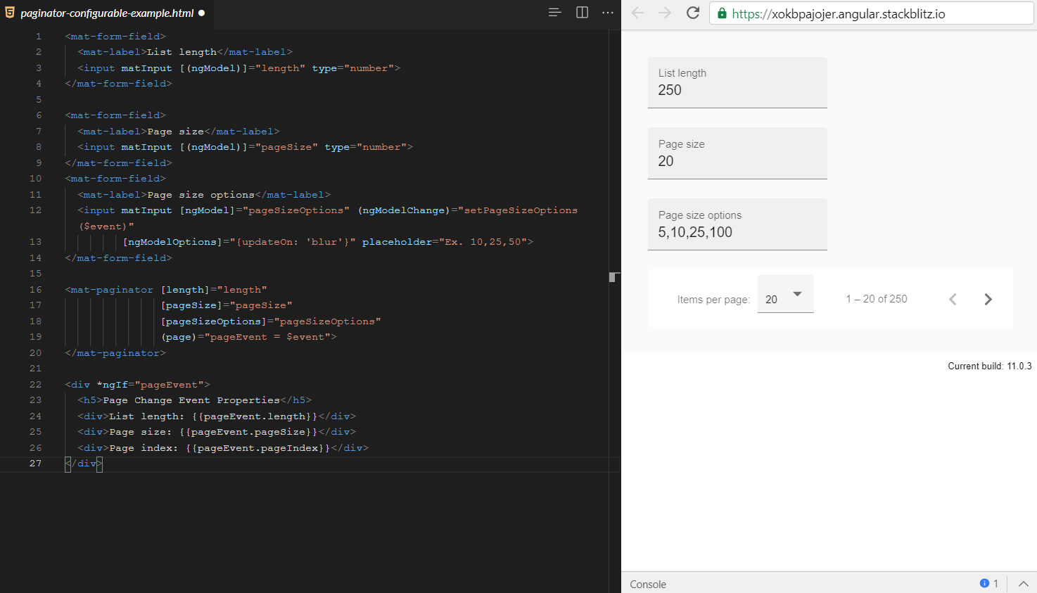
Next TopicMAT Date-picker
|
 For Videos Join Our Youtube Channel: Join Now
Feedback
- Send your Feedback to [email protected]
Help Others, Please Share


