 |

StackPanel ControlStackPanel puts the child element in the vertical and horizontal stack. StackPanel is the most popular panel. StackPanel is also known as simple panel. The child element of the StackPanel grows from top to the bottom in the vertical orientation. We will put the child elements by using the HorizontalAlignment or VerticalAlignment and will do the spacing by using the Margin and Padding property. Now we will create the Layout by using the StackPanel. Now we will write a code through which we will add the one textbox and 5 buttons to the StackPanel. StackPanel will arrange the elements from top to bottom by default. All the contained element inside the StackPanel will stretch itself upto the full width of the StackPanel. MainWindow.XAMLThe output of the stack panel is shown in the below screenshot: OUTPUT 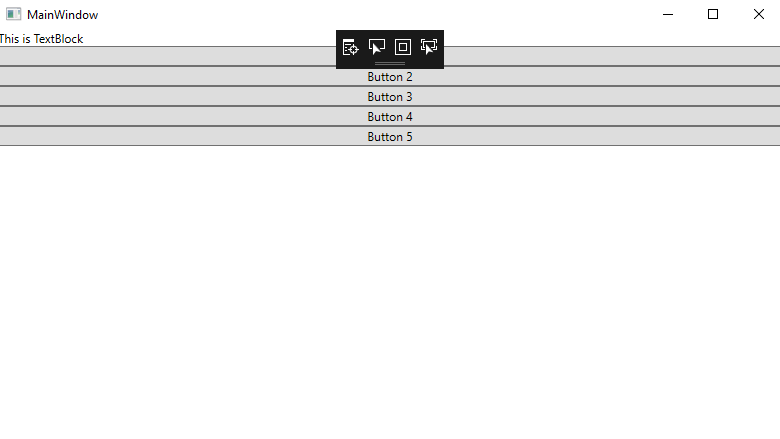
Example 2: Here we are going to take another example of the StackPanel where we will place the element in the StackPanel horizontally. Here we will arrange the child elements of the StackPanel horizontally after setting the orientation property to the horizontal. This time, the child elements will stretch itself upto the height of the StackPanel. For this, we will write the below code: MainWindow.XAMLHere is the output of the above code: OUTPUT 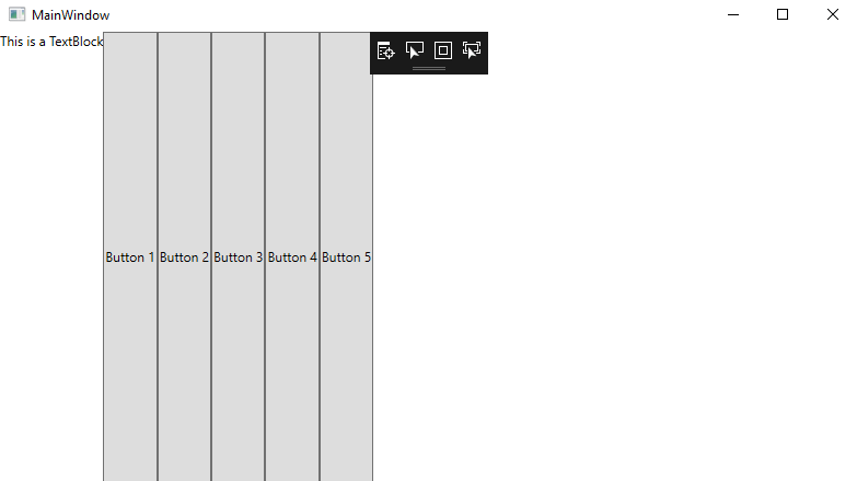
Example 3: Now we will change the FlowDirection property of the StackPanel. Now we will set FlowDirection property from RightToLeft of the StackPanel along with the horizontal orientation. Now stack the child element from RightToLeft. For this, we will write the below code to set the elements of the child in the horizontal from RightToLeft. MainWindow.XAMLOutput of the above code is shown in the below screenshot: OUTPUT 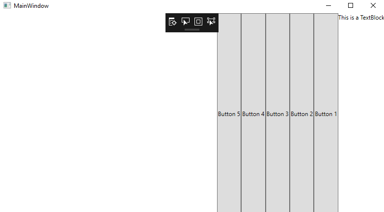
Example 4: Now, we will change the HorizontalAlignment property of child elements in the StackPanel. By default, the HorizontalAlignment property stretches the element upto the width of the StackPanel. Because of this the child element will stretch itself upto the full width of the StackPanel. We can change the HorizontalAlignment to the Right, Left, Center or Stretch. For this we will write the below code: MainWindow.XAML The output of the above code is as shown in below screenshot: OUTPUT 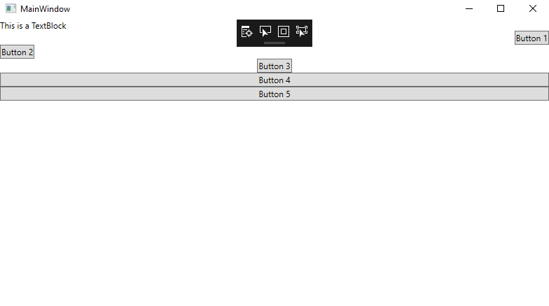
Example 5: Now we will change the vertical alignment property of the Child Elements in the StackPanel along with the Horizontal Orientation. For arranging the element in the verticalAlignment, we will write the following code: MainWindow.XAMLOUTPUT 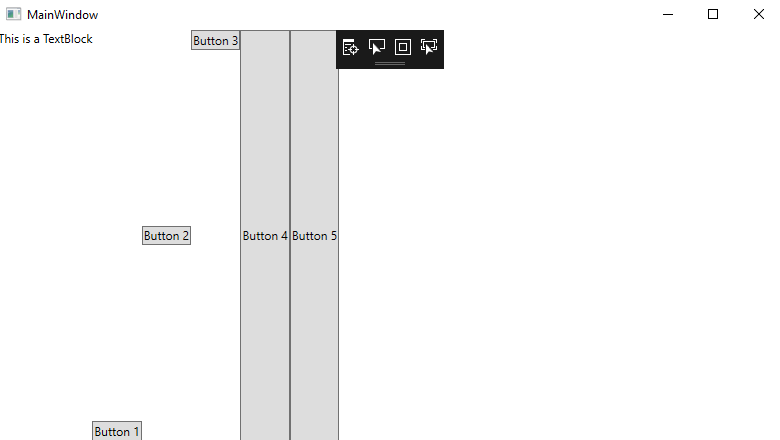
Example 6: Here we will take another example of the StackPanel which is Nested StackPanel.We call the StackPanel as a Nested Stack Panel when we use the StackPanel into the StackPanel. Here we are going to take the example of the NestedStack Panel where we will do the orientation of the outer StackPanel in vertical (which is default orientation) and the Inner StackPanel in the Horizontal orientation and the HorizontalAlignment is in the centre. Here we will write the below code for the NestedStackPanel: MainWindow.XAMLThe output of the NestedStackPanel is shown in the below screenshot: OUTPUT 
Wrap UpAs we have seen above, we have specified all the functionalities of the StackPanel. Alignment of element is done with the use of the Alignment property in the right, left, up, down with the use of the StackPanel.
Next TopicWPF DockPanel Layout
|
 For Videos Join Our Youtube Channel: Join Now
Feedback
- Send your Feedback to [email protected]
Help Others, Please Share


