 Home
Home CSS
CSS HTML
HTML XHTML
XHTML JavaScript
 Bootstrap
 jQuery
 PHP
PHP XML
XML JSON
JSON Python
 C++
C++ Java
Java C#
C# SQL
SQL Interview Q
CSS radial-gradient() functionIf you want to create an attractive background, you can do so with the help of a CSS function called radial-gradient(). The radial-gradient() is an in-built CSS function which generates smooth transitions between two or more colors. It sets the radial gradient as the background image. The radial-gradient() creates a radial effect. It can be a circular or elliptical shape. It saves bandwidth usage and helps reduce download time. In radial-gradient, the color emerges from a single point and then spreads outwards. Its center point and ending shape define a radial-gradient, and two or more color stops. Syntax:Let's discuss its arguments. 1. position: It defines the gradient position. Its default value is center. It can be specified in units (such as px, em, etc.) or keywords (like bottom, left, etc.). 2. shape: It defines the shape of the gradient, which can either be circular or elliptical. If its value is not specified, then it sets to its default value, i.e., ellipse. 3. size: It defines the gradient size. It can be either a length value (for example, 60px, 2em, 45%, etc.) or it can be the following possible values:
Its default value is farthest-corner. 3. [at position]: It is an optional part that defines the position of the gradient's centre. Its default value is the It can be specified in length values (such as 45px, 5em, 25%, etc.) or keywords (like bottom, left, etc.). 4. [start-color, …, last-color]: It holds the list of color stops that define the colors and their positions in the gradient. Each color stop consists of a color value followed by an optional stop position. Examples of CSS Radial-Gradient() FunctionLet's try to understand the radial-gradient() function by some illustrations. Example 1:In this example, we will use the radial-gradient() function to set an HTML element's elliptical radial gradient background. Code: Output: As you can see in the output below, the background image of the HTML elements is set to elliptical and circular radial-gradient. 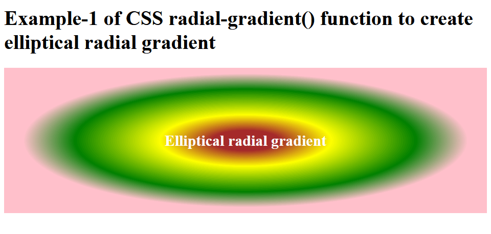
Example 2:In this example, we will set the shape of the radial gradient of an HTML element. Code: Output: As you can see in the output below, the background image is set to a circular radial gradient. 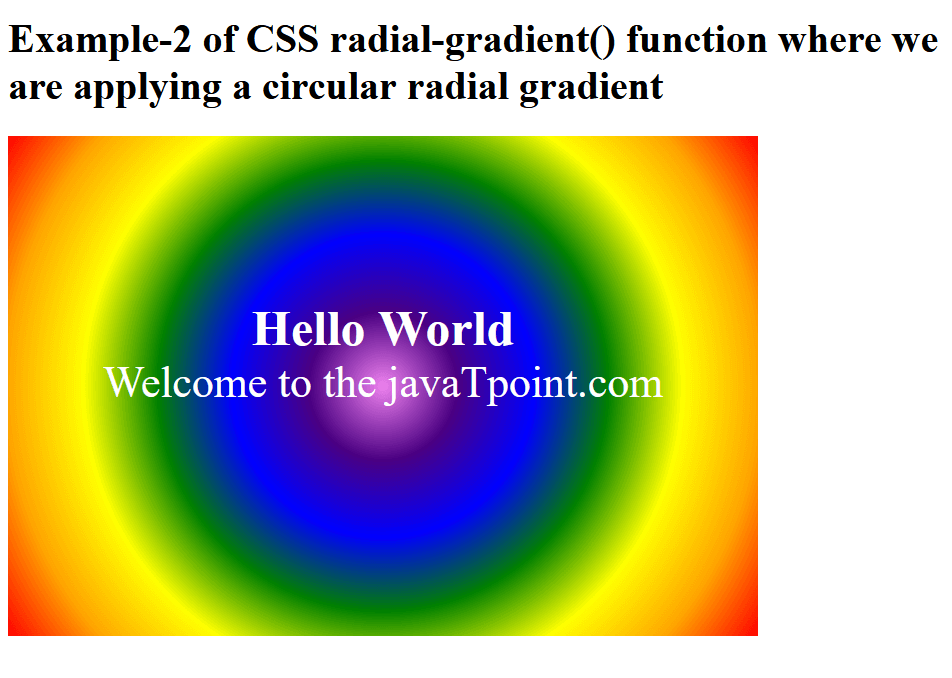
Example 3:In this example, we will set the size of the radial gradient of the HTML elements to the farthest side. Code: Output: 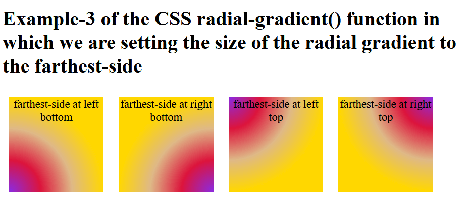
Example 4:In this example, we will set the size of the radial gradient of the HTML elements to the farthest corner. Code: Output: 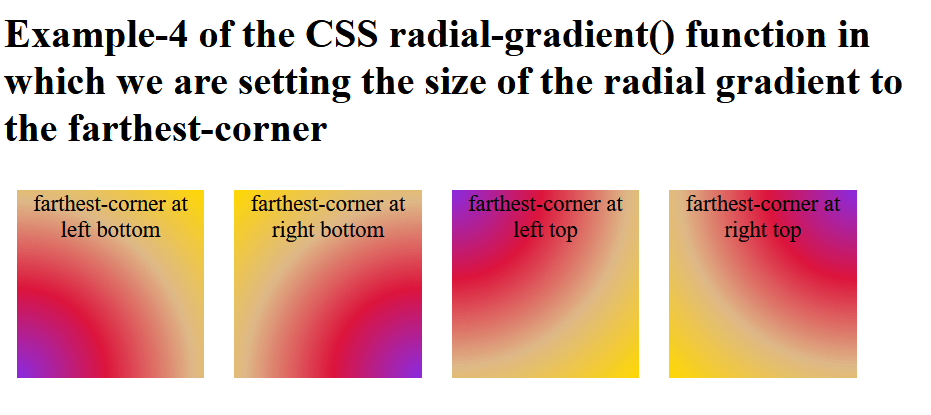
Example 5:In this example, we will set the size of the radial gradient of the HTML elements to the closest side. Code: Output: 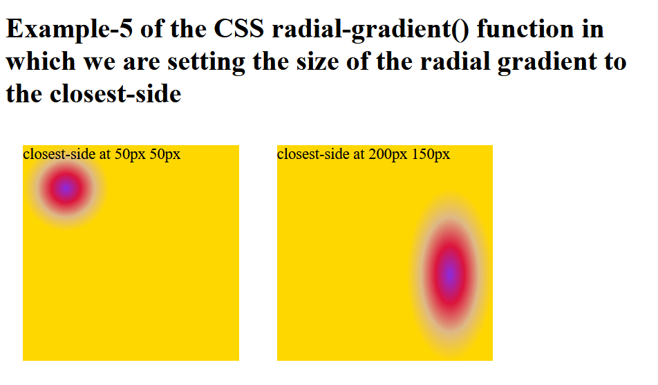
Example 6:In this example, we will set the size of the radial gradient of the HTML elements to the closest corner. Code: Output: 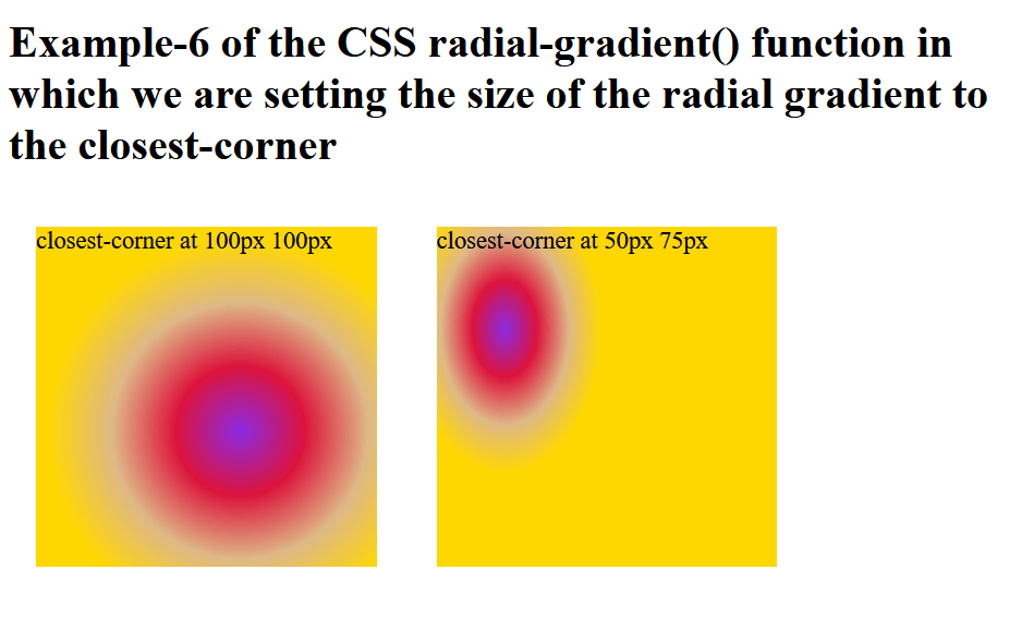
Example 7:In this example, we will set the size of the radial gradient of the HTML elements to the farthest side, farthest corner, closest side, and closest corner. Code: Output: 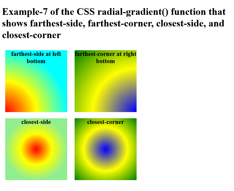
Browsers Support:
ConclusionIn this article, you have understood the CSS radial-gradient() function with examples that you can use to enhance the background of an HTML element.
Next TopicCSS translate
|
 For Videos Join Our Youtube Channel: Join Now
Feedback
- Send your Feedback to [email protected]
Help Others, Please Share


