 Home
Home CSS
CSS HTML
HTML XHTML
XHTML JavaScript
 Bootstrap
 jQuery
 PHP
PHP XML
XML JSON
JSON Python
 C++
C++ Java
Java C#
C# SQL
SQL Interview Q
CSS Transform OriginThis CSS property is used to change the position of transformed elements. It is a point around which the transformation is applied. It establishes the origin of the transformation of an element. It can be applied to both 2D and 3D rotations. The transform-origin property must be used with the transform property. The 2D transformation can change the x-axis and y-axis of the element, whereas the 3D transformation can change the z-axis along with the x-axis and y-axis. This property can be specified by using one, two, or three values. The first value affects the horizontal position, the second value affects the vertical position, and the third value indicates the position of the z-axis. The third value can also work on 3D transformations and cannot be defined using a percentage. If we specify only one value, the value must be a length or percentage or one of the keyword values left, center, right, top, and bottom. If we specify two values, the first value must be a length or percentage or the keyword values left, right, and center. The second value must be a length or percentage or one of the keyword values center, top, and bottom. When we specify three values, then the first two values are the same as the two-value syntax, but the third value represents the z-offset, so it must be a length. The transform-origin property's default value is 50% 50%, which represents the center of the element. Note: If we want to use the transform-origin property, then the transform property is compulsorily utilized.Syntax:The transform-origin is the CSS property in the above syntax, and the values of this property are described in the form of a table, which is given below: The values of this property are tabulated as follows.
Let's understand this property by using some illustrations. Illustrations of 2D Transformation when Utilizing one ValueIllustration 1:We will utilize the transform-origin property and give one value to it in the form of length in pixels. We will give a rotation to the elements utilizing the transform property. Code: Output We can witness in the output below that the transform-origin property is applied utilizing one value in length. 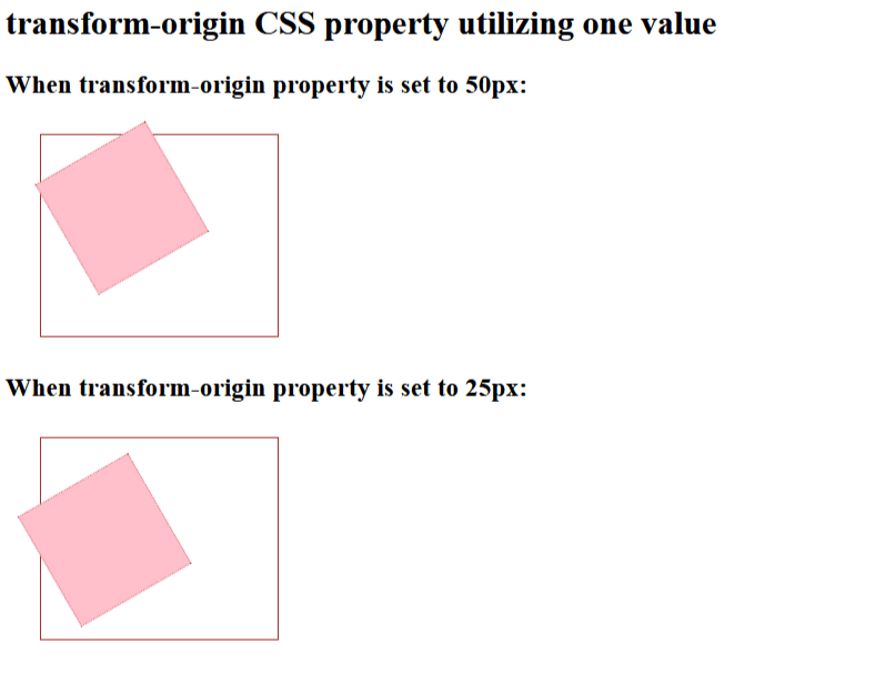
Illustration 2:We will utilize the transform-origin property and assign one value to it in the form of a percentage. We will give a rotation to the elements utilizing the transform property. Code: Output We can witness in the output below that the transform-origin property is applied utilizing one value in percentage. 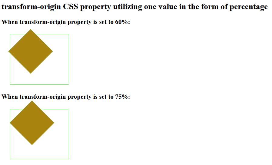
Illustration 3:We will utilize the transform-origin property and assign one value to it as a keyword. We will then rotate the elements utilizing the transform property. Code: Output Here is the output in which we can witness that the transform-origin property is applied utilizing one value as a keyword. 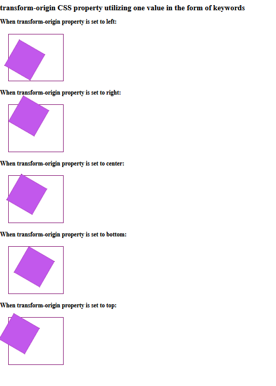
Illustrations of 2D Transformation when Using Two ValuesIllustration 1:We will be utilizing the transform-origin property and assign two values to it as length in pixels. Code: Output Here in the output given below, we can witness that the transform-origin property is applied by specifying two values, i.e., x-axis and y-axis values as length. 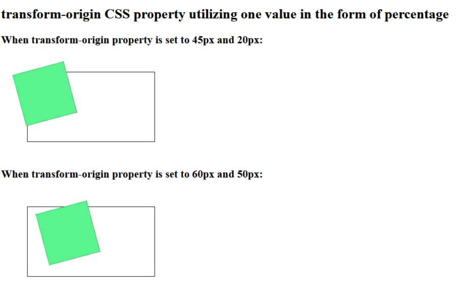
Illustration 2:We will utilize the transform-origin property and give two values to it in the form of percentages. Code: Output Here in the output given below, we can witness that the transform-origin property is applied by assigning two values, i.e., the x-axis and y-axis values in percentages. 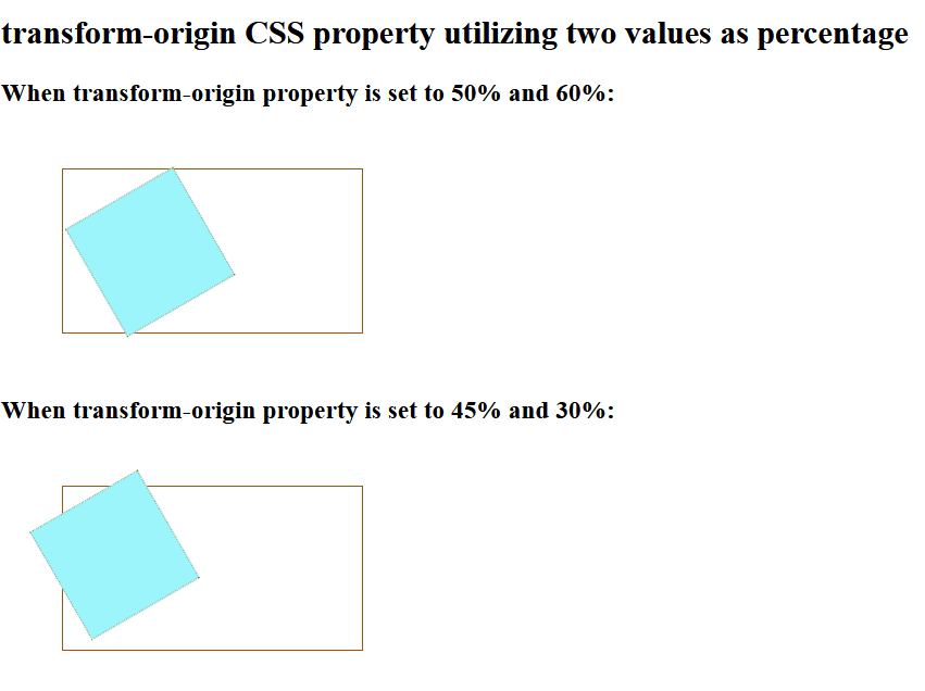
Illustration 3:In this illustration, we are applying the transform-origin property with keyword values to specify the position of elements. We will use the background of transform elements as an image. Code: Output Here in the output given below, we can witness that the transform-origin property is applied by specifying two values, i.e., x-axis and y-axis values in keywords. 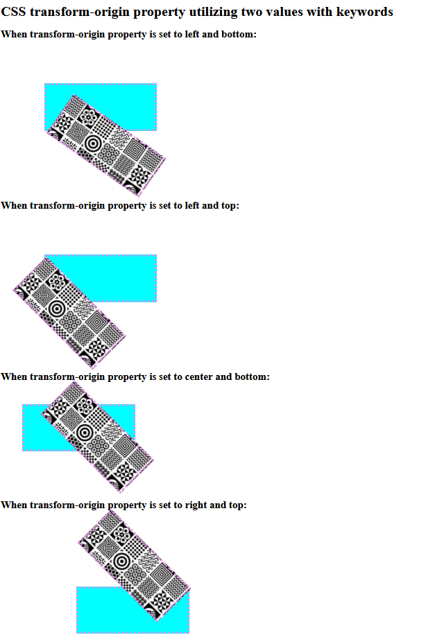
Illustrations of 3D TransformationNow, let's apply the transform-origin property on elements with 3D transformation. We have to utilize three values for 3D transformation. The first two values, i.e., the x-axis and y-axis, can be in length, percentage, or keywords, but the third value, i.e., the z-axis, must be in length only. Illustration 1:We will utilize the transform-origin property in this demonstration and specify three values in length. We will give a rotation3d() function value to the transform property for 3D transformation. Code: Output We can witness that the transform-origin property is applied by specifying three values, i.e., x-axis, y-axis and z-axis value in length. 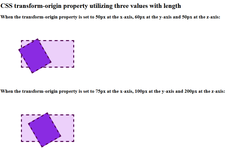
Illustration 2:In this illustration, we will utilize the transform-origin property and give the x-axis and y-axis values in percentage and z-axis values in length. We will also give the transform property a rotation3d() function value for 3D transformation. Code: Output We can witness that the transform-origin property is applied by specifying three values, i.e., x-axis & y-axis values in percentage and z-axis value as length. 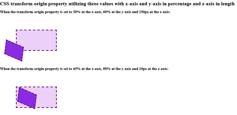
Illustration 3:We will utilize the transform-origin property in this illustration and give x-axis and y-axis values as keywords and z-axis values in length. We will give a rotation3d() function value to the transform property for 3D transformation. Code: Output
ConclusionThis article has taught us about the CSS transform origin. The transform-origin property specifies the origin of transformed elements. There are two kinds of transformations: 2D and 3D. The 2D transformation changes the x-axis and y-axis of the element, and the 3D transformation changes the x-axis, y-axis, and z-axis of the element.
Next TopicCSS resize
|
 For Videos Join Our Youtube Channel: Join Now
Feedback
- Send your Feedback to [email protected]
Help Others, Please Share


