 Home
Home CSS
CSS HTML
HTML XHTML
XHTML JavaScript
 Bootstrap
 jQuery
 PHP
PHP XML
XML JSON
JSON Python
 C++
C++ Java
Java C#
C# SQL
SQL Interview Q
Media Query CSS Min and MaxWe will discuss the media query CSS min and max in this article. Let us know about the media query first then we will comprehend the min and max. Media QueryIn CSS, the media query is a method that uses the @media rule for adding a block of CSS properties when certain conditions are satisfied. The media query is utilized to construct a web page that is responsive, which means the appearance of the web page varies in one system and varies in another system on the basis of the screen size because sometimes the screen can be of laptops, tablets, desktops, and mobile phones. The breakpoint is defined at which the content is to be deformed. When the width of the device matches the breakpoint, then the content is deformed. Syntax:The "not", "only" & "and" are the keywords. The "not" keyword is used to invert the media query, and the "only" keyword is used to stop the older browsers from interpreting the wrong meaning of the media query if older browsers are not able to understand it. The "and" keyword is used to combine mediatype and expressions. The media query contains a media type and has one or more expressions that become true or false based on the conditions. The value of media type can be "all", "print" and "screen". The "all" is utilized for all media type devices. The "print" is utilized for preview mode. The "screen" is utilized for screens of tablets, laptops, desktops, and smartphones. When the media expressions match the conditions, then the result of the media query is true, and a change in the content is applied. When the media expressions do not match the conditions, then the result of the media query is false, and the content remains the same. Demonstration of Media Query:Let us comprehend the media query with the help of an example. Code: Output: When the full-size screen is opened then, the background color is light blue, and the text color is a darker shade of blue. 
When the max-width is 850px, then the background color and text color are different, as we can witness below: 
When the max-width is 550px, then the background color and text color are different, as we can witness below: 
Min-Width:It is utilized to specify the minimum width of an HTML element. Syntax: The min-width is a CSS property, and the length is the value, which can be in px, cm, etc. Max-Width:It is utilized to define the maximum width of an HTML element. Syntax: The max-width is a CSS property, and length is the value, which can be in px, cm, etc. Min-Height:It is utilized to describe the minimum height of an HTML element. Syntax: The min-height is a CSS property, and the length is the value, which can be in px, cm, etc. Max-Height:It is utilized to specify the maximum height of an HTML element. Syntax: The max-height is a CSS property, and length is the value, which can be in px, cm, etc. We will utilize min-width, min-height, max-width and max-height for creating a responsive web page. Illustrations of Media Query Min-width, Min-height, Max-width, and Max-heightWe will comprehend the media query min-width and max-width with the help of illustrations. Illustration 1:In this demonstration, we will use min-width and max-width. We will add the email links, which will change their appearance when the screen size is changed. Code: Output: When the min-width is 650px, and the max-width is 900px, then the output is given below: 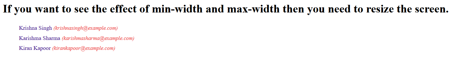
When the min-width is 901px, then the output is given below: 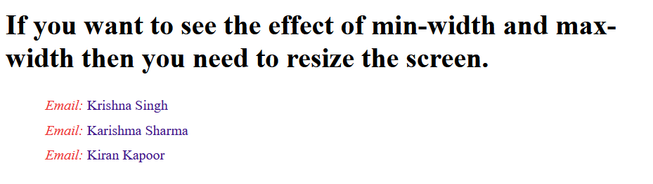
Otherwise, the output will look as given below: 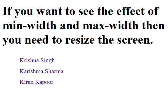
Illustration 2:We will construct a list in this demonstration and change the font size of the list when the screen size is changed using min-width and max-width. Code: Output: When the min-width is 550px, then the font-size of the list becomes 24px. 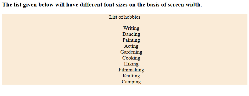
When the max-width is 850px, then the font-size of the list becomes 16px. 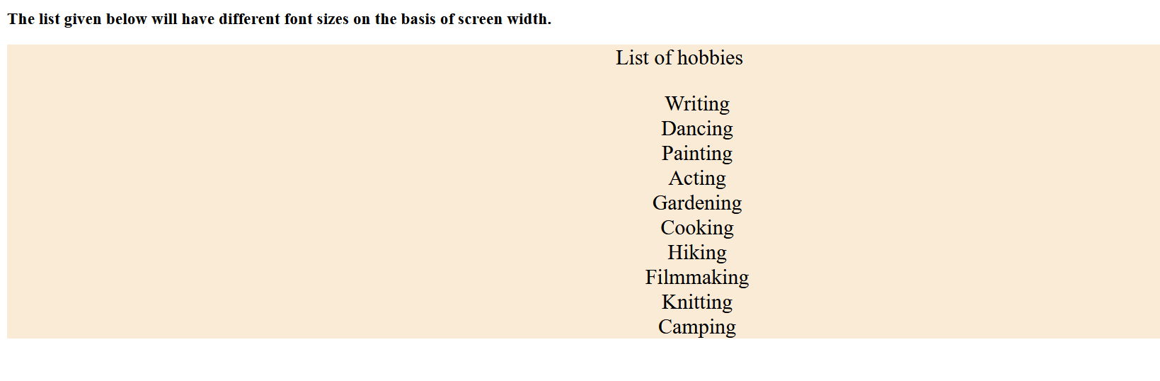
Illustration 3:When the screen size is changed, we will change the background color of the web page utilizing min-height and max-height. Code: Output: When the min-height is 850px, then the output is given below: 
When the max-height is 650px, then the output is given below: 
Illustration 4:We will add the image in this illustration and change the size of the image when the screen size is changed utilizing min-height and max-height Code: Output: When the min-height is 500px, then the width of the image is set to 600px, and the height of the image is set to 300px; the output is given below: 
When the max-height is 700px, then the width of the image is set to 450px, and the height of the image is set to 250px; the output is given below: 
Illustration 5:In this illustration, we will construct a table and change the text color of the table when the screen size is changed utilizing min-width and max-width. Code: Output: When the min-width is 550px, then the color of the text in the table is set to blue, and the output is given below: 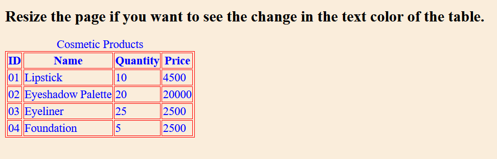
When the max-width is 1400px, then the color of the text in the table is set to blue-violet, and the output is given below: 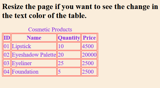
Illustration 6:We will construct a submit button in the form in this illustration and change its size when the screen is resized utilizing min-width and max-width. Code: Output: When the max-width is 1200px, then we can witness the size of the button in the output given below: 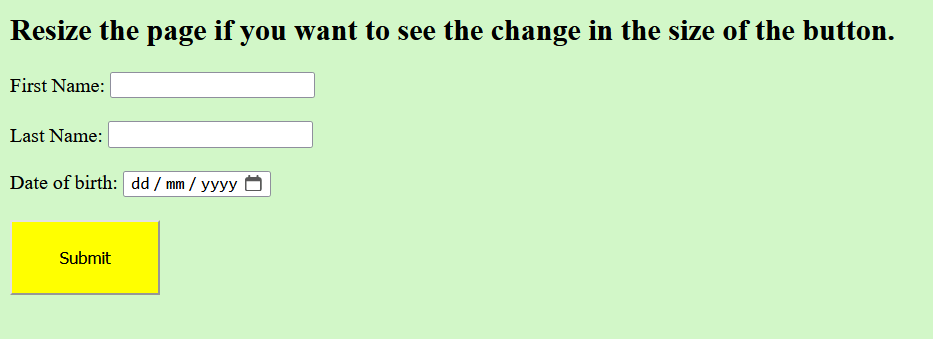
When the min-width is 750px, then we can witness the size of the button in the output given below: 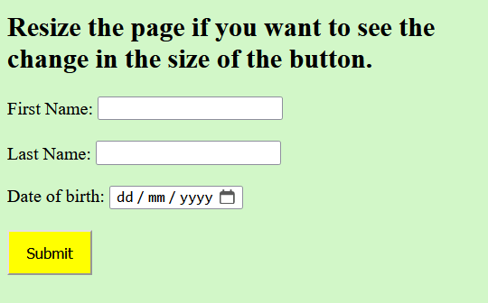
Illustration 7:In this illustration, we will construct a grid layout and change its appearance when the screen is resized utilizing min-width and max-width. Code: Output: When the min-width is 650px, then the grid-template-columns CSS property is set to show two columns, and the output is given below: 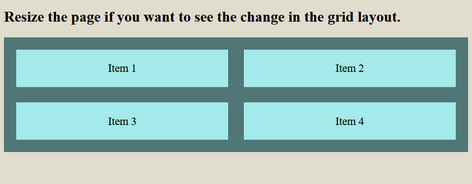
When the max-width is 1350px, then the grid-template-columns CSS property is set to show one column, and the output is given below: 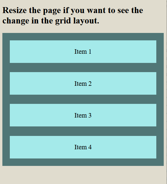
Browser Support:Following are the browsers that support media queries:
ConclusionWe have understood the media query CSS min and max in this article. We have understood min-width, min-height, max-width, and max-height with the help of demonstrations.
Next TopicSearch Bar CSS
|
 For Videos Join Our Youtube Channel: Join Now
Feedback
- Send your Feedback to [email protected]
Help Others, Please Share


