 Home
Home CSS
CSS HTML
HTML XHTML
XHTML JavaScript
 Bootstrap
 jQuery
 PHP
PHP XML
XML JSON
JSON Python
 C++
C++ Java
Java C#
C# SQL
SQL Interview Q
VW in CSSWhat is VW?VW is the abbreviation for viewport width. It is the unit that signifies the percentage of the viewport width. If we set the element's width as 1vw, it means 1 percent of the width of the viewport. In the same way, 25vw is equal to 25% of the width of the viewport. The screen size grows and shrinks with the help of the viewport width. The VW is a very useful unit because it helps in making a responsive webpage. If we set the element's unit in vw, then the width will be adjusted on the basis of the screen size. That means if the screen is of a computer, then vw will adjust according to the screen of the computer, and if the screen is of a tablet, then vw will adjust according to the screen of the tablet. Demonstrations of Utilizing the VW UnitWe will comprehend vw in CSS with the help of demonstrations. Demonstration 1:We will create a list in this demonstration and set the font-size of the <li> element in the vw unit. Code: Output: Here in the output we can witness a list of festivals. The font-size of the <li> element will be adjusted as per the size of the screen. 
Demonstration 2:We will create an inquiry form in this demonstration. We will set the font-size of the <label> element in the vw unit and we will set the height and width of the input elements utilizing the vw unit. Code: Output: Here is the result where we can witness an inquiry form. The font-size of the <label> element and height & width of the input elements will be adjusted on the basis of the size of the screen. 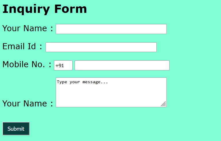
Demonstration 3:We will create two <p> elements in this illustration, and then we will define the font-size and height of Paragraph-1 in vw and define the font-size and width of Paragraph-2 in vw. Code: Output: Here is the output where we can witness paragraphs which will be adjusted on the basis of the size of the screen. 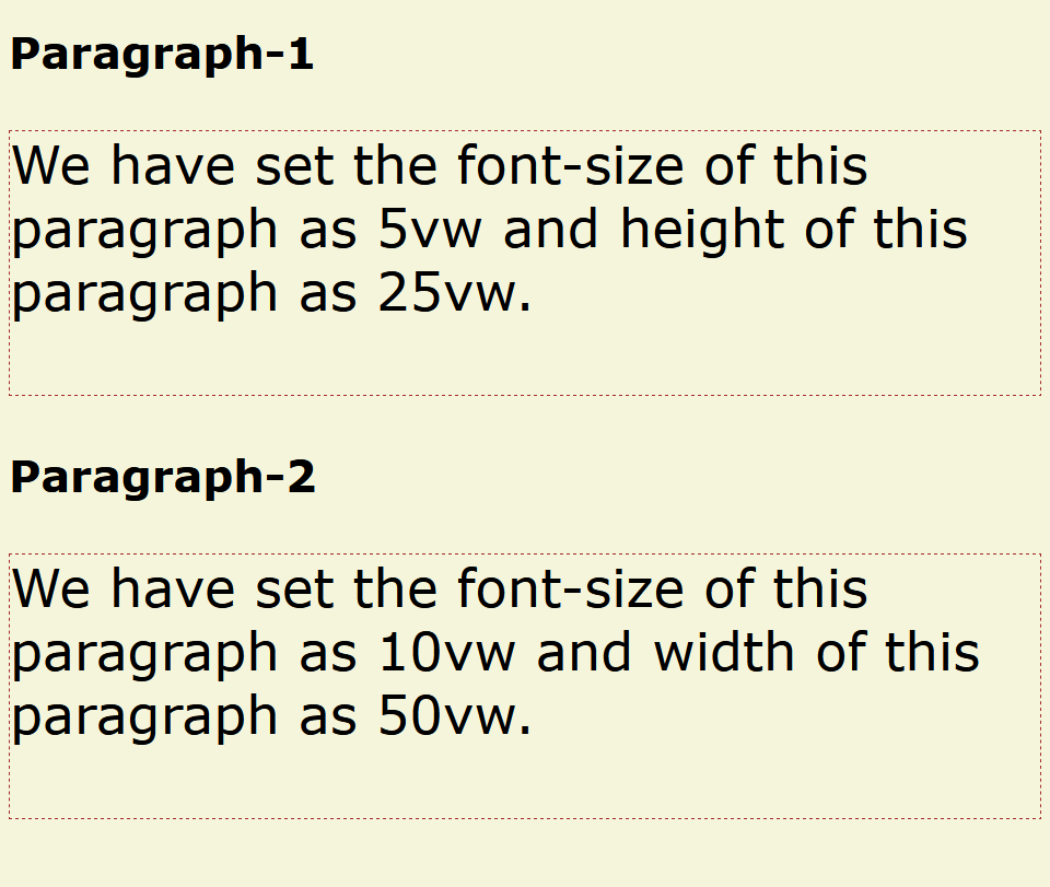
Demonstration 4:We will construct a table in this illustration and specify the font-size of the <table> element utilizing the vw unit. Code: Output: Here is the output where we can witness a table, and the font size of the <table> element will be adjusted as per the size of the screen. 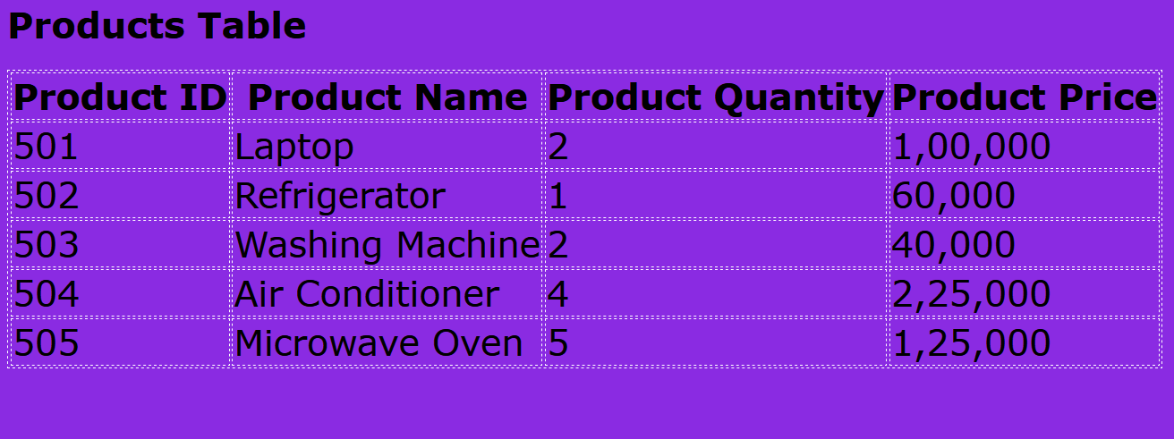
Demonstration 5:In this illustration, we will construct a grid and specify the padding and font size of the grid items in the VW unit. Code: Output: Here is the output in which we can witness a grid, and the padding & font size of the grid items will be adjusted as per the size of the screen. 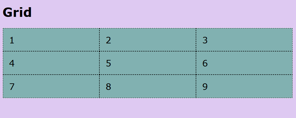
Demonstration 6:We will insert an image in this illustration and specify the height and width of the <img> element utilizing the vw unit. Code: Output: Here is the output where we can witness an image, and the height & width of the <img> element will be adjusted as per the size of the screen. 
Browsers Support:Following are the browsers that support viewport width (VW):
ConclusionIn this article, we have understood the VW in CSS through demonstrations. The VW denotes the percentage of the viewport width and helps create a responsive webpage.
Next TopicBEM CSS
|
 For Videos Join Our Youtube Channel: Join Now
Feedback
- Send your Feedback to [email protected]
Help Others, Please Share


