 |

Creating an Expansion Panel using Mean StackIn the previous section, we learned how to create a toolbar using angular material in the MEAN stack. We will now output the posts and will learn how we can create the expansion panel using the expansion component of angular material. We will use the following steps to create an expansion panel in our application: 1) We will create another new component for it because outputting a post is something that will be decoupled from creating a post. So, in the posts folder, we will create a new sub-folder named post-list. 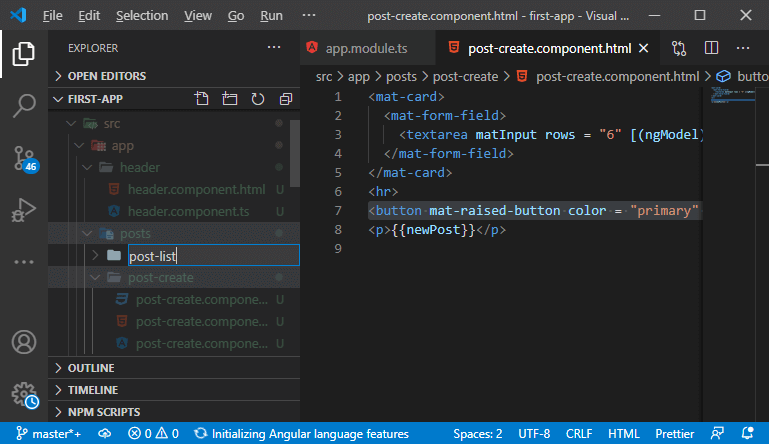
2) In this post-list sub-folder, we will add a post-list.component.ts file and post-list.component.html 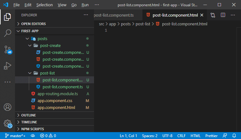
3) We will create a component. If you don't know how to create a component, then go through the https://www.javatpoint.com/adding-new-component-in-mean-stack link. 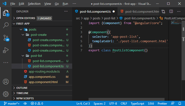
4) We know, we have to include it in the module.ts file. We will add the component in the declaration array and add it in the ngModule in the following way: 5) Now, we will use it in our component.ts file. We will add it below of the app-post-create in the main section in the following way: 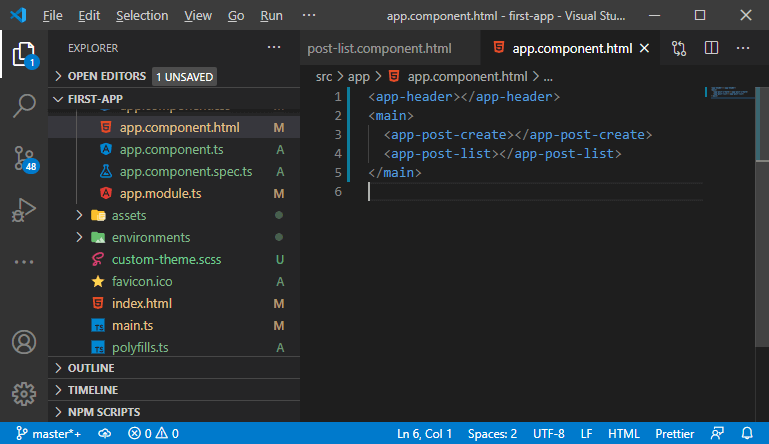
6) Our goal is to render a list of posts in it. So, we will go back to our post-create component and get rid of the ugly paragraph we created before in our application. 
7) We will use another feature of angular material, i.e., Expansion Panel, that is collapsible or panel where we can display some content. So, we will go back to our app module and import an additional module from angular material, i.e., MatExpansionModule, and add it into the import array. 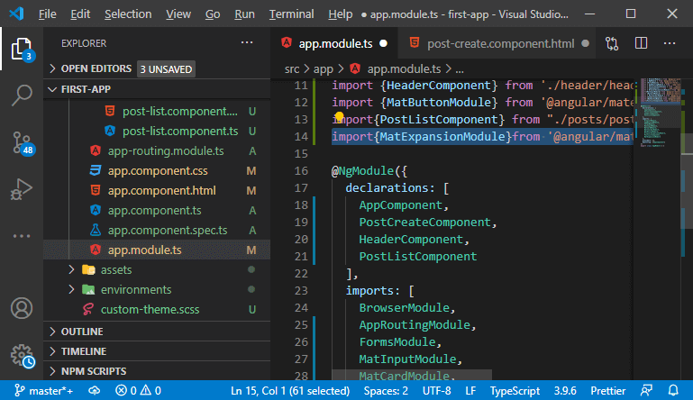
8) We will use such component in the post-list.component.html So, we will use the following line of code to create an expansion panel: In the above code, we have created a header for expansion panel using < mat-expansion-panel-header></mat-expansion-panel-header> element. But if we save it and run it, we will not see the expansion panel on the browser because we need to wrap it with the <mat-accordion> wrapper. So, When we save it, we will see an expansion panel on the browser like as: 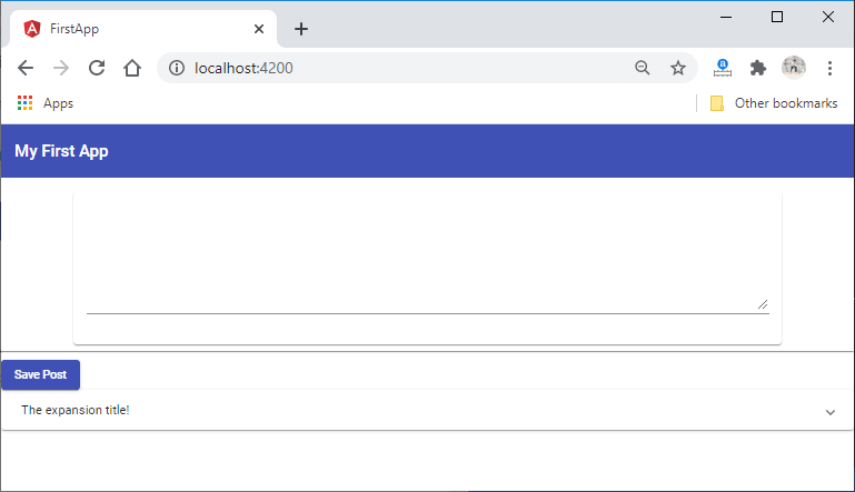
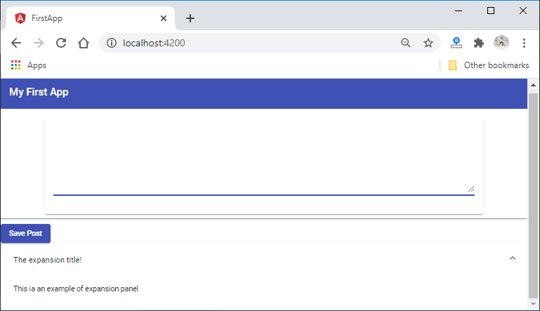
9) Here, the expansion panel is placed directly beneath the card, which looks not super pretty. So, we will restrict the width of it. We need to restrict the width of both the input and the expansion panel. So, we will restrict the width of the total main content. We will go to the post-create.component.css file, and from there, we will remove the CSS code of mat-card. After that, we will go to the component.css file and set the width to 80% and margin to auto in the following way: When we save it, we will see a pretty view of the expansion panel. 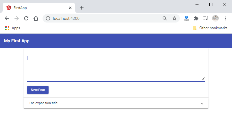
10) Now, we will create some spacing between our post-list component and the post-create component. We have multiple ways of achieving this, and one simple way is to add a margin-top to our post-list component. For this purpose, we will create a post-list.component.css file and import this into our post-list.component.ts file. 
11) Now, we will write the CSS code in the post-list.component.css We will use a special selector called host, which targets the element itself. We also need to set the display to block first because all the elements, by default, are not treated as block-level elements. We will write the CSS code in the following way: We will save it and see the spacing in the expansion panel item like: 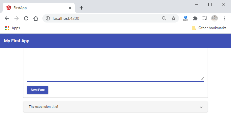
Next TopicUsing Structural Directives
|
 For Videos Join Our Youtube Channel: Join Now
Feedback
- Send your Feedback to [email protected]
Help Others, Please Share


