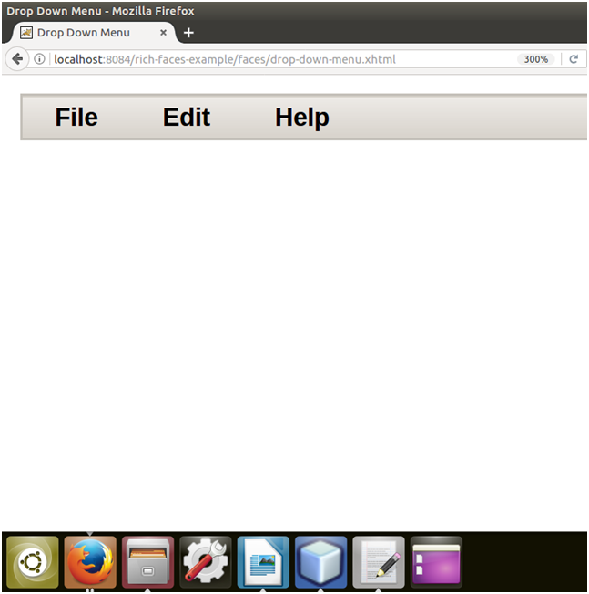
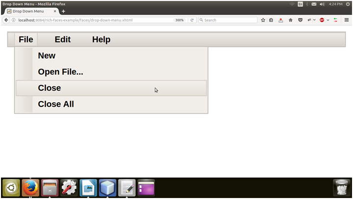
It is used to create a drop-down or a hierarchical menu. We can use it with the <rich:toolbar> component to create menus in an application's toolbar.
The following table contains the Style classes (selectors) and corresponding skin parameters for the dropDownMenu.
| Class |
Function |
Skin Parameters |
Mapped CSS properties |
| .rf-ddm-lbl |
It is used to define styles for the label of the drop-down menu. |
headerFamilyFont |
font-family |
| .rf-ddm-dis |
It is used to define styles for the drop-down menu when it is disabled. |
tabDisabledTextColor |
color |
| .rf-ddm-lbl-dis |
It is used to define styles for the label of the drop-down menu when it is disabled. |
headerFamilyFont |
font-family |
| .rf-ddm-pos |
It is used to define the positioning of the drop-down menu. |
No skin parameters. |
|
| .rf-ddm-lbl-unsel |
It is used to define styles for the label of the drop-down menu when it is unselected. |
No skin parameters. |
|
| .rf-ddm-lst |
It is used to define styles for the drop-down list. |
panelBorderColor
additionalBackgroundColor
|
border-color
background-color
|
| .rf-ddm-lst-bg |
It is used to define styles for the background of the drop-down list. |
additionalBackgroundColor |
border-color |
| .rf-ddm-sublst |
It is used to define the positioning of the menu when used as a sub-menu. |
No skin parameters. |
|
| .rf-ddm-itm |
It is used to define styles for a menu item. |
generalFamilyFont
generalSizeFont
|
font-family
font-size
|
| .rf-ddm-itm-sel |
It is used to define styles for a menu item when it is selected. |
tabBackgroundColor |
background-color |
| .rf-ddm-itm-unsel |
It is used to define styles for a menu item when it is unselected. |
No skin parameters. |
|
| .rf-ddm-itm-dis |
It is used to define styles for a menu item when it is disabled. |
tabDisabledTextColor |
color |
| .rf-ddm-itm-lbl |
It is used to define styles for the label in a menu item. |
generalTextColor |
color |
| .rf-ddm-itm-ic |
It is used to define styles for the icon in a menu item. |
No skin parameters. |
|
| .rf-ddm-emptyIcon |
It is used to define styles for an empty icon in a menu item. |
No skin parameters. |
|
| .rf-ddm-sep |
It is used to define styles for a menu separator. |
panelBorderColor |
border-top-color |
| .rf-ddm-nd |
It is used to define styles for a menu node. |
No skin parameters. |
|

 For Videos Join Our Youtube Channel: Join Now


