Splunk Create a basic chart in Splunk.
In this section, we are going to learn How to create the basic charts in the Splunk. We will also learn to visualize the chart, to create an overlay on the chart, format the X-axis and Y- axis and how to save the chart as a report.
In this example, we compare the counts of user actions by calculating information on the website of the online store that customers took on the action.
- The number of times it sees each product
- The amount of times each product has been added to our cart
- The number of sales on each drug
Prerequisite
This example requires the section Enabling field lookups field productName. Before proceeding with this section, we must complete all of those steps. Unless the field lookups aren't enabled, the searches won't show the right results.
Steps
- Start a new search.
- Set time to the All Time
- Run the following search.
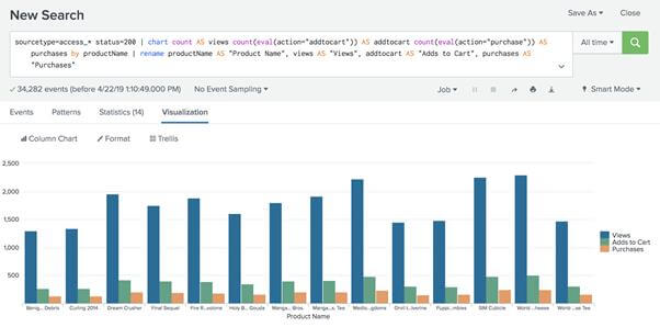
sourcetype=access_* status=200 | chart count AS views count(eval(action="addtocart")) AS addtocart count(eval(action="purchase")) AS purchases by productName | rename productName AS "Product Name", views AS "Views", addtocart AS "Adds to Cart", purchases AS "Purchases"
This quest uses the Chart command to count the amount of action = purchase and action = addtocart events. The search then uses the command rename to rename fields appearing in the results.
The command to a diagram is a command to transform. The search results turn up on the Statistics page.
- Click the Visualization The search results appear in a Pie chart.
- Change the display to a Column
To create an overlay chart and explore visualization options
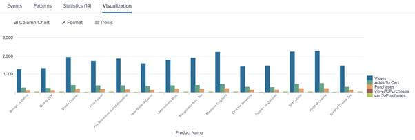
For this example, we create a diagram that overlays two data series as column lines over three data series. The overlay chart will show in another type of chart actions such as Adds To Cart and Purchases on one type of chart and the conversion rates, such as Views To Purchases.
To count the user activities, we'll use the stats command. For those actions, the eval command is used to calculate the conversion rates. For example, how much someone who has seen a product has added the product to their cart as well.
Let's start by running a quest and viewing the results as a chart.
- Start a new search.
- Change the time range to All time.
- Run the following search.
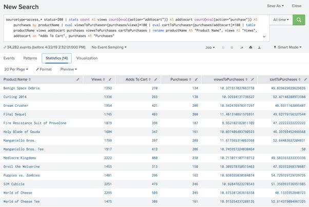
sourcetype=access_* status=200 | stats count AS views count(eval(action="addtocart")) AS addtocart count(eval(action="purchase")) AS purchases by productName | eval viewsToPurchases=(purchases/views)*100 | eval cartToPurchases=(purchases/addtocart)*100 | table productName views addtocart purchases viewsToPurchases cartToPurchases | rename productName AS "Product Name", views AS "Views", addtocart as "Adds To Cart", purchases AS "Purchases"
Two new fields are specified using the eval order. Those fields include the levels of conversion.
- The viewToPurchases area measures the number of customers who viewed the product compared to the number of customers who purchased the product. The reckoning returns a percentage.
- The cartToPurchases area compares the number of customers who added the product to the number of customers who bought the product in their carts. The reckoning returns a percentage.
- Click the Visualization
This is the same chart in the Create a Basic Chart section, including two additional data series, viewsToPurchases, and cartToPurchases.
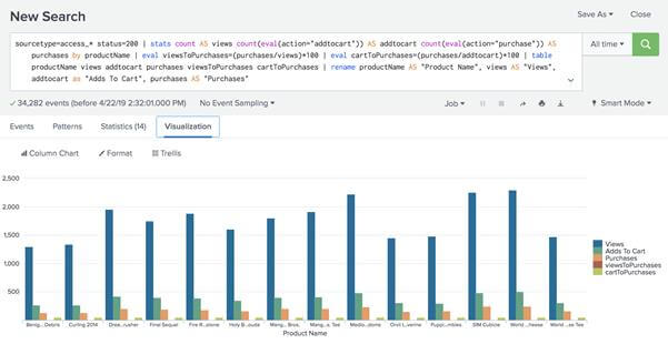
For the conversion rates, the next few steps reformat the chart visualization to overlay the two data series onto the three action data series.
Format the X-Axis labels
Note that the X-Axis labels get truncated. The labels are truncated, because there are so many products, making them difficult to read. Let's just fix this.
- Click on the Formatand X-Axis
- Now, for Label Rotation, we need to select the second option, which is -45
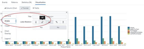
- Now, close the Format dialog box.
However, we must notice a slight change in the labels on the X-Axis.
Format the Y-Axis values and also add a title
Look to the Y-Axis numbers. The numbers range from 1000 to 3000 in this axis, and there is no description defining what tracks the axis. Let's make it easier to read the Chart.
- Here, click on the Format option and Y-Axis.Now,we're going to add a title and specify different number intervals on the Y-Axis.
- For Title, choose Customand type Actions.
- For Intervaltype 500.
- For Max Valuetype 2500.
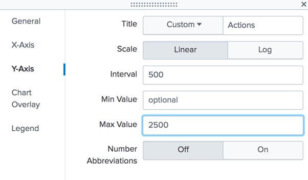
- Close the dialog box on Format. Notice the label changes and the Y-Axis values.
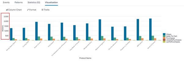
Save the revised chart as a report.
We made major changes to the map to make it readable. Now is the time to save the diagram as a report.
- Click Save Asand select Report.
- For the title form Analysis of Activities and Conversion Levels by Item, please see the Save Report As dialog box.
- Now, for Description, type The number of times a product is viewed, added to the cart and purchased from these actions and the purchase rates.
- Click Save
- In the confirmation dialog box, click View.
|

 For Videos Join Our Youtube Channel: Join Now


