Splunk Create an overlay chart
In this section, we are going to learn about the creating an overlay chart in the Splunk web. We will also learn about how to build the overlay, format the x- axis label, format the y- axis label, save the saved chart as report and create the report from a sparkline chart.
Build an overlay, and explore options for visualization
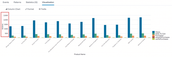
For this example, we create a diagram overlays two data series as column lines over three data series. The overlay chart will show in another type of chart actions such as Adds To Cart and Purchases on one type of chart and the conversion rates, such as Views To Purchases.
To count the user actions, we'll use the stats command. For those actions, the eval command is used to calculate the conversion rates. For example, how much someone who has seen a product has added the product to their cart as well.
Let's start with a search running, and display the results as a chart.
- Start a new search.
- Change the time range to All-time in the Time
- Then, run the following search command in the search bar.
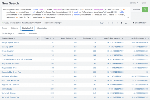
sourcetype=access_* status=200 | stats count AS views count(eval(action="addtocart")) AS addtocart count(eval(action="purchase")) AS purchases by productName | eval viewsToPurchases=(purchases/views)*100 | eval cartToPurchases=(purchases/addtocart)*100 | table productName views addtocart purchases viewsToPurchases cartToPurchases | rename productName AS "Product Name", views AS "Views", addtocart as "Adds To Cart", purchases AS "Purchases"
Two new fields are specified using the eval command. Those fields include the levels of conversion.
- The viewToPurchases area compares the number of clients who viewed the product to the number of clients who bought the product. The reckoning returns a number.
- The cartToPurchases area compares the number of customers who added the product to the number of customers who bought the product in their carts. The reckoning returns a number.
- Click on the tab Visualisation.
This is the same chart in the Build a Simple Chart segment, plus two additional data sets, viewsToPurchases, and cartToPurchases.
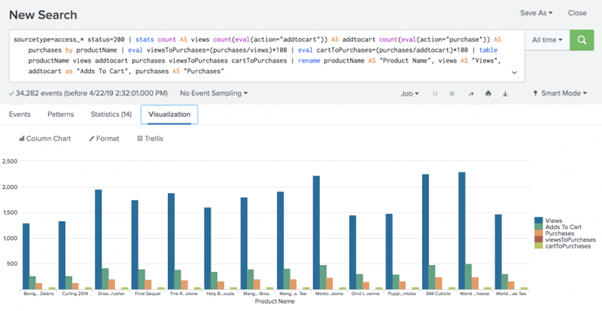
For the conversion rates, the next few steps reformat the map diagram to add the two data series onto the three action data series.
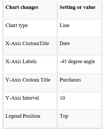
Format the X-Axis labels
Remember that the X-Axis labels get truncated. The labels are truncated, because there are so many products, making them difficult to read. Let's just fix this.
- Click Formatand X-Axis.
- In Splunk, for Label Rotation, we have to select the second option in the list or window, which is -45 degrees.
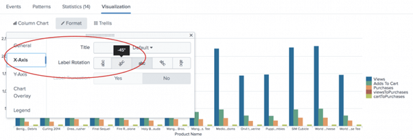
- Now, close the Format dialog box in your window.
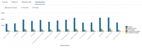
- Now, you can notice the change in the labels on the X-Axis of the chart.
Format the Y-Axis values and add a title to it
Look to the Y-Axis numbers. Here, the numbers range from 1000 to 3000, and there is no title describing what tracks the axis. Let's make it easier to read the charts.
- Click Formatand Y-Axis.
We should add a title to the Y-Axis and assign different number intervals.
- For Title, choose Customand type Actions.
- For Intervaltype 500.
- For Max Value type 2500.
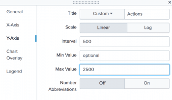
- 5Close the dialog box on Format. Note the mark shifts and Y-Axis values.
Format the second Y-Axis
Look at the caption. It shows some of the columns represent actions like Views and Purchases, and some columns represent conversion rates like viewsToPurchases. The acts are values counts within different fields. The rate of conversion is in percentages. Such two data forms should be shown separately.
- Format and Chart Overlay to address the problem.
We can overly set one set of values over another set of values to separate the actions from the conversion rates. In this example, we overlay the conversion levels over the acts, as lines, which will remain as columns.
- Press Inside the box for Overlay. Start and pick viewsToPurchase. Click again inside the box, and choose CartToPurchase. This describes the two series that we want the column map to add on to.
- For View as Axis, click On.
- For Title, choose Custom.
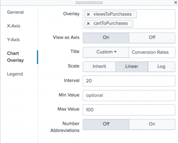
- Type Conversion Rates.
- For Scale, click Linear.
- For the Intervaltype 20. For the Max Value type 100.
- Close the dialog box on Format. Remember, the conversion rates now appear in the chart as lines.
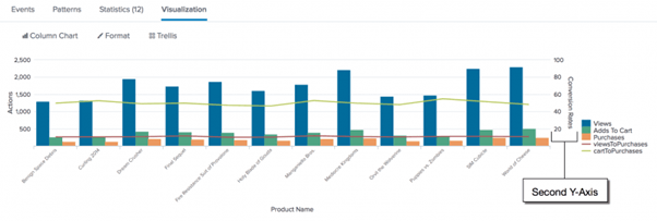
The axis at the chart's right side is called the second Y-Axis. Along this axis, the mark and values appear for the line series.
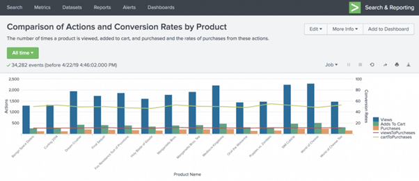
Save the revised chart as a report.
We made significant changes to the map to make it readable. Now is the time to save the diagram as a paper.
- Click Save As and select Report.
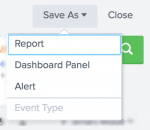
- For the title type Comparison of Actions and Conversion Rates by Product, please see the Save Report As dialog box.
- Now, type The number of times a product is viewed, added to the cart and purchased from these actions and the purchase rates.
- Click Save
- In the confirmation dialog box, click View.
Create a report from a custom chart
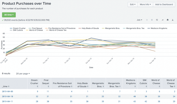
In this example, we build a report which charts the products that have been purchased over a period of time. This example creates and customizes a chart using the timechart command and chart options.
Here the example uses the productName field from the Enabling field lookups section of this tutorial.
If we do not configure the field lookups in our Splunk web, then the searches in this section will not produce the correct results.
- Start a new search.
- Change the time range to All time.
- Run the following search.
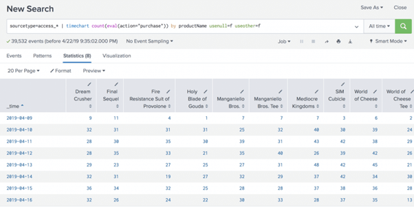
sourcetype=access_* | timechart count(eval(action="purchase")) by productName usenull=f useother=f
This search will use the count()function to count the number of events having the action = purchase field.
The search also uses the usenull and other arguments to ensure that events that have a value for productName Events with null values for productName are not included in the timechart function.
The table below appears on the Statistics page.
- Now, click on the Visualization tab option.
- Now, change the chart type to a Line type chart in the chart option.
- Use the Format drop-down to format the X-Axis, Y-Axis, and Legend to produce the following chart.
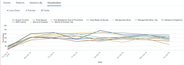
This table lists the changes made to the chart.
- Click Save Asand select Report.
- In the Save Report Asdialog box, for Title type Product Purchases over Time.
- For Description, type The number of purchases for each product.
- For Content, select the first option, Line Chart and Statistics Table.
- For Time Range Picker, keep the default setting Yes.
- Click Save.
- Tap on Show to see the page in the Confirmation dialog window.
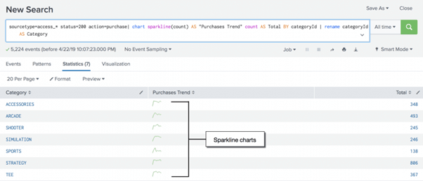
Create a report from a sparkline chart
We build a report in this example, which shows the trends in the number of transactions made over time. Uses sparkline charts in this example. Sparklines are inline charts which appear in the search results table and are designed to show the time-based trends associated with each row 's primary key.
We can add sparkline charts to the results table for searches that use the stats and chart commands.
This example uses the productName field in this tutorial 's section, Enabling field lookups. If we don't configure the lookups area, the searches in this section will not produce the correct results.
- Start a new search.
- Set the time range to All time.
- Run the following search.
sourcetype=access_* status=200 action=purchase| chart sparkline(count) AS "Purchases Trend" count AS Total BY categoryId | rename categoryId AS Category
This search uses the command chart to count the number of purchases by using action="purchase". The search specifies which purchases are made by using categoryId for each product. The difference is, the purchase count is now an justification for the function sparkline().
Using the AS keyword, when we rename a column, names that are more than a single word must be in quotation marks. In this search quotation marks are around Transactions Pattern name but not around Group name.
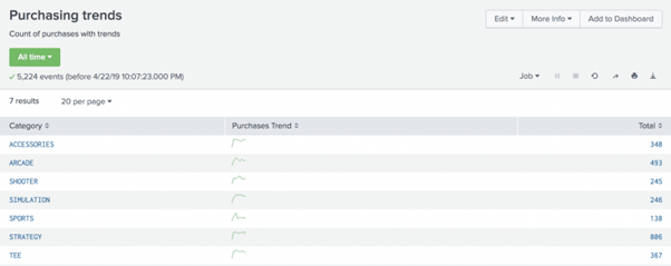
- Now, click on the Save As option and select Report in the window.
- Here, in the Save Report Asdialog box, for Title type Purchasing trends.
- For Description, type Count of purchases with trends.
- Click Save.
- In the confirmation dialog box, click View. It must look something like this .
|

 For Videos Join Our Youtube Channel: Join Now


