| |

How do you draw the S curve in Microsoft Excel?It was well known that the respective "S curve" in Microsoft Excel is primarily used for "visualizing a relation of two variables": how one variable impacts the other variable and how the value of both variables changes due to this impact. It is termed to be an "S curve" because of the reason that the curve is in an S shape. This type of curve can be effectively used in two types of charts: the line charts and the scatter charts. What is meant by S-Curve in Microsoft Excel?S curve is a special type of curve that is available in Microsoft Excel, and they are responsible to depict a graphical report of a given project's "cumulative progress" concerning time as well as the growth of a variable in terms of the other variables often expressed as time units. Besides all this, they are very much helpful for real-estate builders as well as the developers to track and implement the different phases of the project in their ongoing building project respectively, which will help them to finish their ongoing project within the scheduled time and within the allocated budget. S curves are also very useful for the purpose of tracking the project timeline and its costs in the field of Information Technology and the pharma company respectively, and we can also keep an eye on the Project progress daily or on a monthly basis with the help of S CURVE implementation effectively. Cumulative Value of Work Progress with Reference to TimeWe all know that, when we are considering the S curve for the purpose of building any specific project then the work might start at slower in the starting of the project and later on it will pick up slowly, while in the middle of this phase we can easily observe the rapid pickup as well, and in the final part it will be slows down. And in the same manner, the S curve for a new product launch as well as for tracking its progress can be easily achieved in the initial phase of the curve, and the rapid initial growth of the company sales for a new product can be easily seen here as well, that is none other than the exponential increase in sales for a specific period of time. In the later part of the curve, we can also see a leveling off or taper off. How to create S CURVE in Microsoft Excel?Now, we will be considering some of the examples to see the working of S CURVE in Microsoft Excel. # Example 1 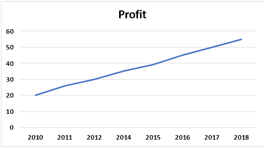
The above figure usually depicts a slight S curve in the graph, and this curve will depend upon the data which we get. Step 1: First of all, we are required to select the data effectively. 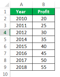
Step 2: After that, we are required to go to the "Insert" tab, and then we need to select a "Line" graph or "Scatter" graph as per our requirement of the data chosen. 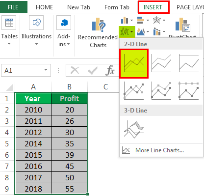
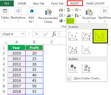
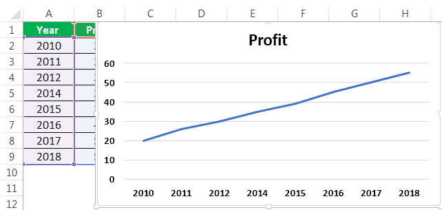
And it can see that the first figure is for line graph, and the second figure is used to select the scatter plot. When we are selecting any chart type, then in that scenario it will be displaying the chart on the selected sheet, so just after that, we can easily choose the graph as per our requirement by looking at it. The final graph is now ready and it was depicted below. 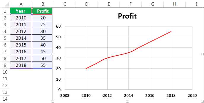
And now in this graph, we can see that there is a presence of slight S curve, as the name suggest that in S curve, there is no compulsion that graph need to be in the S shape format. Instead of this, there can be a slight curve present in the graph, moreover the shape of the curve will be depending upon the data which we will be considering. # Example 2: Depicting the S-Curve in Microsoft Excel We are taking a dual-axis graph with an S curve in this example. Step 1: First of all, we must select the data. 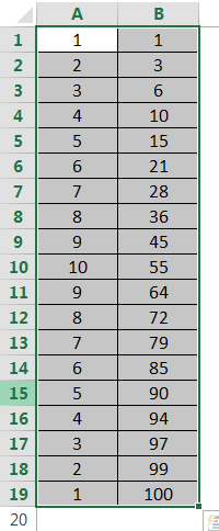
Step 2: Now, in this step, we are required to go to the "Insert" tab, and then after that, we need to select a "Line" graph or 3D scatter plot in Excel or 2D, which are effectively based upon the requirement as well as the interest, just after that we need to click on the "OK" button respectively. 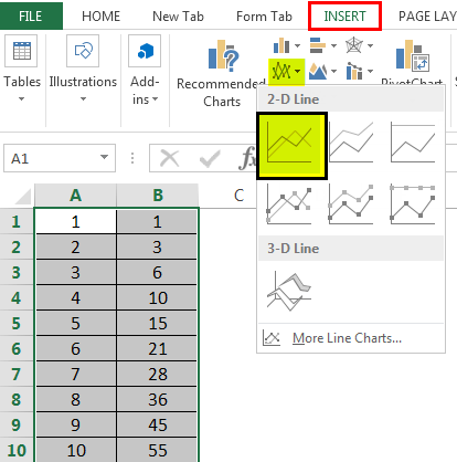
Step 3: In this particular step, the graph will be ready, and we can easily use a dual chart if two data columns are displayed on one chart as well. 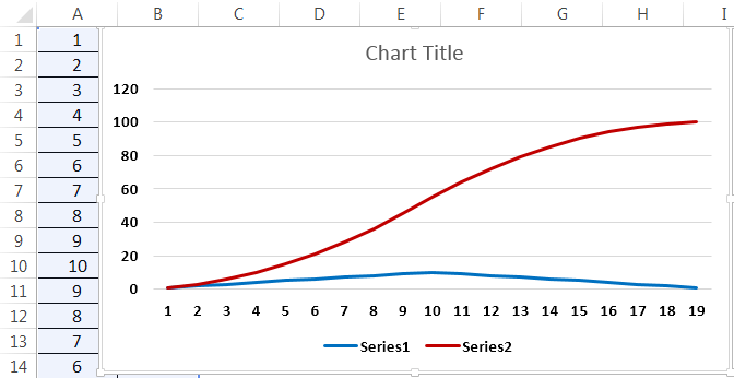
Step 4: Once the chart is prepared, we must click on the point of the graph where we want to move to the secondary axis. Right-click now to select the "Format Data Series" option. 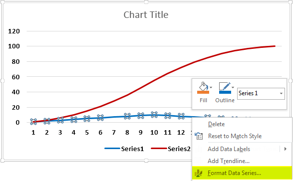
Step 5: Now, in this step, on the "Axis" tab, the default option will be the "Primary Axis." And we are required to change it to the "Secondary Axis." Once the job is completed, the selected data will be set for the secondary axis. 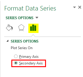
The final step is the dual-axis graph; we can easily show this in the screenshot below as well. 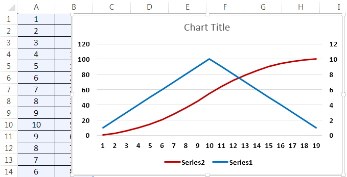
# Example 3: Representation of S Curve in Microsoft Excel Step 1: First of all, we are required to fill out the data correctly in the selected sheet with all the columns. 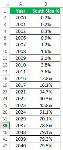
Step 2: Now, after that, we must select the data we want to draw the S curve, as depicted in the screenshot below. 
Step 3:
The graph looks like this as given below: 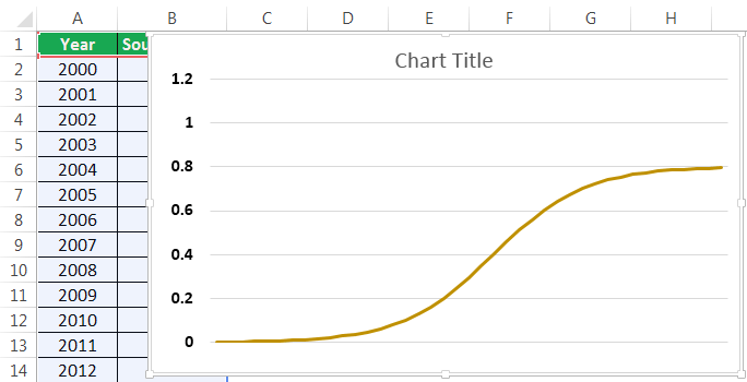
We will select the "Scatter" plot from the "Insert" tab similarly, as shown below. 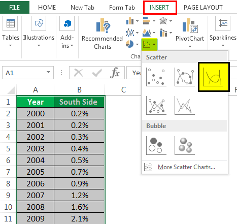
And the curve will be shown automatically just after selecting the type of charts which we want to use in our data respectively. 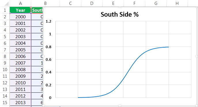
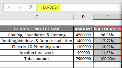
# Example 4: S CURVE, which can be used for the creation of a Building Project In the below-mentioned table, we have the project task list and an amount which are allocated for every task in the building of the respective project in the column "C" & "D," and here in this, we are required to calculate the total amount of each task ranging from D3 to D6, in the cell "D7" by just applying sum formula that is =SUM (D3:D6) 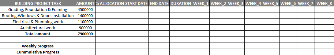
And once we are done with this, after that we are required to convert the amount of each task allocated to percentage allocation for the purpose of computing and then preparing the S curve. And then we will be entering the formula to get a percentage allocation for each task, which could be easily achieved by just dividing each task with the total amount allocated, e.g., in the cell E3 type =D3/$D$7. 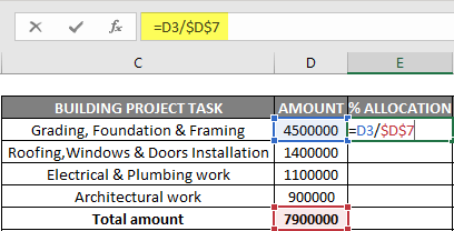
As in this example, the D7 reference is made absolute or can be easily locked so that the formula will be then applied to other cell referencess. 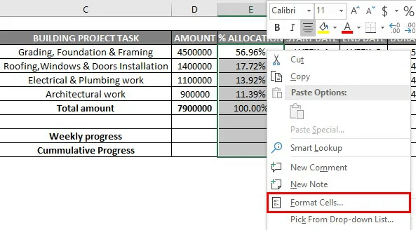
And then the obtained value will be get converted to percentage by making use of the format cells option. 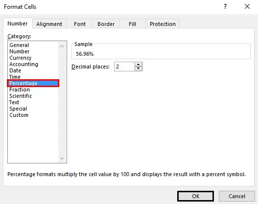
After that we are required to enter the details of the allocated task timeline for each task (in weeks) as well as its duration 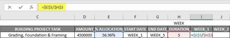
Now we will be distributing the percentage allocation of work every week, with prorated work percentage distribution for each week. And then let us apply for the first task activity in cell "I3", that would be the Allocation percentage for that task, and it could be efficiently divided by the total duration or timeline for that task (In weeks) =$E$3/$H$3 Here, in this, we are required to lock both the cell reference in the formula or make it an absolute reference, and then we need to drag it to other colored cells (I3 to M3) to apply the formula as well. And then the output values will be then converted to percentage format with the format cells option. Similarly, it is then followed and applied to the other 3 task allocations for the purpose of getting the correct distribution of the percentage allocation of work on a weekly basis in a respective cell. 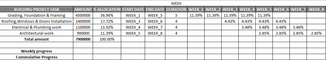
And just after calculating the percentage allocation of work on a weekly basis, we are then required to get the total for a weekly percentage of work done on a weekly basis (from week 1 to week 8) by making use of the sum function, that is For week 1, and then we will be applying out sum function for the total percentage of work done. i.e.,=SUM(I3:I6) for a week 1 total work progress. 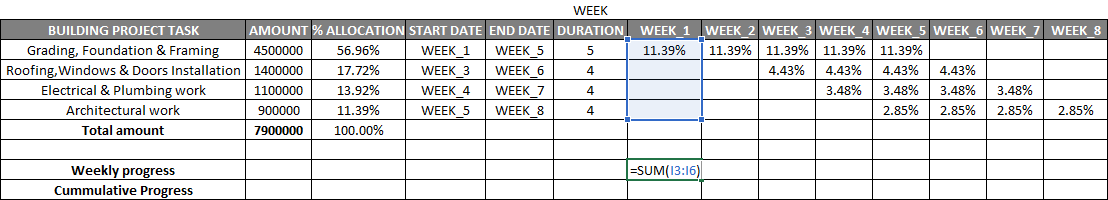
In the same way, the steps are then followed until 8 weeks progress to get a better distribution of the percentage allocation of work on a weekly basis as well. Then, we must need to apply the sum function to other cell references, from I9 TO P9 cell reference, by dragging it till week 8. 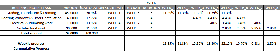
Once we can obtain the weekly progress data, we are required to calculate Cumulative progress for each week effectively. Now, let us calculate the Cumulative progress right from the cell "I10". And in the cell "I10", we are required to add cell reference "I9", while in the cell "J10", we will be then adding the cell values of "I10" and "J9" to get out the cumulative progress. 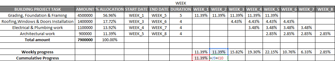
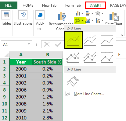
Besides all this, we can also make use of this cumulative work progress each week to create an "S curve chart." So, in order to create an "S Curve chart," we are then required to select the cumulative work progress from week 1 to week 8, and simultaneously, by just pressing out the CTRL key from our keyboard, we can easily select the cells from week 1 to week 8. 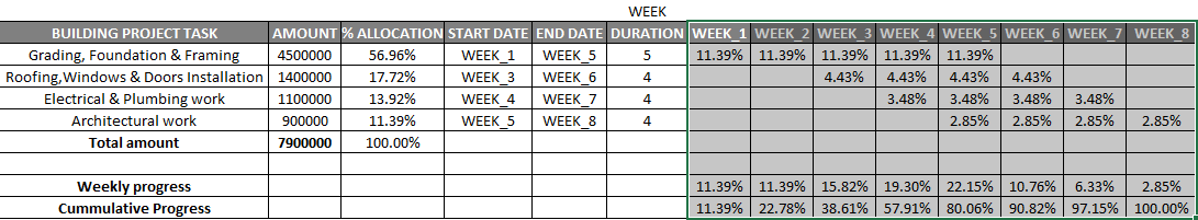
And once both the cell ranges are selected, then we are required to move to the insert option; under this, we will be selecting a line with the markers option chart respectively 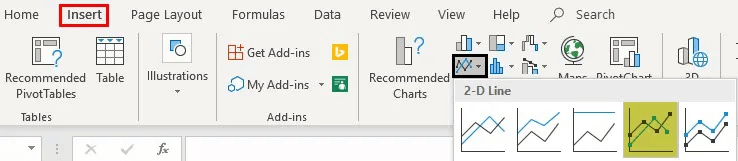
And after that, we can easily carry out the formatting of the chart as well. 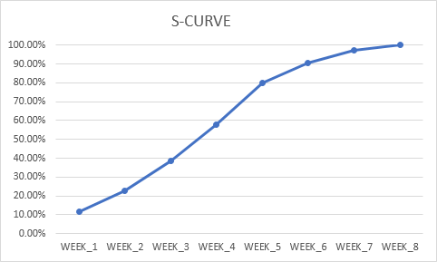
One can edit and change the chart's title text to "S CURVE." Moreover in the Vertical axis, we can easily the vertical limit from 120% to 100% by making use of the format axis options. 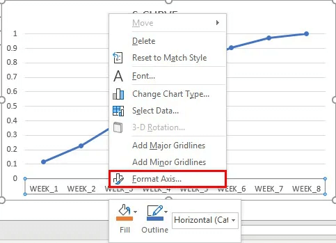
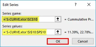
Simultaneously, we can also make changes to the data series name to the cumulative progress by just right-clicking on the chart area and then selecting the edit option that are present under the legend entries. After that, we can also edit the series window which get appears in the series name box, in which we can enter a cell reference of the cumulative progress, that is, the cell "C10." 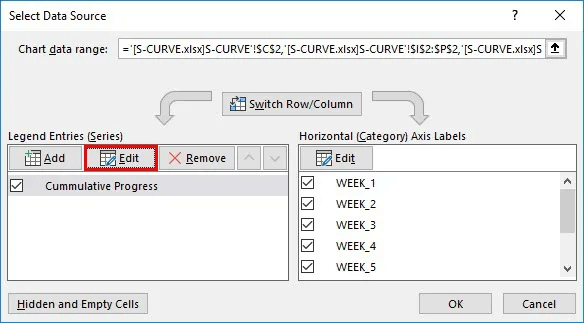
And we will be get our S curve as well for the above set of Data. 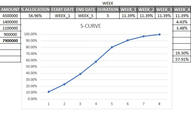
List out the various uses of S Curve in Microsoft Excel.The various important uses of the S Curve in Microsoft Excel are as follows:
What are the important things which are required to be remembered by an individual while working with the S Curve in Microsoft Excel?The various important things which are efficiently required by an individual while working with the S Curve in Microsoft Excel are as follows:
Next TopicPowerPivot in Microsoft Excel
|
 For Videos Join Our Youtube Channel: Join Now
Feedback
- Send your Feedback to [email protected]
Help Others, Please Share


