Button in ReactButtons allows users to take actions and make choices with a single tap. They (buttons) communicate the actions that users can perform. It is placed by your UI in places like below:
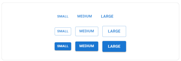
The Button comes in 3 variants: text (default), contained, and outlined. 
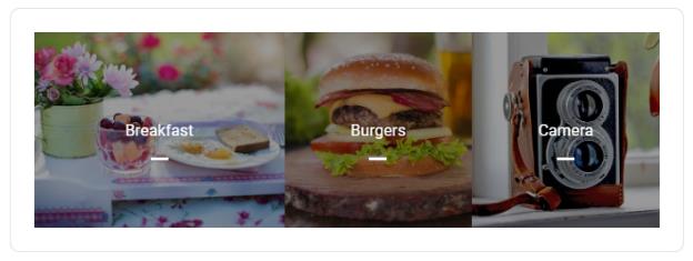
Text buttonText buttons are used for less-pronounced actions, including those in card dialogs. In cards, the text buttons will help us to maintain an emphasis on card content. 
Contained ButtonContained buttons are high-emphasis, distinguished by the use of elevation and fill. It contains actions which are primary used in our App. 
You can remove the elevation with the disable Elevation prop. 
Outlined ButtonOutlined buttons are medium-emphasis buttons. They contain essential actions but not the main action in the app. Outlined buttons are the lower alternative to contain the buttons or a higher emphasis alternative to the text buttons. 
Handling clicksAll components accept an onClick handler which is applied to the root DOM element. Note: The documentation avoid mentioning the native props in our API section of the components.Color
In addition, by using the default button colors, you can add custom or disable any you don't need. SizeUse this propertty for larger or smaller buttons. 
Upload button
Buttons with label and iconSometimes you may want to have icons for certain buttons to enhance the UX of the application, as we acknowledge logos easier than plain text. For example, If we want to delete button than you should label it with a dustbin icon. 
Icon buttonIcon buttons are found in toolbars and app bars. Icons are appropriate for toggle buttons which allow the choices to be selected or deselected. Like, adding or removing any item from the label. 
SizesUse the size prop for larger or smaller icon in button. 
Colors
Use color prop to apply the theme color palette to the component. Customization
Below are the examples of customizing our component. Loading buttonThe loading buttons can show the loading state and disable interactions of the button. 
Toggle the loading button to see the transition between unrelated positions. 
Complex buttonIcon button, Text button, contained buttons, and floating action buttons are built into a single component which is called as ButtonBase. 
You can take lower level component to create custom interactions. Third-party Routing librariesNavigating the client without an exact HTTP trip to the server is a unique use case. The ButtonBase component provides component properties to handle the use case. BordersButtonBase sets the component pointer-events: none; on the disable Button, which prevents the appearance of the disabled cursor. If you want to use "not allowed", you have two options: CSS only: You can remove the pointer-event style on the disabled state of < Button> element: Although, You should add pointer-events: none; when you needed to display tooltips on disabled elements. If you render anything other than the button element, then the cursor will not change. For example, a link <a> element. DOM change. You can wrap the button: It can support any element, for example, a link <a> element. unstyled The component will comes with the unstyled version. It is ideal for doing heavy optimizations and reducing bundle size. API
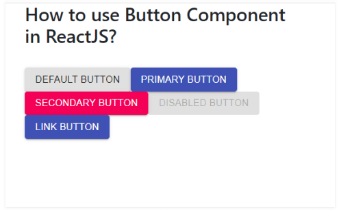
How to use the button component in ReactJS?Buttons allow users to take their actions and make choices at a single tap. This component is available to us for React UI content, and it is very easy to integrate. We can use button component in ReactJS by using following approach. Creating react app and installing modules: Step 1: Build a React application by using the given below command: Step 2: After creating the project folder, and name of the folder to navigate it by using the given command: Step 3: Install the Material-UI module using the following command, after creating the ReactJS application: Project Structure: It will look as the following. 
project structure App.js: Now, you have to write the below code in the App.js file. Here, the App is the default component where we have written in our code. JavaScript Steps to run the application:Run the application by using the command from the root directory of the project: Output: Now open your browser and go to http://localhost:3000/. You can see the below output: 
Next TopicWhat is Dom in React
|
 For Videos Join Our Youtube Channel: Join Now
Feedback
- Send your Feedback to [email protected]
Help Others, Please Share


