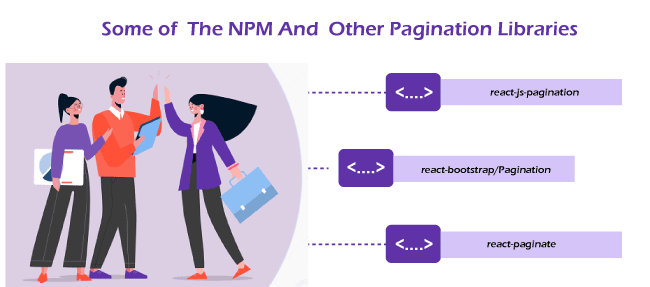
React-PaginateThe Reactjs pagination library will be used directly for the pagination functionality of any list of items. The props required here are an array of list items to render and an onChange callback function, which informs the parent component about the page change. But pagination is important by filtering and displaying only relevant data, for example, Google search engine. Therefore, Reactjs pagination becomes crucial when users search for certain information and do not consume random information. Some built-in libraries are used to handle pagination in web development, in the case of React. You directly use many resources to handle pagination in the application. Some of the NPM and other pagination libraries available are: 
Instead of rewriting your own, it's ideal to use these existing libraries, as there's no need to reinvent the wheel; instead, you can focus on other things. But at the same time, it is very important to know what is going on behind the scenes to build and customize the app to your needs without compromising any requirements. There is also a possibility that different logic is used for different reactjs pagination packages. To implement react pagination in your app, read this excellent react-jw-pagination article. Here we talk only about react-paginate (the second one): 
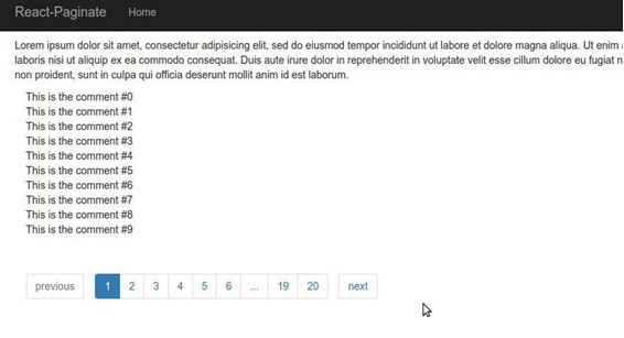
A ReactJS component to render the pagination. By installing the component and writing just a bit of CSS, you can get this: Note: You must write your CSS to get this UI. This package does not provide any CSS. 
or 
InstallationTry it on Code Pen. You can read the code in demo/js/demo.js to understand make reactive pagination work in a list of objects. Finally, the CodePen demo introduces getting the sample code (GitHub API) and two synchronized widgets of pagination. Props
DemoClone the repository and access it easily to run the demo: Install the dependencies: Prepare the demo: Run the server: Open the browser and go to http://localhost:3000/. 
Here we implement a pagination element in React app by using the react-paginate. Let's start Add and install react-paginate on a dependency in the app. State DefinitioncurrentPage is index of the page selected by user, you may want to set it to 0, ie. the first page. Data contains all data elements. It is empty and we fill it after we get the data. Here, we create a useEffect hook by an empty dependency array that functions as the DidMount component's lifecycle method and is responsible for getting the data and updating the data state. Calculation of data to represent the current page. Let's first define some constants: The PER_PAGE constant contains the number of items to display on each page, and an offset is the number of items that is already been displayed on previous pages. If the current page is two (or the third page indexing starts by 0), then the offset becomes 20. It means that the first 20 elements have been rendered, and we will start rendering the next elements after 20 (the first page yielded the first ten items, 2nd the page yielded the next 10). The third page will render items 20 to 20 + BY_PAGE, 30. This offset is used to set the current page elements, ie the current page data, which is mapped to an array of images using the split data. let's render the component: You can refer to this to see the different types of props passed to ReactPaginate. When a new page is clicked here, a handlePageClick event handler function sets the current page. Styling the pagination element:
It would be best to classify props like nextLinkClassName, previousLinkClassName, disabledClassName, and activeClassName to add classes of the pagination links for custom styling of the page.
Next TopicWhat is the useState in React
|
 For Videos Join Our Youtube Channel: Join Now
Feedback
- Send your Feedback to [email protected]
Help Others, Please Share


