React Date Picker
IntroductionWe often come across various forums and websites where we need to enter our date of birth or select a date for an appointment of any cause, and a calendar-like icon appears right in front of our eyes. How and where does that pop up from? It must be some specific and dynamically powered calendar that smartly recognizes and presents to us to select dates of our desire. This is where React Date Picker hops in. In this tutorial, we would be learning all such methods from scratch to advanced level on how it is implemented in React and how it can be customized. Let's proceed with the discussion. The React Date Picker is a helpful and abundant Component used to display dates using the calendar dialog format. There are usually a lot a Date picker options available these days. All of them can have different technical aspects and applications. In this tutorial, we are specifically going to deal with React Date Picker. For that, we need to have a package for it that displays time and date. For better understanding, we will make an application that would help us understand React Date Picker better. But, before that, let's install it as shown in the below steps. InstallationTo install Date Picker for our React application, we need to have Node.js pre-installed on our system. Although it is not important to always have node modules, it is highly recommended to download them so that all the dependencies are served efficiently. Therefore, the command to install React Date Picker is given below. The package can be installed via npm: Or via Yarn: There might arise a need to install React and its Proptypes individually because, without these dependencies, it is impossible to build a React Date Picker. Also, we may need to use CSS from the external packages so that the Date Picker looks visually great. To get started with our application, we need to import the React Date picker in our main file, and we need to keep checking it through React view. React Datepicker exampleAssuming that our system is configured with all the installation requirements and dependencies, we will learn how to create a React application from scratch. This implementation is completely based on the application of React datepicker. In the discussion above, we assume that we have installed React and PropTypes independently since these dependencies are not incorporated in the package itself. To proceed with the methods of building our application, we need to follow the below-given steps. Move inside the project folder with the command. Start the React app. After the Node engine is started, we can check our application through port number 3000 of the localhost. Also, we need to include the code snippet given below in our app.js file so that important components for React Date Picker are imported into our file. Our application would now look something like this. 
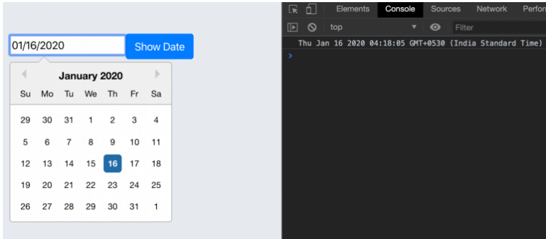
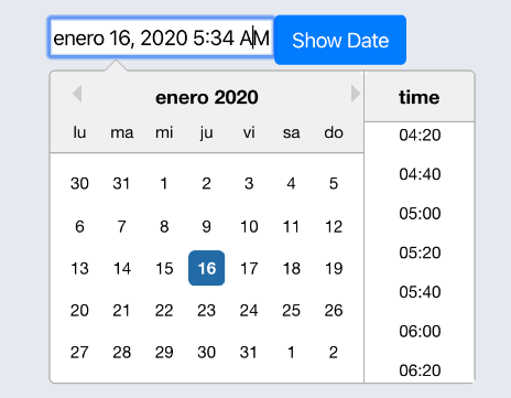
In the above sample coded, we first imported the packages of Datepicker and Bootstrap in the React template. Then, we defined it to bind the handle change and submit the Component in the event calendar. These events will automatically be triggered when a user submits or changes the Datepicker's input value values. Later, we initialized the Datepicker form state with a new Date() object inside the constructor. Lastly, we initiated the Datepicker with the below directive to add some properties to it. We can visualize the output in the form of a calendar-centric datepicker format. The above-given Datepicker adds customized properties to the React application components shown above. It allows us to pick the dates in the form of months, days, and years. Furthermore, to customize the datepicker, we have various other methods, be it coloring the components or smartly applying the functions to pick up the dates. We can also customize them easily if we have HTML and CSS components related to the app.js file. Localizing the DatepickerAnother instance we are going to learn about is to localize the Datepicker. The Date Picker we are going to make highly depends on date-fns internationalization. This is because it is used to localize the elements that will be on display. If we need to use a locale except for the default en-US, we may need to import it to the project from the date-fns. Moreover, English is the default locale which consists of 3 methods to set the locale. register local (string, object): loads an imported locale object from date-fns. Set default locale (string): sets a registered locale as the default for all datepicker instances. getDefaultLocale: returns a string showing the currently set default locale. We can import these services to the locale of the calendar view using the below code snippet. On importing and saving these locale services into our app.js file, our application will look like this. 
In another instance, to change the locales, we need to primarily change the locale code or by using the internationalization of the date-fns so the code review can be supported. Setting Calendar date range in Datepicker.We will learn how to implement the range functionality using the minDate and maxDate property in this step. To do so, we import the addDays API from the date-fns library to the top of our React component. It will add the specific number of days to the assigned date to set the range. The addDays() method usually takes two parameters: Date: The date that needs to be updated. Amount: The significant amount of days needed to be included. We can easily set the date range from the current to the next seven days in the React calendar. This can be understood when we implement the minDate and maxDate methods in the example code shown below. The full code snippet for our application after implementing all the steps given above is shown below. In the above example snippet, we have made minDate as a check-in component, and the user can only pick the date before today. We have used the date value for the check-out Component, which means that the user cannot pick a date before the check-in date. In the next step, we will save the value of our state and define how each handle works. The main idea is to implement it by simply creating a state for each check-in and check-out date with the defined values and saving the data there. The only difference lies in the minDate method of the check-out component, as it is solely dependent on the check-in component. Thus, ensuring that everything is set in terms of values not before and not after, we can now easily select the dates and define the check-out. ConclusionIn this tutorial, we have been able to follow through a simple step-by-step guide on building a custom React Datepicker component that can be easily used as a replacement for the native HTML5 datepicker input elements. We have learned how to set up the React application on priority because rendering the React components might seem complex for beginners, so setting up dependencies would always be preferred by a beginner. We also came across various examples to establish a crystal clear concept of using the components of Datepicker in our application. We also learned about the process of localizing the datepicker so that the date selection process doesn't cause a problem if they are selected for a specif duration on the calendar. Although the custom datepicker created in this tutorial works as expected, it doesn't comply with all the advanced requirements for a datepicker element. Further improvements can be made, such as implementing the max and min via props, switching the input type from text to date, and establishing better accessibility improvement. We can also develop design methods for the datepicker that we implemented in this tutorial by importing Bootstrap packages and adding custom styling and properties of hovering to make it look more good.
Next TopicReact Helmet
|
 For Videos Join Our Youtube Channel: Join Now
Feedback
- Send your Feedback to [email protected]
Help Others, Please Share


