 |

Materialize CSS ButtonsMaterialize CSS provides different CSS classes to apply various predefined visual and behavioral enhancements to the buttons. Let's see those various classes and their effects.
ExampleLet's take an example to demonstrate the use of mdl-button classes to show different types of buttons. Test it NowOutput: 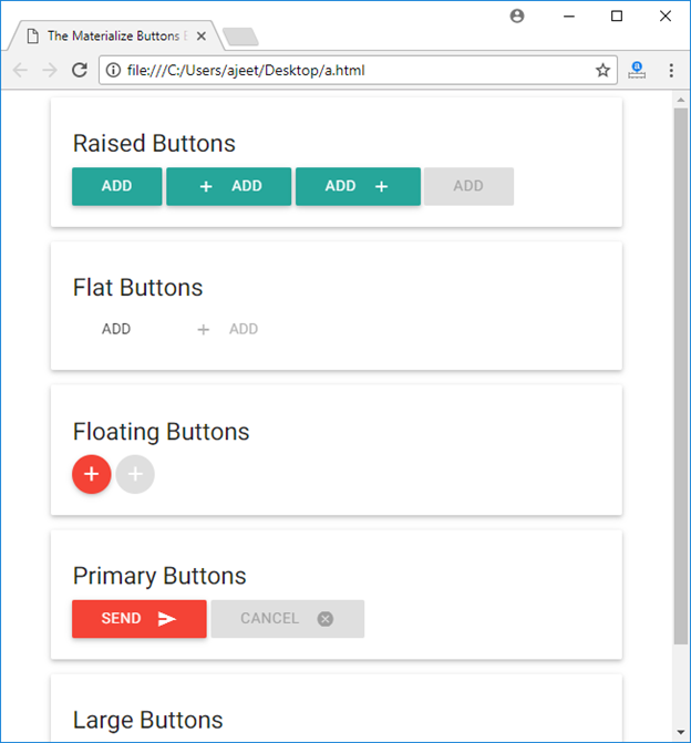 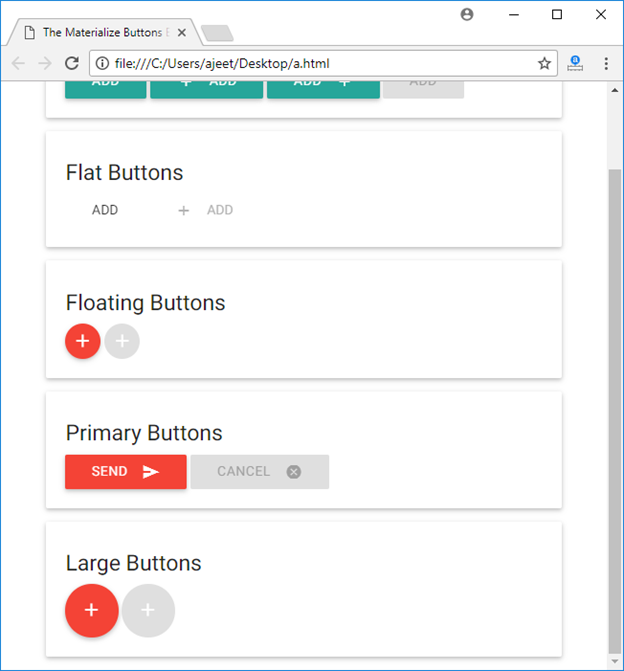
Next TopicMaterialize CSS Breadcrumb
|
 For Videos Join Our Youtube Channel: Join Now
Feedback
- Send your Feedback to [email protected]
Help Others, Please Share


Like/Subscribe us for latest updates or newsletter 


