Materialized CSS Grids
Materialize provides a standard 12 column fluid responsive grid system. It uses the row and column style classes to define rows and columns respectively.
| Index |
Class name |
Description |
| 1) |
row |
It is used to specify a padding-less container to be used for responsive columns. This class is mandatory for responsive classes to be fully responsive. |
| 2) |
col |
It is used to specify a column with sub-classes. |
Note: col contains several sub-classes for different types of screens.
Columns for Small Screen Devices
Following is a list of column-level styles for small screen devices, typically smartphones.
| Index |
Class name |
Description |
| 1) |
s1 |
It is used to define 1 of 12 columns with width as 08.33%. |
| 2) |
s2 |
It is used to define 2 of 12 columns with width as 16.66%. |
| 3) |
s3 |
It is used to define 3 of 12 columns with width as 25.00%. |
| 4) |
s4 |
It is used to define 4th of 12 columns with width as 33.33%. It contains s4, s5, s6, s7, s8, s9, s10, s11 |
| 12) |
s12 |
It is used to define 12th of 12 columns with width as 100%. Default class for small screen phones. |
Columns for Medium Size Screen Devices
See the list of column-level styles for medium screen devices i.e. tablets:
| Index |
Class name |
Description |
| 1) |
m1 |
It is used to define 1 of 12 columns with width as 08.33% |
| 2) |
m2 |
It is used to define 2 of 12 columns with width as 16.66%. |
| 3) |
m3 |
It is used to define 3 of 12 columns with width as 25.00%. |
| 4) |
m4 |
It is used to define 4 of 12 columns with width as 33.33%.m5 - m11 |
| 12) |
m12 |
It is used to define 12 of 12 columns with width as 100%. Default class for medium screen phones. |
Columns for Large Size Screen Devices
See the list of column-level styles for large screen devices i.e. laptops, desktops etc.
| Index |
Class name |
Description |
| 1) |
l1 |
It is used to define 1 of 12 columns with width as 08.33%. |
| 2) |
l2 |
It is used to define 2 of 12 columns with width as 16.66%. |
| 3) |
l3 |
It is used to define 3 of 12 columns with width as 25.00%. |
| 4) |
l4 |
It is used to define 4 of 12 columns with width as 33.33%. l5 - l11 |
| 12) |
l12 |
It is used to define 12 of 12 columns with width as 100%. Default class for large screen devices. |
Usage
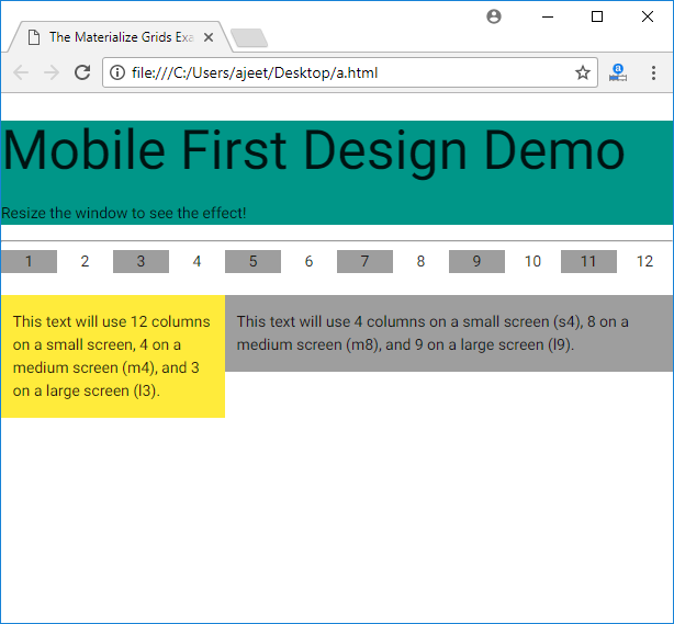
Each subclass determines the number of columns of the grid to be used based on the type of a device. Consider the following HTML snippet.
Example
Test it Now
Output:
|

 For Videos Join Our Youtube Channel: Join Now


