 |

Bootstrap 5 FlexDesigning flexible, responsive layout structures without utilising float or positioning is made simpler with the Flexible Box Layout Module. Quickly control the layout, alignment, and scaling of components, grid columns, navigation, and more using a comprehensive set of responsive flexbox utilities. Custom CSS can be required for more complicated applications. Basic Flex FunctionThe "d-flex" class create a basic flex box for handle layout. We can contain information, functions and other application data. SyntaxThe following syntax uses the flex function with its value. ExampleThe following example shows the flex function with its value. Output The following output shows the flex function with its value. 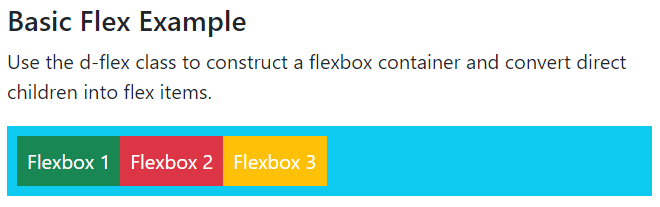
Inline Flex FunctionThe "d-inline-flex" class create a flex function for handle functions layout. The information and function fit into flex as per format. We can remove extra space and padding automatically. SyntaxThe following syntax uses the flex function with its value. ExampleThe following example shows the inline flex function with its value. Output The following output shows an inline flex function with its value. 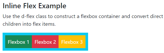
Horizontal Direction Flex FunctionThe "d-flex" class create a flex with the horizontal direction of the data. The "flex-row" class creates flex in horizontal format with its value. If we want to display the value in the horizontally reverse format, then use the "flex-row-reverse" class. SyntaxThe following syntax uses the horizontal flex function for the start position. The following syntax uses the horizontal flex function for the end position. ExampleThe first flex function uses simple horizontal direction content. We use a second flex function with reverse horizontal direction content. The following example shows a horizontal flex function with a start and end position. Output The following output shows the horizontal flex function with start and end positions. 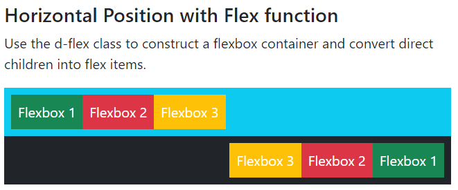
Vertical Direction Flex FunctionThe "d-flex" class create a flex with the vertical direction of the item. The "flex-column" class creates a flex box in vertical format with value. If we want to display the value in the vertically reverse format, then use the "flex-column-reverse" class. SyntaxThe following syntax uses the vertical flex function for the start position. The following syntax uses the reverse vertical flex function for the end position. ExampleThe following example shows the vertical flex function with start and end positions. We can use the first flex function with simple vertical direction content. The second flex function works reverse vertical direction content. Output The following output shows the vertical flex function with start and end positions. 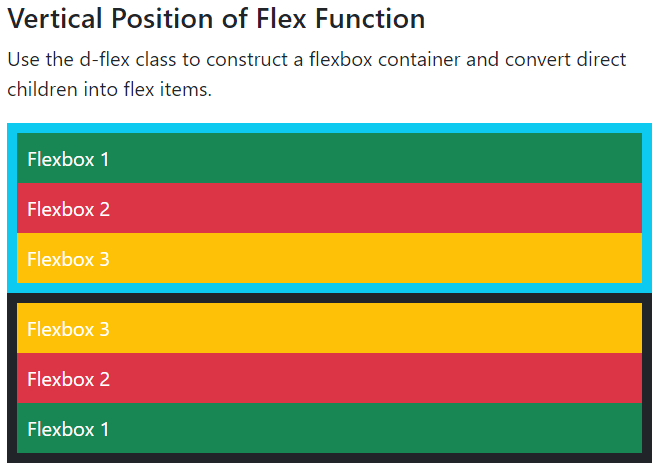
Justify Content of Flex FunctionThe "d-flex" and "d-inline-flex" classes create flexes with the required position. The "d-flex" uses the "justify-content-*" class to get the required position in the flexbox. Here, we can place content into start, end, center, around, and between positions of the flex function. SyntaxThe following syntax uses the flex function with justify-content for the start position. The following syntax uses the flex function with justify-content for the end position. The following syntax uses the flex function with justify-content for the center position. The following syntax uses the flex function with justify-content for between positions. The following syntax uses the flex function with justify-content for around position. ExampleThe following example shows the flex function with the justify-content position. We can place first and second flex for start and end positions. The third flex function content places center position and the fourth flex comes between the content. The last flex shows justify content around the position. Output The following outputs show flex function with the justify-content position. 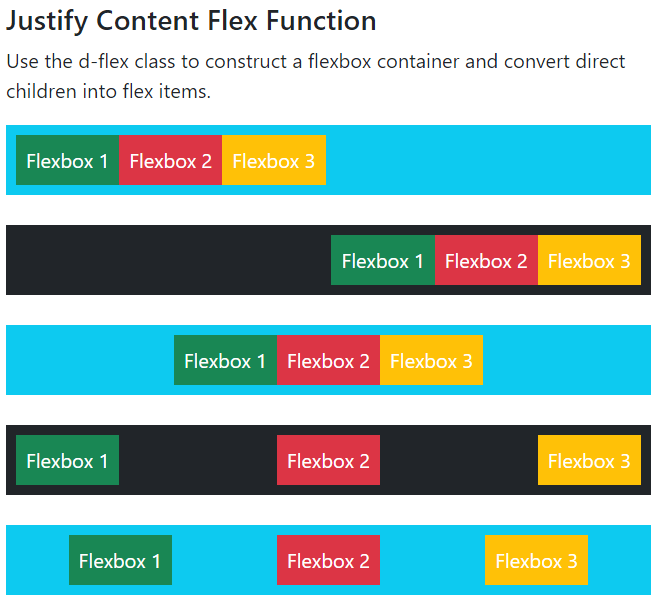
Equal Width Flex FunctionThe "flex-fill" class creates equal width of the flex item. This class is placed inside of the "d-flex" class. SyntaxThe following syntax uses the flex function with its value. ExampleThe following example shows the flex function with its value. The first flex function uses padding with equal width content, and the second flex works without padding for content. Output The following output shows the flex function for equal width content with or without padding. 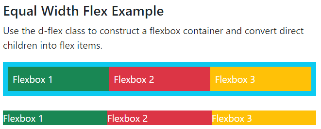
Grow Flex FunctionThe "flex-grow-1" class uses the flex item inside the "d-flex" class. The flex-grow class acquires the remaining space of the flexbox. It does not work with the "d-inline-flex" class. SyntaxThe following syntax uses the flex function with its value. ExampleThe following example shows the flex function with grow item. The first flex container shows grow item in the flex function. The second flex function shows without grow item. Output The following output shows flex function with or without grow class. 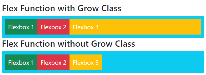
Auto Margin Flex FunctionThe "ms-auto" class uses to place the item right side of the flex function. The "me-auto" class uses to place the item left side of the flex function. SyntaxThe following syntax uses the right side of the flex function. The following syntax uses the left side of the flex function. ExampleThe following example shows a flex function with left and right margins. The flex item automatically sets the margin in the flexbox. Output The following output shows the auto margin flex function. 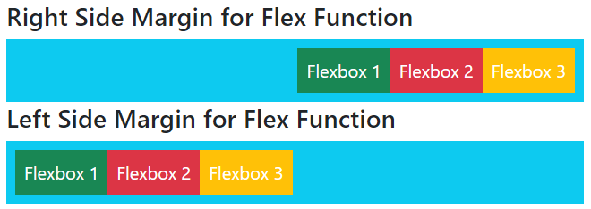
Order of Flex FunctionThe "order-*" class uses to place the item as per the required order in the flex function. The first order uses the "order-1" class in the flex item element. SyntaxThe following syntax uses the order of the flex item. ExampleThe following example shows the order of the item in the flex function. We can place from 1 to 5 orders in the flex function. Output The following output shows the order of flex function. 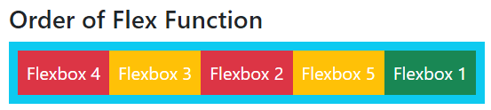
Wrap for Flex FunctionThe wrap function displays items in the flex function as per the device. The item auto fits in the flexbox as per screen width. The flex item uses the "flex-nowrap" class by default. SyntaxThe following syntax uses the flex function with the nowrap function. The following syntax uses the flex function with the wrap function. The following syntax uses the flex function with the reverse wrap function. ExampleThe following example shows the flex function with the wrap function. Output The following outputs show flex function with wrap function. 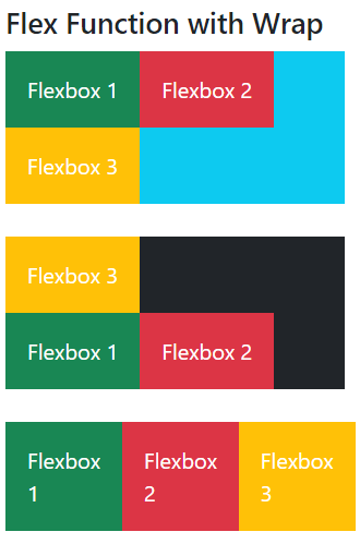
Alignment for Flex FunctionThe "align-item-*" class uses for shows flex items as per position. We can place item alignment using start, end, position, baseline and stretch class. The "align-self-*" class SyntaxThe following syntax uses the flex function with justify-content for the start position. The following syntax uses the flex function with self-alignment. The following syntax uses the flex function with content alignment. ExampleThe following example shows the flex function with the flex function alignment. Output The following outputs show flex function with the content, item, and self alignment. 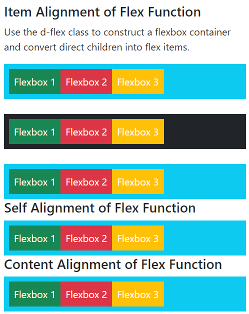
ConclusionThe flex uses to contain information, content and items of the application. It fits items in a flex container with proper layout and margin automatically.
Next TopicBootstrap 5 Popover function
|
 For Videos Join Our Youtube Channel: Join Now
Feedback
- Send your Feedback to [email protected]
Help Others, Please Share


