 |

Bootstrap 5 imageBootstrap 5 image tags insert an image on a web page for reference and information. Technically, an image is not placed into a web application like text and table data. The image path places on the web page using the <img> tag and the "href" element. The image tag of the online site does not have a closing tag. Rounded corner imageBootstrap 5 image function places image with rounded shape corner. The bootstrap 5 image function uses the "rounded" class with the image tag. We can use the class = "rounded" class for the rounded corner image. SyntaxThe following syntax shows rounded corner image in web page.
ExampleThe following example uses rounded corner image in container tag. We can see the different size of the images place in one page. Output The following output shows two different sizes of the image with rounded corners. 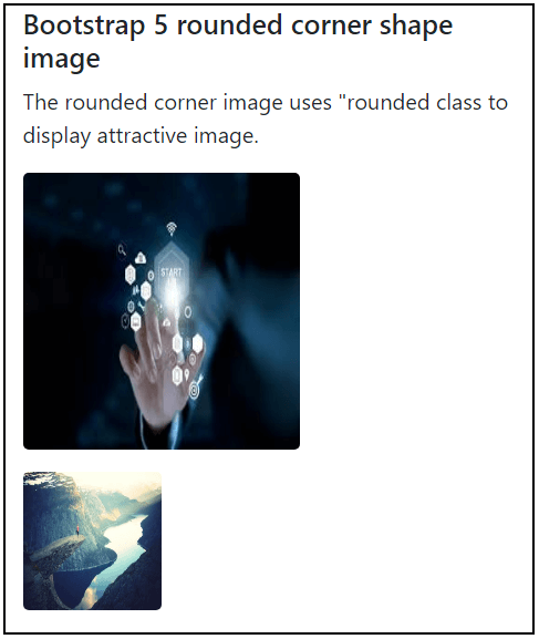
Circle imageBootstrap 5 image function places images with circle shape border. The bootstrap 5 image function uses the "circle" class with the image tag. We can use the class = "rounded-circle" class for the circle shape image. SyntaxThe following syntax shows rounded corner image in web page.
ExampleThe following example uses circle shape image in container tag. We can see the different size and circular shape of the images place in one page. Output The following output shows an image of different sizes and shapes with height and width. 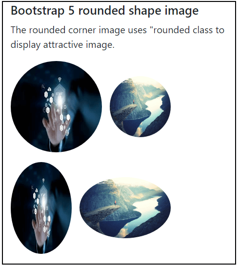
Thumbnail imageBootstrap 5 image function places square shape image with its border. The bootstrap 5 image function uses the thumbnail class with the image tag. We can use class = "img-thumbnail" class for the stylish square shape image. SyntaxThe following syntax shows thumbnail image in web page. ExampleThe following example uses thumbnail and without thumbnail image in container tag. We can see the difference between thumbnail image and default image. Output The following output shows the default and thumbnail image height and width on a web page. 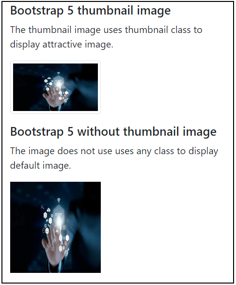
Aligning imageBootstrap 5 image function displays images in the required alignment of the web page. The image can place either start or end of the page. We can use the "float-start" and the "float-end" classes for the start and end of the page, respectively. SyntaxThe following syntax shows start alignment of the image in web page. The following syntax shows end alignment of the image in web page. ExampleThe following example uses start and end aligning image in container tag. Output The following output shows the start and end alignment of the image with the required height and width on a web page. 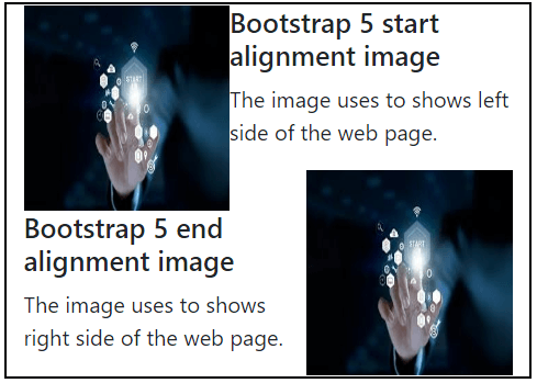
Centered imageBootstrap 5 image function displays the image in the center alignment of the web page. The image places the center point of the container class or <div> tag using these two classes simultaneously. We can use the "mx-auto" and the "d-block" to automatically set the margin and display the image as a block. SyntaxThe following syntax shows center alignment image in web page. ExampleThe following example uses center aligning of the image in container tag. Output The following output shows the center alignment of the image with the required height and width on the web page. 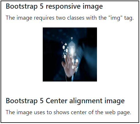
Responsive imageImages exist in various sizes, and they must fit in all sizes of the devices. Images that are responsive instantly change the size of the screen. Create responsive images by adding the "img-fluid" class to the <img> tag. The image will then scale proportionally to its parent. The "img-fluid" class sets the image's max-width upto 100 percent and its height to the "auto" value. SyntaxThe following syntax shows responsive image in web page. ExampleThe following example places two images with different height and width in screen. The responsive image class helps to set in all size of the device. We can use image tag without height and width to create responsive image Output The following output shows the responsive image to set in all screen sizes. 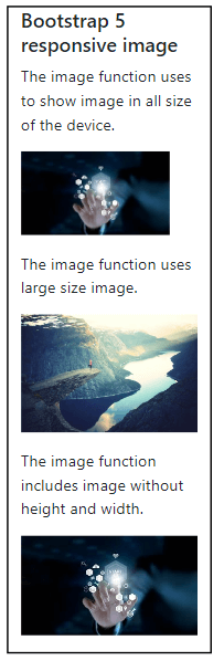
ConclusionThe image is vital for showing data in an interesting format on the web page. Bootstrap 5 image function provides several classes to place and look image attractive in web applications. Bootstrap 5 image classes help set a picture on a web page as per requirement and user interaction.
Next TopicBootstrap 5 jumbotron
|
 For Videos Join Our Youtube Channel: Join Now
Feedback
- Send your Feedback to [email protected]
Help Others, Please Share


