| |

How to create chart using Bootstrap?Bootstrap is one of the most famous frameworks of CSS in web development. It is used to design and create websites with great designs and full responsiveness. It is used in front-end development, which makes it very easy to create web pages without so much HTML and CSS. It is compatible with almost all browsers. What is chart in Bootstrap?Charts are the graphical representation of the data set in which data is represented by various symbols. There can be multiple types of charts like pie charts, line charts, donut charts or bar charts, etc. We will see some examples of the charts using Bootstrap: Example1:Output: 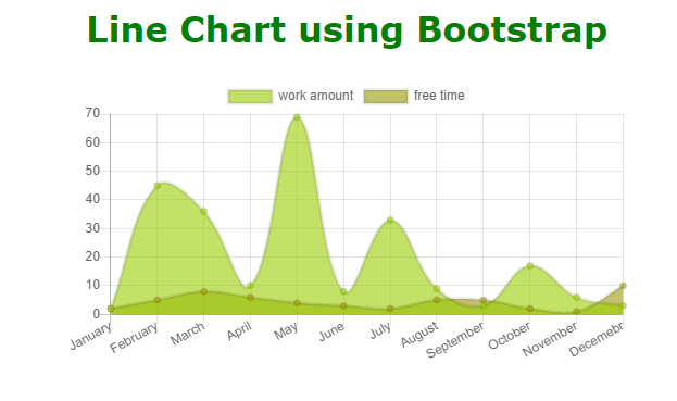
Explanation In the above HTML code, we have inserted the CDN links, which are necessary to use the Bootstrap classes directly in our code. Then, we have used the canvas tag in which we have drawn our line chart. In the script tag, we have created the two-dimensional context of the canvas tag, and we have used the Chart class to make the chart for the canvas context. In the type, we have mentioned 'line' to create the line chart, and then we have defined some labels for the horizontal axis using an array. Also, we have defined the datasets for the horizontal and vertical axes, respectively. We have created the titles for the horizontal and vertical axis also. We have styled the components in the style tag with the necessary colors and margins. Example 2:Output: 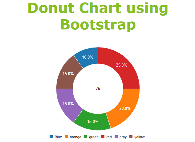
Explanation In the above HTML code, we have inserted the CDN links, which are necessary to use the Bootstrap classes directly in our code. Then, we have created a div tag and given it an id to target it easily. Then, we have used the generate() function to create the donut chart on the div tag with a dataset. In the generate() function, we have created a 2D array defining the column name and its proportion in the donut chart using integer numbers. The percentage of each column can be calculated using average theory. So, in the above code, we have six columns, and the sum of their values is 20. So, the percentage of the blue part will be 2/20 = 0.1 or 10%. The percentage of the orange part will be: 4/20 = 0.2 or 20% The percentage of the green part will be: 3/20 = 0.15 or 15% The percentage of the red part will be: 5/20 = 0.25 or 25% The percentage of the gray part will be: 3/20 = 0.15 or 15% The percentage of the yellow part will be: 3/20 = 0.15 or 15% We have defined the onclick() function, onover(), and onout() function for the donut chart. For each function, we have printed some statements using the console.log() function. |
 For Videos Join Our Youtube Channel: Join Now
Feedback
- Send your Feedback to [email protected]
Help Others, Please Share


