 |
C Tutorial
C Control Statements
C Functions
C Array
C Pointers
C Dynamic Memory
C Strings
C Math
C Structure Union
C File Handling
C Preprocessor
C Command Line
C Misc
C Programming Test
C Programs
MCQ
Math
C Interview

Responsive Images in Bootstrap with ExamplesIn this tutorial we will learn how to make images responsive in Bootstrap with examples. Bootstrap provides various classes for images to improve their appearance and make them responsive. Trying to make an image responsive implies that it needs to scale in accordance with its parent element. That is, the image's size must not be greater than its parent's size, and it needs to expand and reduce in proportion to its parent's size without having lost its aspect ratio. The image classes offered in Bootstrap are as follows: 1. .img-responsive class: Responsive images in Bootstrap are formed by updating the.img-responsive class to the img tag. The following .img-responsive class is applied to the image: display: block, height: auto and max-width: 100%. HTML Code: Output: 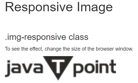
2. .img-fluid class: Include the.img-fluid class in the tag. The.img-fluid class is applied to the image, with the following settings: max-width: 100% | height: auto. HTML Code: Output: 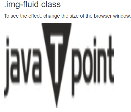
3. .img-rounded class:img-rounded class adds rounded edges to an image. (IE8 does not support rounded corners.) HTML Code: Output: 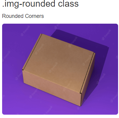
4. .img-circle class:img-circle class transforms the image's structure into a circle. HTML Code: Output: 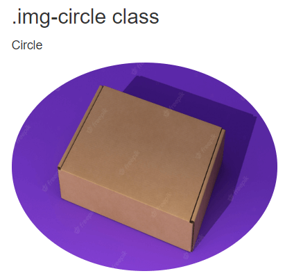
5. .img-thumbnail class: The .img-thumbnail class is responsible for transforming the image into a thumbnail. HTML Code: Output: 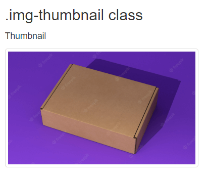
Browsers that are supported:
|
 For Videos Join Our Youtube Channel: Join Now
Feedback
- Send your Feedback to [email protected]
Help Others, Please Share


