 |
 Home
Home Java
Java Programs
 OOPs
OOPs String
 Exception
 Multithreading
 Collections
 JavaFX
 JSP
JSP
React Bootstrap AlertsAlert is a useful component for displaying a message. The alerts have a different color to specify a message. For example, to display a success message, we use green color, and for a danger message, we use red color. The Bootstrap alerts are designed in a way that represents a message according to its usage. If we use the Alert with success variant, the message text will be green. Similarly, other variants have different colors. Alerts provide a contextual feedback message for typical user actions with the specified message based on the alert type. By default, Alerts are full width, but we can specify a width for the alert message and choose other options such as dismiss button. The dismiss button is optional; we can use it if needed. Bootstrap provides 8 alert variants; which are as follows:
How to Use Alert Component?To use the Alert component, define it as < Alert>Your message</Alert> and import it as follows: The variant prop is used to define the variant of the Alert component. Consider the below example: App.js: Output: 
Similarly, we can use other variants of the Alert component. All Alert Variants:We are rendering all the alert variants at once using the React Map function. App.js: Output: 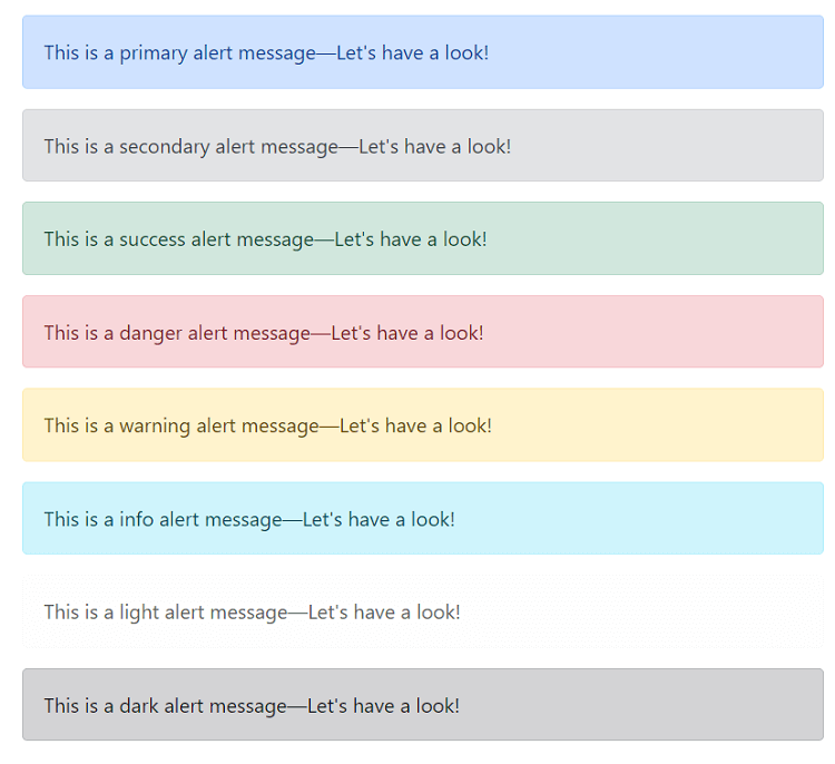
Colors make the text meaningful and provide a visual indication. That's is why every alert message has some specific color to indicate users. Adding Dismiss IconWe can also add a dismiss icon to close the alert message. The dismissible prop is used to add a dismissal icon to the alert message. We have to use the useState Hook to show or hide the alert component. Consider the below example: App.js: Output: 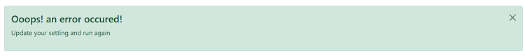
When we click on the close icon, it will hide the alert message and display the show alert button. 
When we click on the show alert button, it will display the alert message. This is how we can toggle an alert message using React Bootstrap. We can also use the manual button for hiding the alert message to create a more attractive and meaningful user interface. Manually Hiding an AlertTo create a manual hide button for an alert, we need to update its state using the onClick event. Consider the below example: Output: 
When we click on the Hide Alert button, it will hide the Alert. Thus we can define a manual button for hiding the alert message. Adding Navigation LinksTo add a navigation link with an alert message, we can use < Alert.Link> component to specify any link with the matching color. Consider the below example: App.js: Output: 
Adding Additional ContentThe Alert component allows us to add additional content to the message. We can add headings, paragraphs, even images with the alert component to make it more specific. To add the additional component with the alert message define it within the <Alert></Alert> component. Consider the below example: App.js: Output: 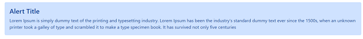
Next TopicReact Bootstrap Breadcrumbs
|
 For Videos Join Our Youtube Channel: Join Now
Feedback
- Send your Feedback to [email protected]
Help Others, Please Share


