 |
 Home
Home Java
Java Programs
 OOPs
OOPs String
 Exception
 Multithreading
 Collections
 JavaFX
 JSP
JSP
React Bootstrap TablesThe tables are very useful for displaying a bulk amount of data in an organized layout. Bootstrap supports different pre-defined layouts of the tables. We can use them in our React application. The Tables in React bootstrap are used as normal Bootstrap; the only difference is that we use the className to specify a table style, and, in React Bootstrap, we use the props to specify the table layout. Let's understand how to use the React Bootstrap Tables: How to Use the React Table Component?To create a table using React Bootstrap, we have to specify the <Table> component along with the specific props and variants. The Table component is imported as follows: import Table from 'react-bootstrap/Table' Let's understand it with an example: App.js: Output: 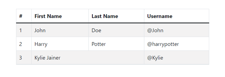
Small TableTo create a small size table, pass the size prop value as sm in the Table component. It will create a small size table with the lower cellspacing and cellpadding. Consider the below example: App.js: Output: 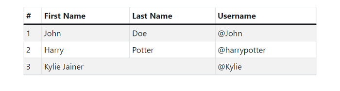
Dark TableWe can use the dark variant for the dark table. The background color of the table cells will be dark. To specify a dark variant, pass the variant='dark' value in the table component. Consider the below example: Output: 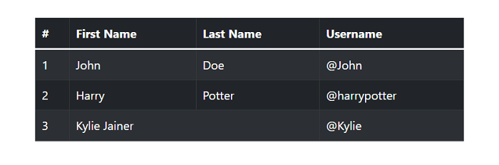
Responsive TablesThe responsive tables are designed in a way that allows horizontal scroll when the viewport size is lower than the table content width. The responsive prop is used to create a table responsive on all the viewports and breakpoints. The responsive tables are automatically wrapped in a div container that has a pre-defined CSS for the content overflow. Let's understand it with the following example: We are increasing the number of columns for filling the table data. App.js: Output: 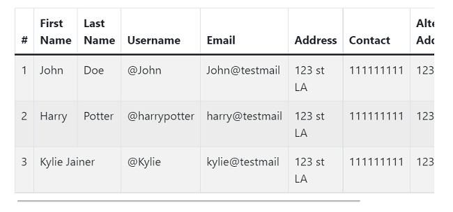
The responsive table is automatically adjusted on all the viewports. From the above example, when the table data will get max to the viewport width, it will display a scroll bar for scrolling the table data. Breakpoint Specific Table We can also specify breakpoints where we want to be our table responsive; we can use the responsive prop values as sm, md, and lg. From the specified breakpoint, for larger screens, the table behavior will be normal as per the original format. The following table will be only responsive on the medium devices only: Similarly, we can specify the sm and lg options for the responsive table. If we do not specify any specific viewport, it will always be responsive across all the viewports.
Next TopicReact Bootstrap Carousels
|
 For Videos Join Our Youtube Channel: Join Now
Feedback
- Send your Feedback to [email protected]
Help Others, Please Share


