 |

Ionic ButtonsThe ionic framework contains several types of buttons. These buttons are an essential way to interact with and navigate through an app. It should also use to clearly communicate what action will occur when the user clicks on them. It can be used in the forms or anywhere that needs a simple, standard button functionality. The buttons can contain two things, which are text, icons, or both. It can also be enhanced with a variety of attributes to look a specific way. We can access buttons by using a standard <ion-button> </ion-button> element. The different styles of buttons attributes are listed below.
DefaultIt is the basic usage of the buttons. The syntax of default style is: You can sets the color of the button by using color property. Ionic includes several default colors which can be easily overridden. For example, ExpandThis attribute is used to specify the width of your buttons. By default, the buttons are inline blocks. But, by setting these attributes, we can change the button to a full-width block element. We can divide it into two types: 1. Block Buttons Block button will always make the button take 100% width of its parent's container with a rounded corner. 2. Full Buttons The full button will also make the button take 100% width of its parent's container. It also removes the button's left and right border. The Full button style is useful when the button needs to stretch across the entire width of the display. FillIt determines the background and border color of the buttons. By default, buttons are of a solid background. We can divide these attributes into the following types. Clear It is used to make the buttons with a transparent background, which resembles a flat button. You can do it by adding the clear property in the button as like below: Outline It is used to make the buttons with a transparent background and a visible border. You can do it by adding the outline property in the button as like below: Solid It is used to make the buttons with a filled background. It is useful for buttons in a toolbar. You can do it by adding the solid property in the button as like below: Round Shape ButtonIt is used to create a button with rounded corners. You can do it by adding the round property in the button as like below: Example In the below example, we can clearly understand the usage of all types of button attributes. Button.html Button.ts Output When we execute this Ionic application in the terminal window, it gives the following output. 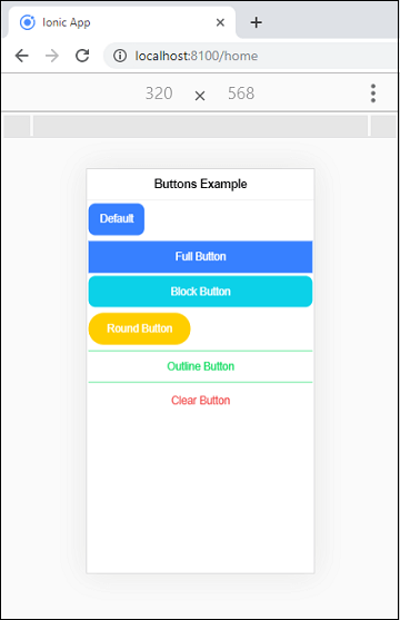
Button SizeThe size attribute is used to specify the size of the button. It allows us to change the height and padding of a button. There are mainly three types of these attributes, which we can see in the below table.
Example In the below example, we can clearly understand the differences between all the size of the buttons. Output When we execute this Ionic application in the terminal window, it gives the following output. 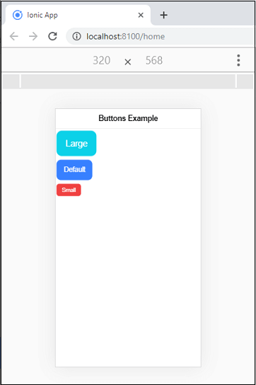
Button IconsIf you want to add icons to a button, you need to add an icon component inside of the button. You can also set the position of the icon inside the button by using slot attributes. The slot attributes are given in the following table.
Example Output 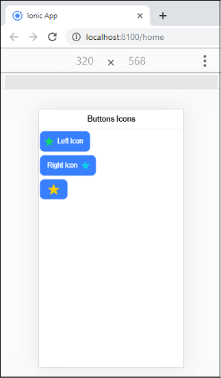
Next TopicIonic Cards
|
 For Videos Join Our Youtube Channel: Join Now
Feedback
- Send your Feedback to [email protected]
Help Others, Please Share


