 |

Ionic RangeThe Ionic range slider is used to choose and display the level of values by moving the slider knob. By default, only one knob controls the value of the range, but it can also accept dual knobs. Range labelsThe labels can be placed on both side of the range by adding the attribute slot= "start" and slot= "end" to the element. Maximum and Minimum valuesThe maximum and minimum values can be passed in the range by using the max and min properties, respectively. By default, the range has set the min=0 and max=0 values. Steps and SnapsThe steps property is used to specify the value granularity of the range value. It can be useful when the value is not in increments of 1. If you set the step property in the range, it will show the tick marks on the range for each step. The snap property is used to automatically move the knob to the nearest tick mark based on the step property value. Dual knobsIf the dual-knobs property is set to true on the range component, it will enable the two knobs on the range. It means the value will be an object containing two properties: lower and upper. We can understand the Ionic range from the following example. ExampleOutput: 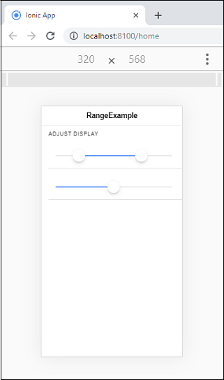
Adding Icons to the rangeIcons are used to display the data clearly. We can place the icons before and after the range input on both sides of the range element. The following example shows the use of icons in range. ExampleOutput: 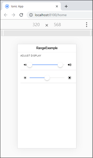
Styling RangeWe can also style the range by using the color property. The following example shows the use of color with ionic range component. ExampleOutput: 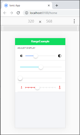
Next TopicIonic Refresher
|
 For Videos Join Our Youtube Channel: Join Now
Feedback
- Send your Feedback to [email protected]
Help Others, Please Share


