 |

Ionic Radio ButtonA radio button is a type of input components which holds the Boolean value. It is similar to HTML radio inputs. The Ionic radio button is styled differently on each platform as like other Ionic components. Radio components are generally used as a set of related options inside of a group, but it can also be used alone. A radio button options can be checked by selecting it or checked programmatically by setting the checked property. It also uses a disabled attribute to disable the user from changing the value. An <ion-radio-group> component can be used to group a set of radios. It allows you to select at most one radio button from a set. In other words, when the radio group contains many radio options, then only one radio option will be checked at any time. If we select any radio option inside the group, it unchecks the previously selected radio option. If the radio option is not in a group with another radio, then both radio can be checked at the same time. ExampleIn the following example, we can see how radio buttons work in the Ionic app. Output 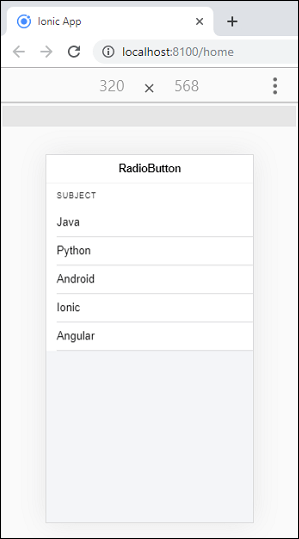
Multiple Radio Button groupSometimes you want to create more than one group of radio buttons. Ionic radio button provides <ion-radio-group> element to create multiple group of radio buttons. ExampleThe following example explains how you can create multiple groups of radio buttons. Here, we are also going to see the uses of the checked and disabled property of the radio button. Output When you execute the app, the following screen appears. Here, Group1 is CS Subject, where the second item uses checked property and Group2 is Auto Manufactures where the second option uses the disabled property. 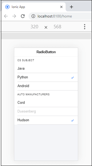
Next TopicIonic Range
|
 For Videos Join Our Youtube Channel: Join Now
Feedback
- Send your Feedback to [email protected]
Help Others, Please Share


