 |

Ionic ChipThe Ionic chip represents complex entities in a small box, such as a contact. It is just an element or component which you can use to display information in some text system inside of your applications. It is a pretty bubble-like container for holding text and icons. It can contain a number of different Ionic elements like text, avatars, and icons. We can understand it from the following example. ExampleOutput: 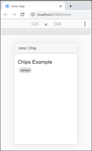
Outline ChipWe can also configure the border of an Ionic chip. By default, the shape of the Ionic is solid. But, it can be changed by using the outline property. The below example explains it more clearly. ExampleOutput: When you execute the app, it will display the following output. Here, you can see the difference between default and outline chips. 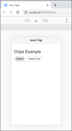
Adding Icons and AvatarThe Ionic allows to add icons and avatar media in the chip component. To add an icon and avatar in the <ion-chip>, you need to place <ion-icon> and <ion-avatar> component inside <ion-chip>. The following example explains how icon and avatar can be added to the chip component. ExampleOutput: 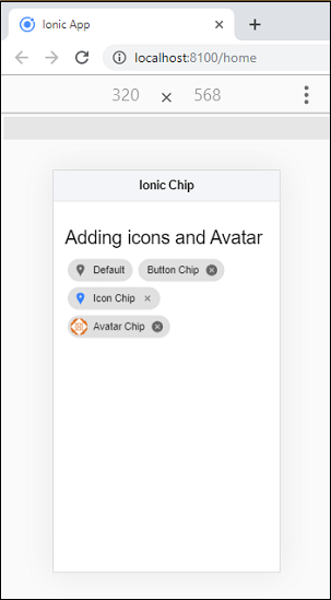
Styling the ChipThe chip components can also colorize in different styles. To change the styling of <ion-chip>, use the color attribute. The following example explains the use of color attributes inside the chip component. ExampleOutput: 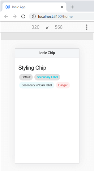
Next TopicIonic Colors
|
 For Videos Join Our Youtube Channel: Join Now
Feedback
- Send your Feedback to [email protected]
Help Others, Please Share


