 |

Ionic cardsCards are a great way to display standard pieces of UI content which serves as an entry point to more detailed information. They are the best elements for displaying information that will feel user-friendly. If there is a need to display more content at once, and often have a small screen, the choice of the card becomes the popular design pattern for many companies like Google, Twitter, Spotify, etc. For mobile experiences, an Ionic card makes it easy to display the same information across many different screen sizes. They are flexible, allow more control, and can be animated also. Cards can be a single component, which often broken up into several other sub-components. These sub-components are header, title, subtitle, and content. We can access cards by using a standard <ion-card></ion-card> element. Let us see the sub-components of cards in detail: Ion-card-content It is the child component of <ion-card> which adds some content padding. It is recommended to add text content for a card which should be placed in an ion-card-content element. Ion-card-header It is a sub-component of <ion-card> which creates a header for the card. Ion-card-subtitle It is a child component of card which adds subtitles for the card. It displays in the capital form inside your app. Ion-card-title It is a child component of card which adds titles for the card. ExampleThe below example helps to understand how Ionic card and its sub-component works. Output When you execute the app in your terminal, you will get the following output. 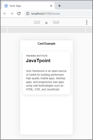
Card ImagesYou can add your app images easily inside the cards. The Ionic card will give a constant width and variable height to the image. You can also combine the headers, lists, and other card components easily with image cards. To add an image in your card, use the following markup <img src="assets/jtp_logo.png"/> Example The below example helps to understand how an Ionic card works with images. Output When you execute the app in your terminal, you will get the following output. 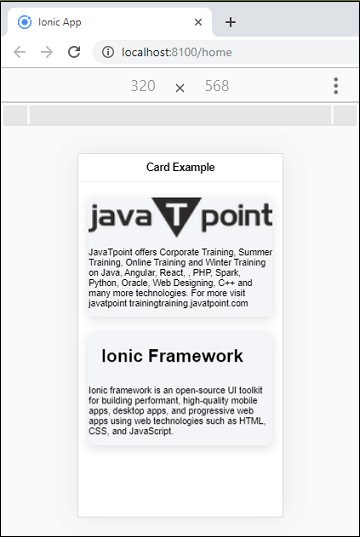
Lists in CardsThe Ionic card can also contain a list of items. To display a list inside of the Example The below example helps to understand how lists work with Ionic card component. Example Output When you execute the app in your terminal, you will get the following output. 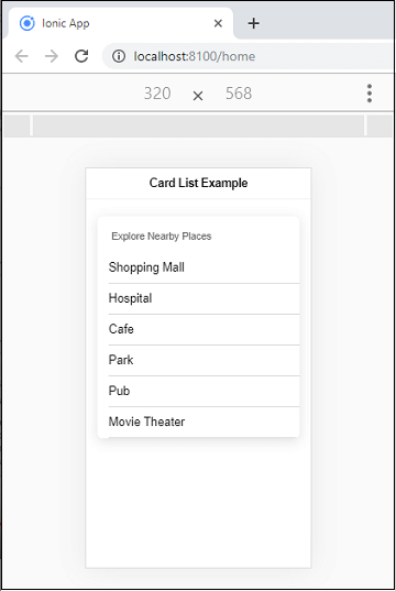
Next TopicIonic Checkbox
|
 For Videos Join Our Youtube Channel: Join Now
Feedback
- Send your Feedback to [email protected]
Help Others, Please Share


