 |

Components in Adobe XDComponents are the reusable objects in Adobe XD. They provide unmatchable flexibility that helps us reuse it while varying its instances multiple times. We can update them globally by only modifying the main component. A button is a good example of a component as it is used several times throughout the project. By making a button as a component, we can reuse it on different pages of the project. If we need to customize the style of the button, we can update the button style globally by just updating the main component. If we need to update the text for a button on the internal page, we can update it by just updating its text. It will keep the button style and update the text. Since the reused components are linked together, the main component's changes will be replicated across all of them instantly. The component feature of the Adobe XD is one of the finest and time-savvy features. It reduces the effort of the designer by reusing the component. But, it requires a thoughtful approach and a carefully prepared workflow. In this section, we will discuss how to create and use the component. To understand the components better, make sure to know the responsive resize and padding feature of the Adobe XD. How to Create ComponentTo make an object or group of objects as a component, select it and navigate to the Object menu and select the Make Component option. Alternatively, we can use Ctrl+K keys as a shortcut to make an object or group of objects as a component. For example, we want to create a button as a component so that it can be used in other screens with the same properties. Select the button from the artboard. 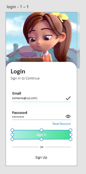
Now, navigate to the Object menu and select the Make Component option. 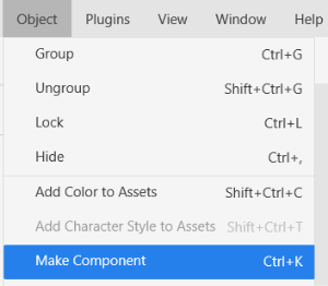
By selecting this option, it will make the button group a component. It will look as follows: 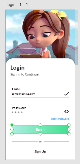
Now, this button can be copied to different artboards by holding the Alt and drag keys. It will copy the same style and text to all the artboards. When we make any changes to this button, it will be reflected in all the buttons throughout the project. 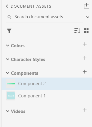
It will be listed in the assets panel given left to the workspace. We can also drag and drop this component to anywhere in the workspace using the assets panel. When we make any changes to the main component, it will automatically update other copied components as well. When the first time we create any object or group of objects as a component, it becomes the main component. Visibly, it will be updated in a green diamond shape in the upper left corner. The components can be edited as a simple object. While making a component, keep the following points in my mind for best use:
What are the Component Instances?The copy of the main component is known as the instances. The components instances are visible by a green diamond icon to the upper left corner of the object edge. The changes updated in the main components will also be reflected in its instance. To override the main component properties in a component instance, ungroup the component and overwrite its values. We can easily override the component property in its instance. However, It will be removed from the chain, so it will not reflect the changes if the main component is updated. If you do not want to break it from the chain and override its properties, do not ungroup it and change the values you want to override. After overriding an instance, you want to update the main component; then, the changes property will not be reflected in the updated instance. However, we can revert any instance to its main state. To revert an instance to its original state, right-click on the component and select revert to the main state option. The following properties can be overridden in a component instance: Text: The text can be edited in a component state. It will be useful for changing the label for an input field or a button. Bitmap: We can update the bitmap content of a component instance. It will be useful for replacing an image in a card or product component. Size: We can also modify the size of a component. It will be useful for updating the size of the fields in a form component. Appearance: We can also modify the component's appearance by updating its color, border, blur, and shadow values. It will be useful for updating the background in a notification section. Layout and structure: Apart from the above-discussed properties, we can also modify the layout and structure of a component instance by adding, deleting, and moving objects. It will be useful for adding the dropdown entries in a dropdown component. States in a ComponentThe components state makes the component intractable. It allows us to save the different variations of the component with the events. We can add and update the state to a component. The state properties inherited by a component instance means the child component also holds the change state properties. The states are also useful for creating a different variation of a component. For example, if we want to hold the different variations of the buttons such as primary and secondary using the state. We can create two states for the button component and change it in a child component as per the requirement. We can also create different variants of the components by overriding the state in the component instance. The following points will be useful while working with states and Components:
Next TopicComponents States in Adobe XD
|
 For Videos Join Our Youtube Channel: Join Now
Feedback
- Send your Feedback to [email protected]
Help Others, Please Share


