 Home
Home HTML
HTML XHTML
XHTML CSS
CSS JavaScript
 Bootstrap
 jQuery
 PHP
PHP XML
XML JSON
JSON Python
 C++
C++ Java
Java C#
C# SQL
SQL Interview Q
How to Make Smooth Bounce Animation Using CSSBounce AnimationWe can use HTML and CSS to create the bounce animation on a web page. Here, to make the bounce animation, we will create a shape using HTML and CSS then we will animate that with the help of CSS. Bounce animation is made only for fun and to create a web page more attractive. Step1: Creating a Shape We will create the shape of the ball, so first of all, we create its shape using a div tag. Step2: Styling the shape and color to look more attractive In the above code, we put the display flex of the body tag and justify content as horizontally centered. So, all the elements will be aligned in the center. For the styling of the ball, we kept its width and height the same to give it a more circular look. Then with a border radius equal to 50%, it gives it an exactly circular shape with a background color. Step3: Set up the keyframes rule In the CSS part, we can control each and every animation and make it more attractive as we want. Syntax: In the keyframe section, we will use from and to keywords to give the starting and ending points of the animation. For the bouncing animation, we will change the ball's position according to our animation. So we will use the transform attribute to change the ball's coordinates. In the above code snippet, we use the translate3d attribute, which takes three parameters. In whatever direction, we want to move the shape, we will give the value in that parameter, so if we want to move the ball in the up and down direction so we will translate it in the y-direction. If we're going to move the ball in a horizontal left-right direction, then we will translate it in the x-direction. Step4: We will add the properties of animation in the target tag. Now in this code, we want an animation in the element whose class name is shape, so we targeted that element defining its own style and with the animation attribute. In the above code snippet, the type of animation is bounce which will run for 0.5 seconds exactly. Now the direction of the animation is alternate, which means in 0.5 seconds, it will move from a down to an up direction, and then it will alter its direction from top to down and animate for 0.5 seconds again. We have set the animation iteration count as infinite, which means it will run until the program runs. If we set the animation-iteration-count to some integer, then it will animate only for those number of iterations. We can also speed up the animation by decreasing the time of animation. If we set the animation time as 0.2 or 0.3 sec, then it will look faster than the previous. Since the animation speed is the same for the whole 0.5 seconds, it will not look bouncy. To make it more clear, we will slow the rate of the animation at the starting and end and speed up the animation in the middle part. So we will add the cubic-bezier attribute in the animation to manage the speed. So here is the final HTML code which will create the bounce effect. HTML code:Output: 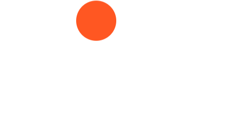
Next TopicHTML <blink> Tag
|
 For Videos Join Our Youtube Channel: Join Now
Feedback
- Send your Feedback to [email protected]
Help Others, Please Share


