 |

Angular Material Expansion Panel<mat-expansion-panel> provides an expandable summary view. The <mat-expansion-panel>, an Angular Directive, is used to create an expandable detail v/s summary view.
app.component.html app.component.ts app.component.css Output: 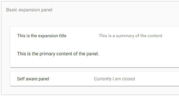
Expansion-panel contentHeader The <mat-expansion-panel-header> shows a summary of the panel content and acts as the control for expanding and collapsing. This header may optionally contain an <mat-panel-title> and an <mat-panel-description>, which format the content of the header to align with Material Design specifications. It is a summary of the content By default, the expansion-panel header includes a toggle icon at the end of the header to indicate the expansion state. This icon can be hidden via the hideToggle property. Action barActions may optionally be included at the bottom of the panel, visible only when the expansion is in its expanded state. Disabling a panelExpansion panels can be disabled using the disabled attribute. A disabled expansion panel can't be toggled by the user but can still be manipulated programmatically. AccordionMultiple expansion panels can be combined into an accordion. The multi="true" input allows the expansions state to be set independently of each other. When multi="false" (default), just one panel can be expanded at a given time: Lazy renderingBy default, the expansion panel content will be initialized even when the panel is closed. To instead defer initialization until the panel is open, the content should be provided as an ng-template: Some deferred content AccessibilityThe expansion-panel aims to mimic the experience of the native <details> and <summary> elements. The expansion panel header has role="button" and also the attribute aria-controls with the expansion panel's id as the value. The expansion panel headers are buttons. Users can use the keyboard to activate the expansion panel header to switch between an expanded state and collapsed state. Because the header acts as a button, additional interactive elements should not be put inside the header. Example:Following is the content of the modified module descriptor app.module.ts. Following is the content of the modified HTML host file app.component.html. Output: 
Details As first, we've created expansion panel using mat-expansion-panel. Then, we've added title, subtitle and content to it.
Next TopicAngular Material Toggle Button
|
 For Videos Join Our Youtube Channel: Join Now
Feedback
- Send your Feedback to [email protected]
Help Others, Please Share


