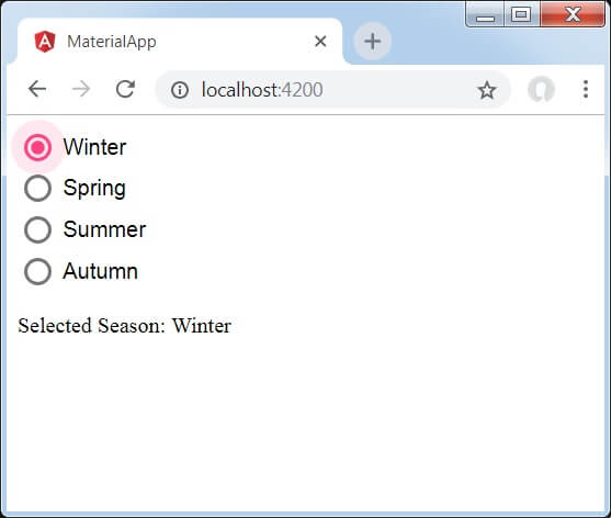
Angular Material Radio ButtonThe <mat-radiobutton> is used for <input type="radio"> for enhance the material design-based styling. It provides the same functionality as the <input type="radio"> with Angular Material Design styling and animations. Radio-Button LabelThe radio-button label is provided as the content of the <mat-radiobutton> element. If you do not want the label to appear next to the radio button, you use the area-label to specify the appropriate label. Radio GroupsThe radio-button should be placed inside the <mat-radio-group> unless the DOM structure makes that impossible (e.g., the radio button inside the table cell) impossible. Different radio buttons inside a radio group will inherit the group name. Use with @angular/forms <mat-radio-group> is compatible with @angular/forms and support the ReactiveFormsModule. Accessibility <Mat-radio-button> uses internal <input type = "radio"> to provide an accessible experience. This internal radio button receives focus and is automatically labelled the text content of <mat-radio-button> element. Radio button groups must be given a meaningful label through an area-label or area-labelledby. Default Color Configuration The default color for radio buttons is configured globally by using the MAT_RADIO_DEFAULT_OPTIONS provider. Example: 1app.component.html app.component.ts app.component.css Output: 
If Radio buttons with the same name occurs then only one may be selected at a time. Example 2:app.module.ts Below is the modified CSS file app.component.css. app.component.ts app.component.ts Below is the HTML host file app.component.html. Output: 
Explanation: First, we have created a radio button group using mat-radio-group bound with ngModel. Then, we have added radio buttons by using the mat-radio-button.
Next TopicAngular Material Chips#
|
 For Videos Join Our Youtube Channel: Join Now
Feedback
- Send your Feedback to [email protected]
Help Others, Please Share


